Over several months, we continuously iterated on the onboarding to make it as fluid and intuitive as possible helping users quickly understand the app’s value and ultimately increase the install-to-trial conversion rate. The onboarding steps shown here are not exhaustive and highlight only the key moments. Feel free to download the app to explore the full experience.
 OLY
OLY KEY METRICS The key metrics for our launch were onboarding completion, install-to-trial conversion, first workout completion, and D1 / D7 retention. While designing the app, I was particularly focused on D1 retention. This meant getting the FTUE right: making the core value immediately clear, guiding users toward their first workout, and giving them a reason to come back the next day.
PROJECT DESCRIPTION OLY's purpose is to make Teddy's training method accessible to everyone. Working directly with his coaches, we distilled a highly technical methodology into an everyday experience. Everything is built around each user's neurotype so their program and coaching feel personal to how they actually train. At the center of the experience : a personalized training program and a permanent chat with Teddy.
MY ROLE As the Founding Designer at OLY, I led product design from 0→1. I wore both product and design hats shaping the roadmap and shipping features directly in code. I worked closely with a product manager and a developer in collaboration with Olympic champion Teddy Riner and Alan.
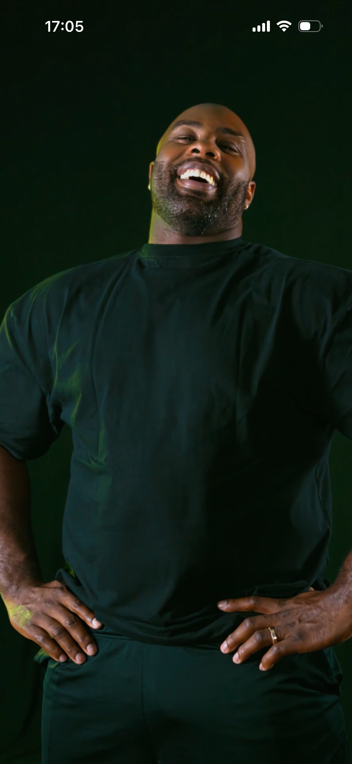
The app opens with a 5-second video of Teddy exercising, immediately immersing the user in the experience.
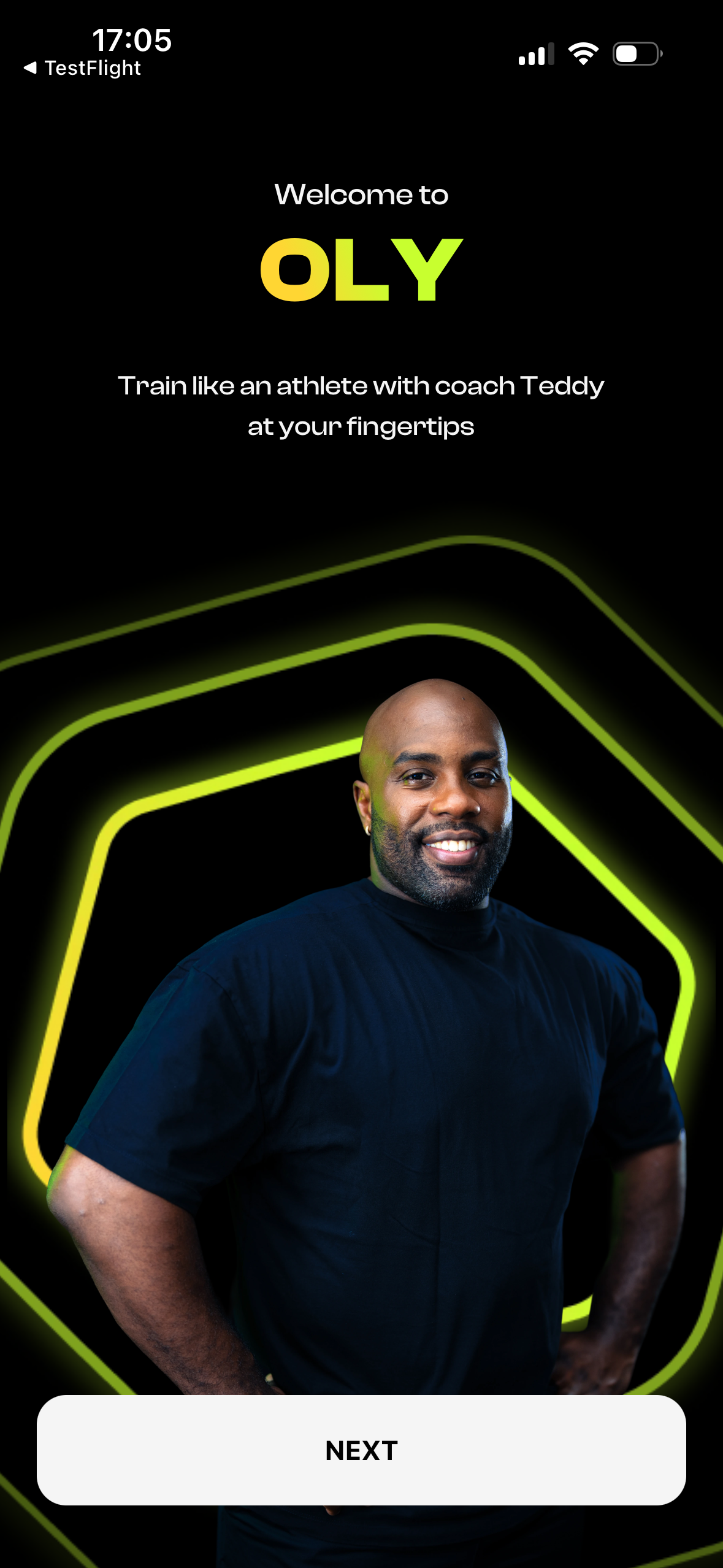
Welcome screen that introduces users to the app’s brand identity and sets the tone for the experience.
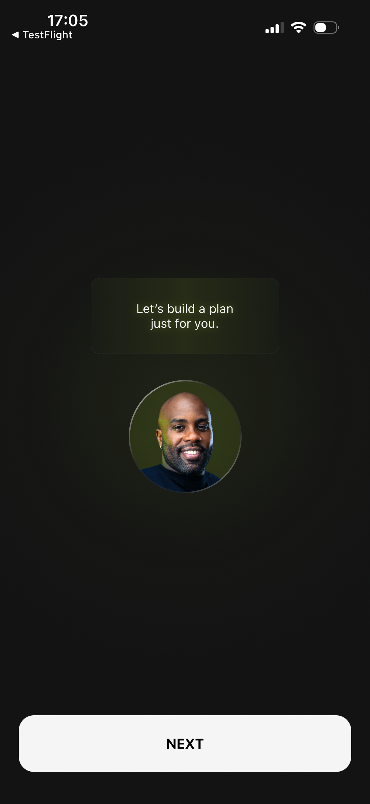
Introducing Teddy’s chat feature by showing that Teddy speaks directly to the user, creating a personal interaction that continues throughout the experience.
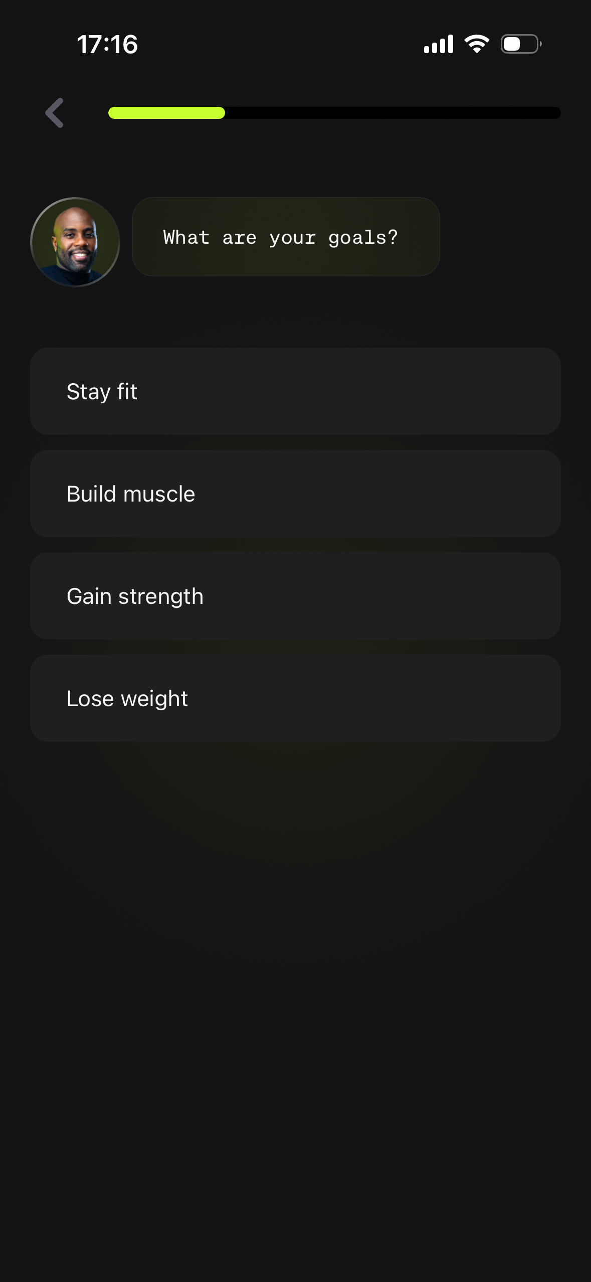
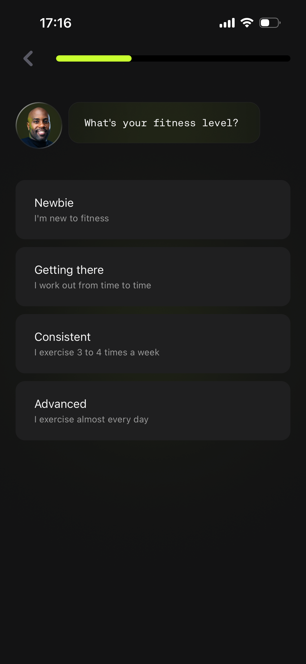
Building a deeply personalized experience by understanding the user’s goals and current fitness level, then adapting the journey to their unique needs.
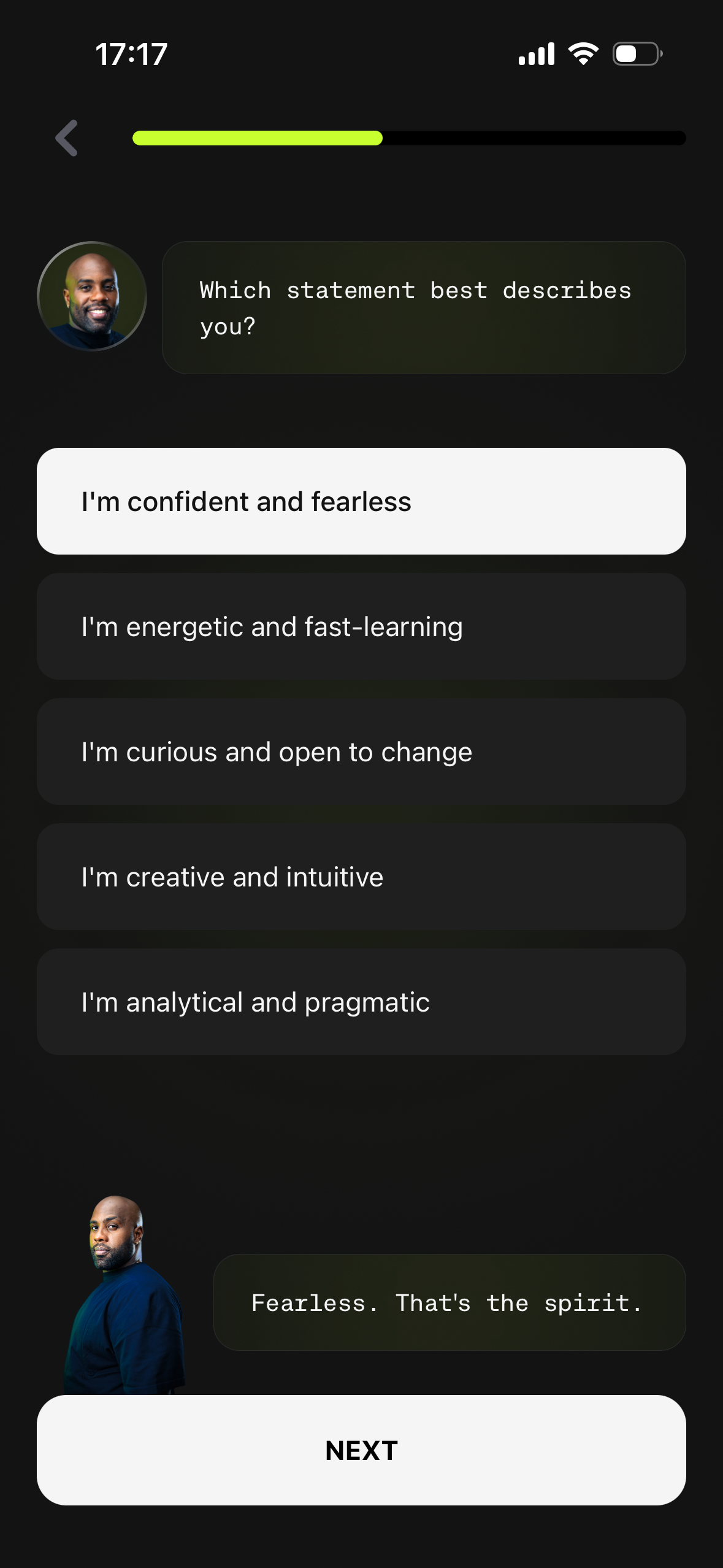
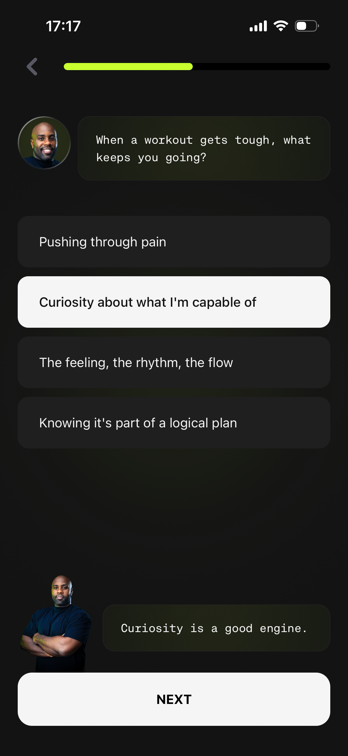
Asking targeted questions about the user’s behavioral traits to identify their neurotype, while Teddy reacts to their answers in real time, creating the feeling of a natural, personalized conversation.
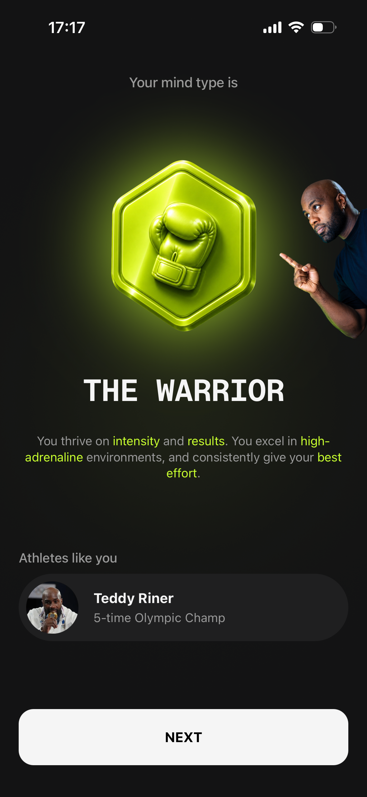
Revealing the user’s neurotype profile based on their previous answers, which becomes the foundation for a fully personalized experience tailored to how they think, engage, and stay motivated.
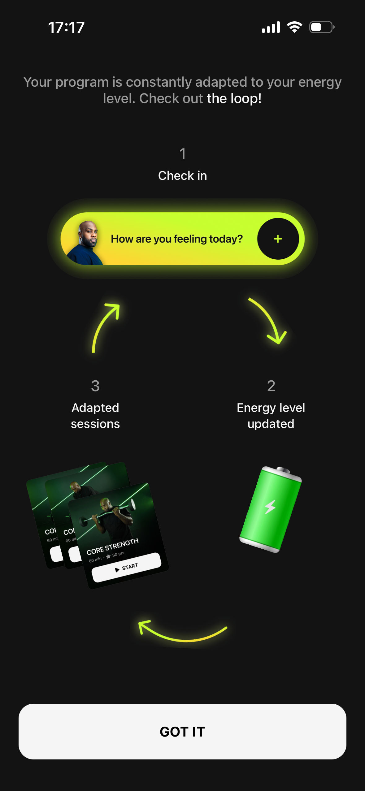
Introducing the core experience loop, where daily check-ins continuously adapt each session to the user’s evolving needs, creating a more relevant and personalized experience over time.
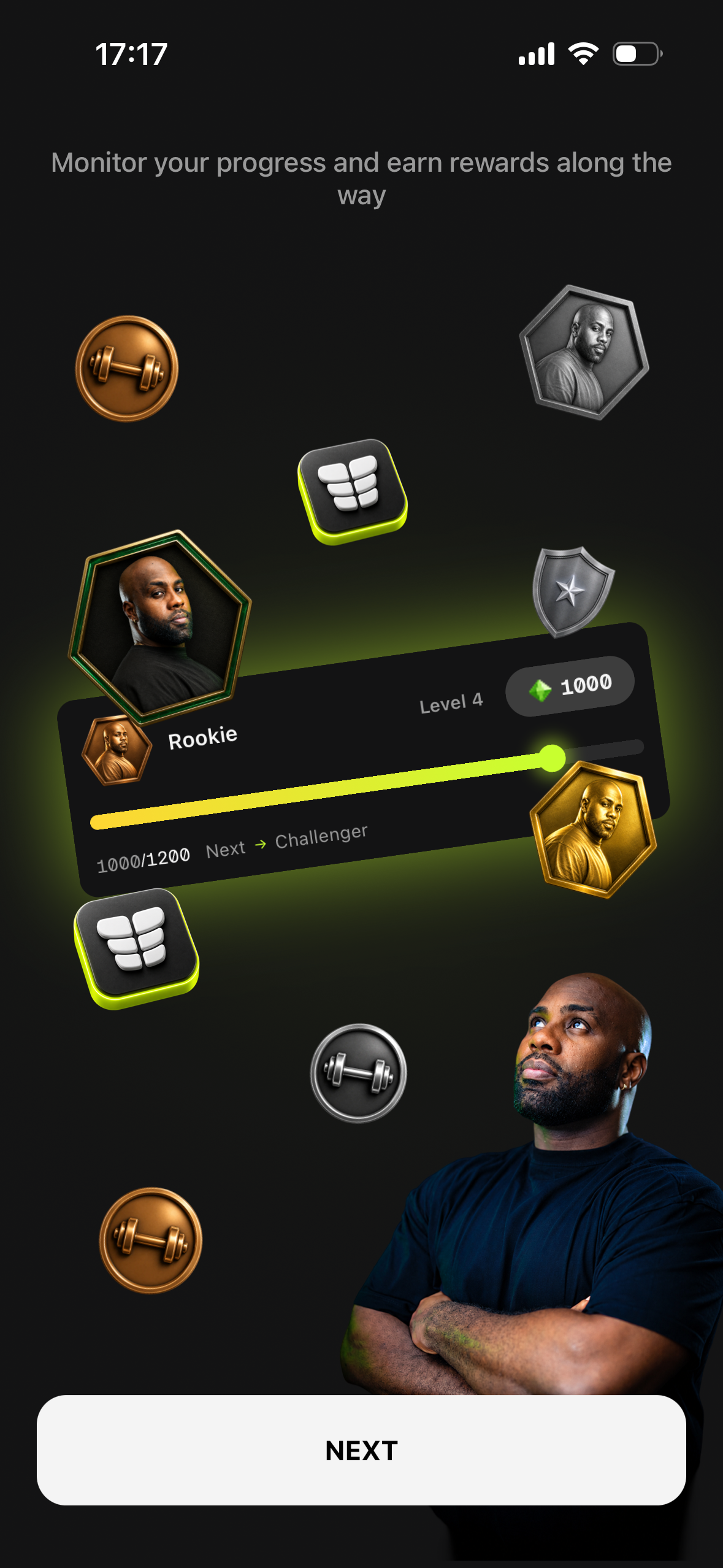
Introducing gamification through badges and rewards that celebrate milestones, reinforce progress, and keep users motivated as they advance through the program.
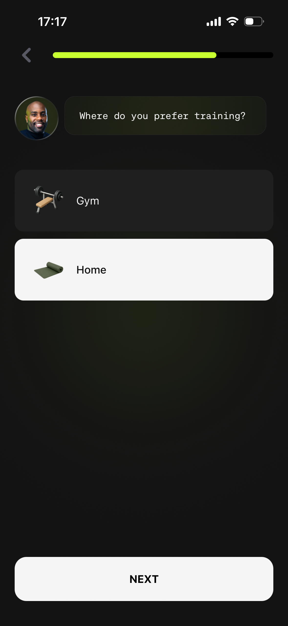
Letting users choose whether they prefer to train at home or at the gym, tailoring the experience to their preferred training environment.
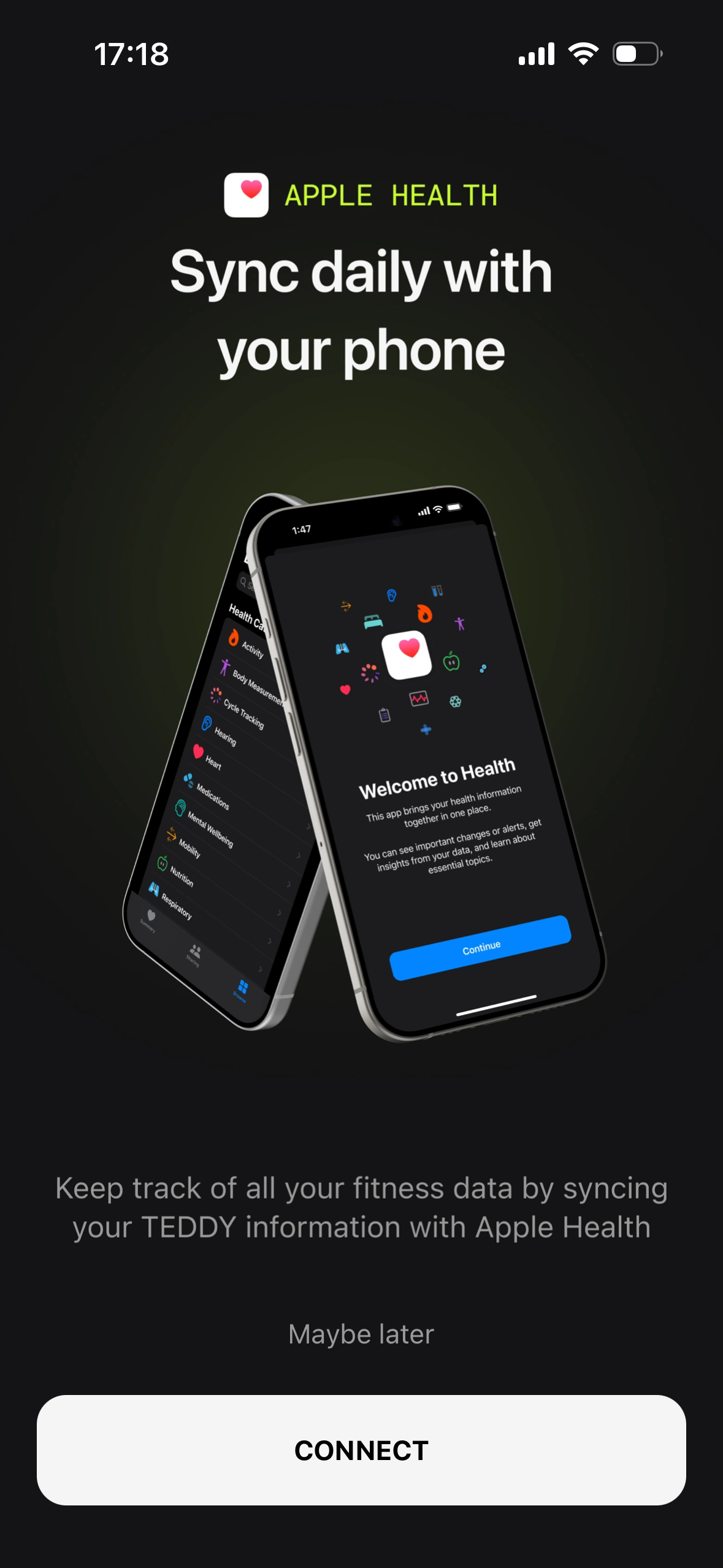
Connecting with Apple Health to enrich the app with real user data, enabling a more accurate and continuously personalized experience.
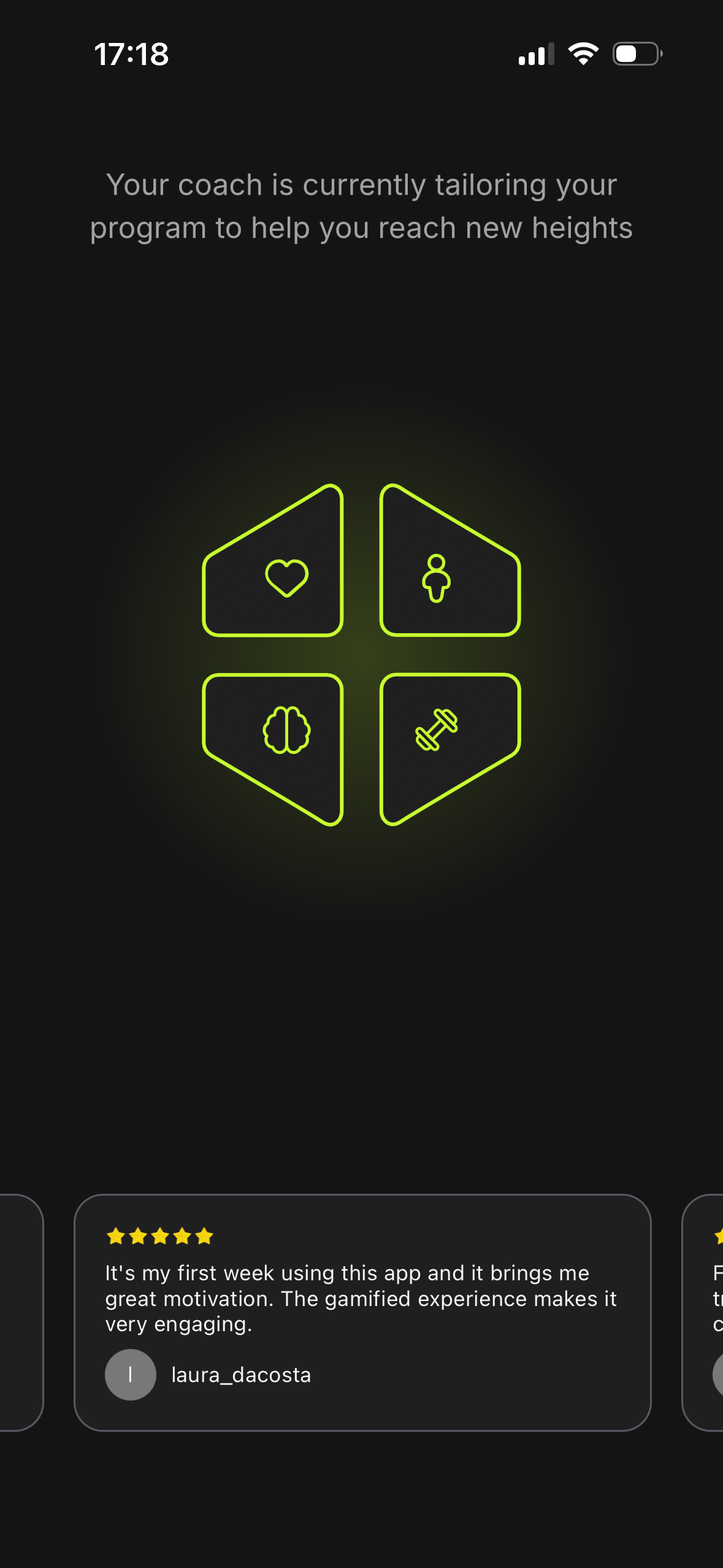
A loading screen showing that the user’s personalized program is being built, reinforcing the sense that the experience is uniquely tailored to them.
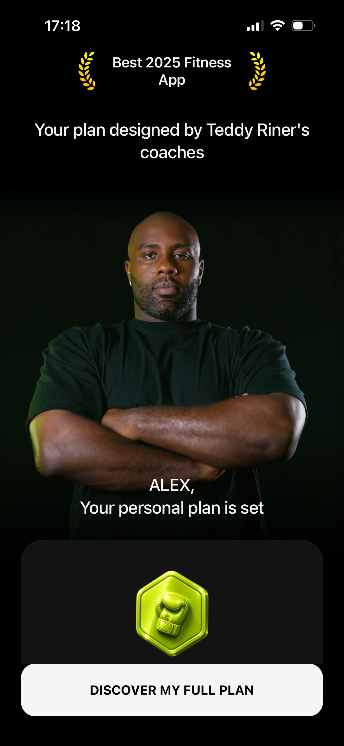
A pre-paywall moment that brings together the user’s goals, preferences, and insights to reveal how Teddy has shaped their personalized plan reinforcing its unique value and increasing willingness to subscribe.
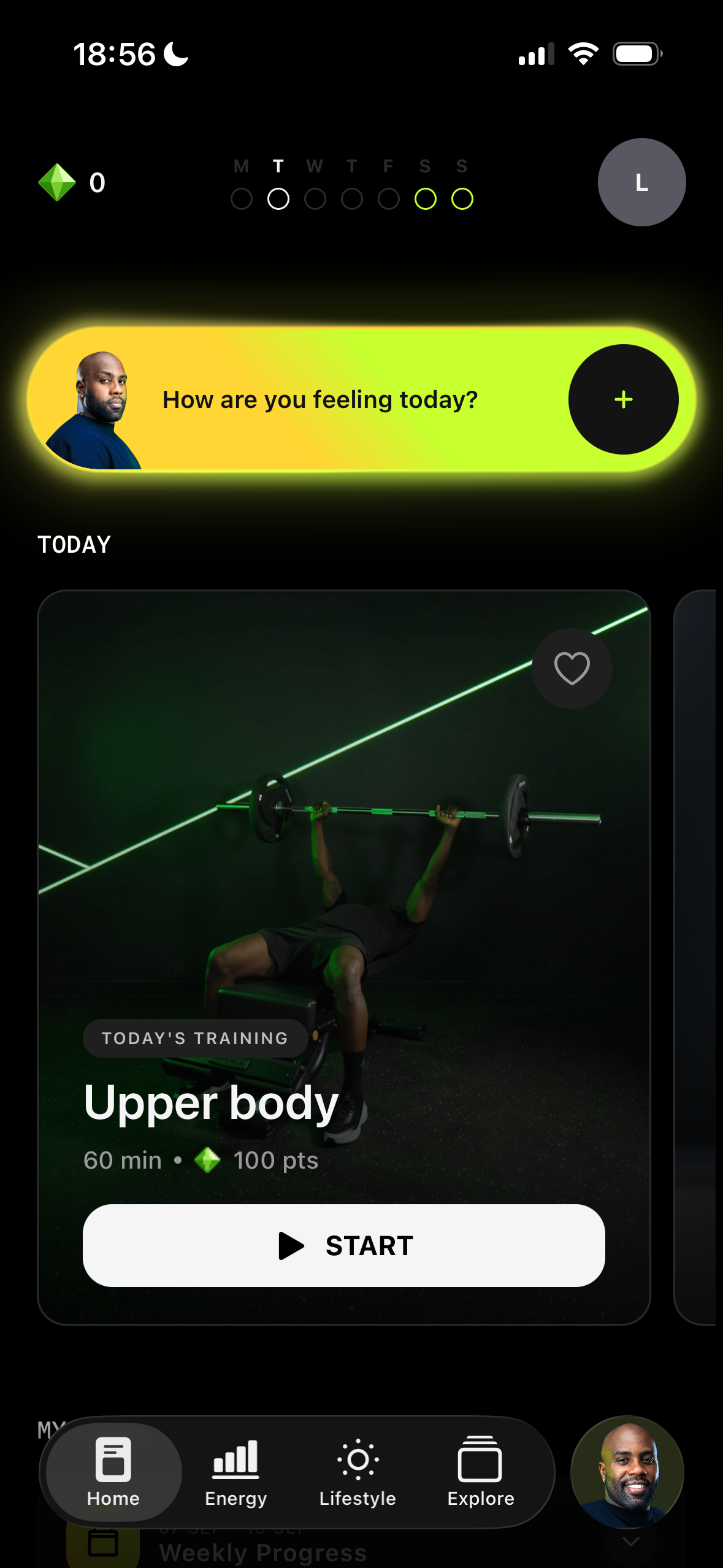
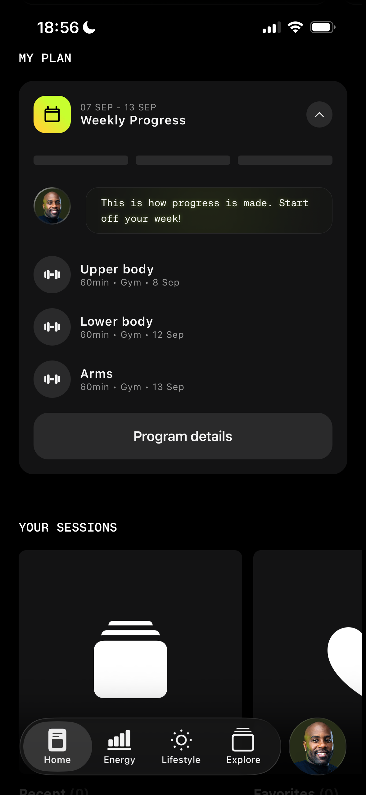
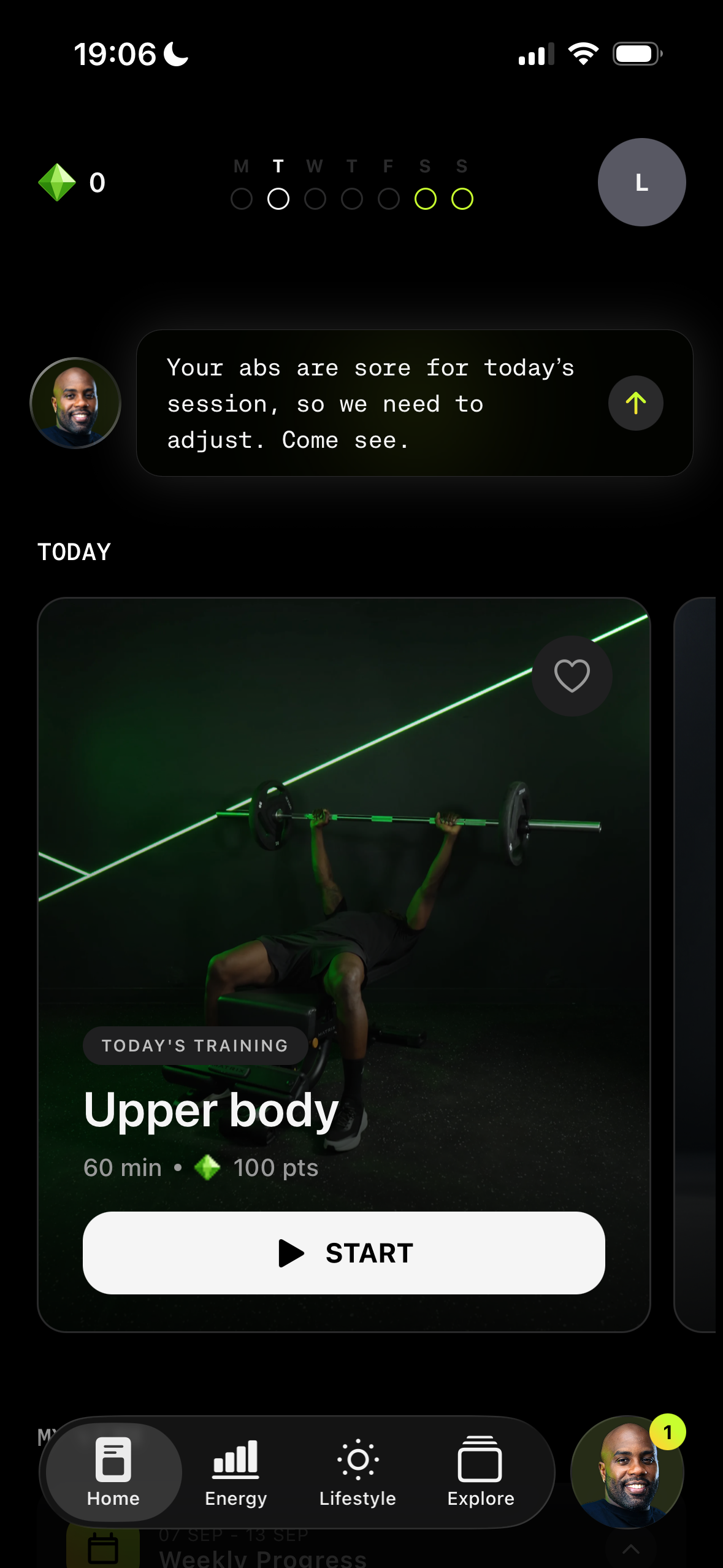
The goal of the FTUE is to make the core loop introduced during onboarding immediately clear and actionable, with as little information as possible. The daily check-in is positioned as the primary action, while today’s sessions remain directly accessible alongside a clear view of the user’s personalized program. By reducing complexity and making the next step obvious from the first visit, the FTUE aims to help users quickly understand the product’s value, build a daily habit, and ultimately improve D1 and D7 retention.
Making the core loop immediately actionable by putting the two key actions front and center: completing a daily check-in to adapt the session or jumping straight into today’s workout. The navigation separates the core sections : Home, Energy, Lifestyle and Explore from Teddy’s chat using his face to make it instantly recognizable and reinforce his presence throughout the experience.
The user’s program stays easily accessible, with recent and favorite sessions surfaced for quick access.
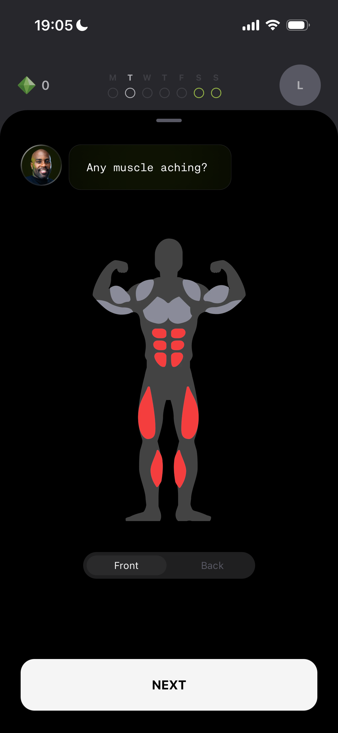
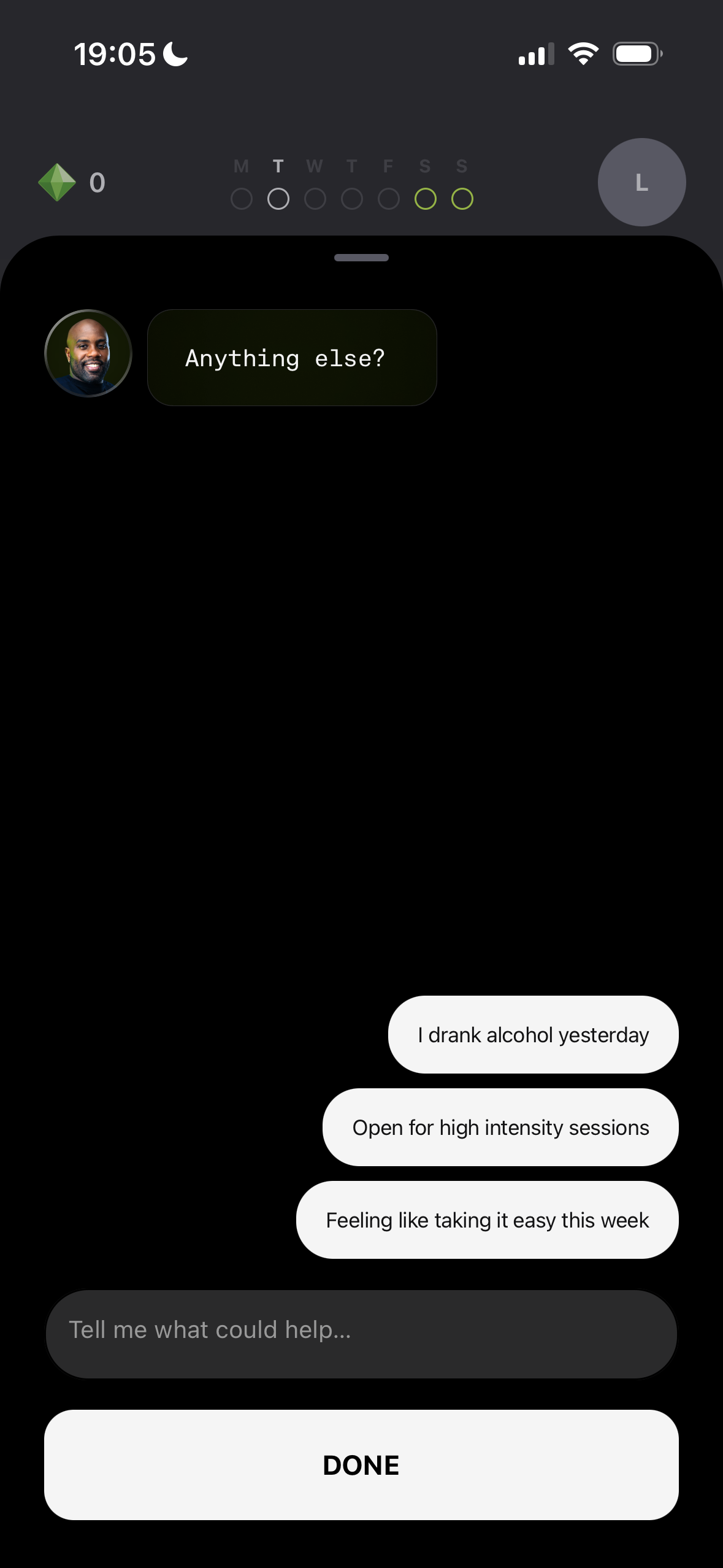
The check-in is a key part of the app’s core loop capturing the user’s current state to adapt each day’s sessions without altering their overall program.
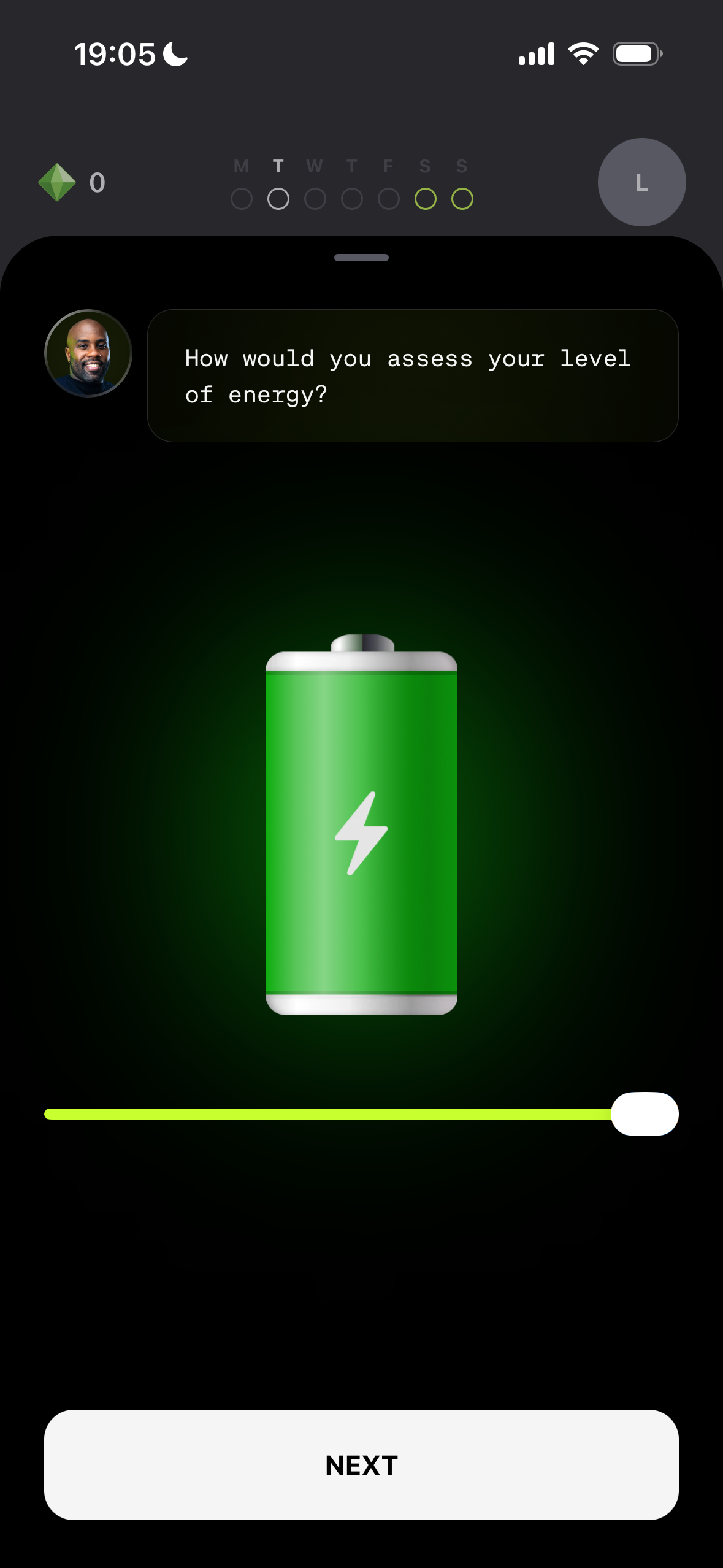
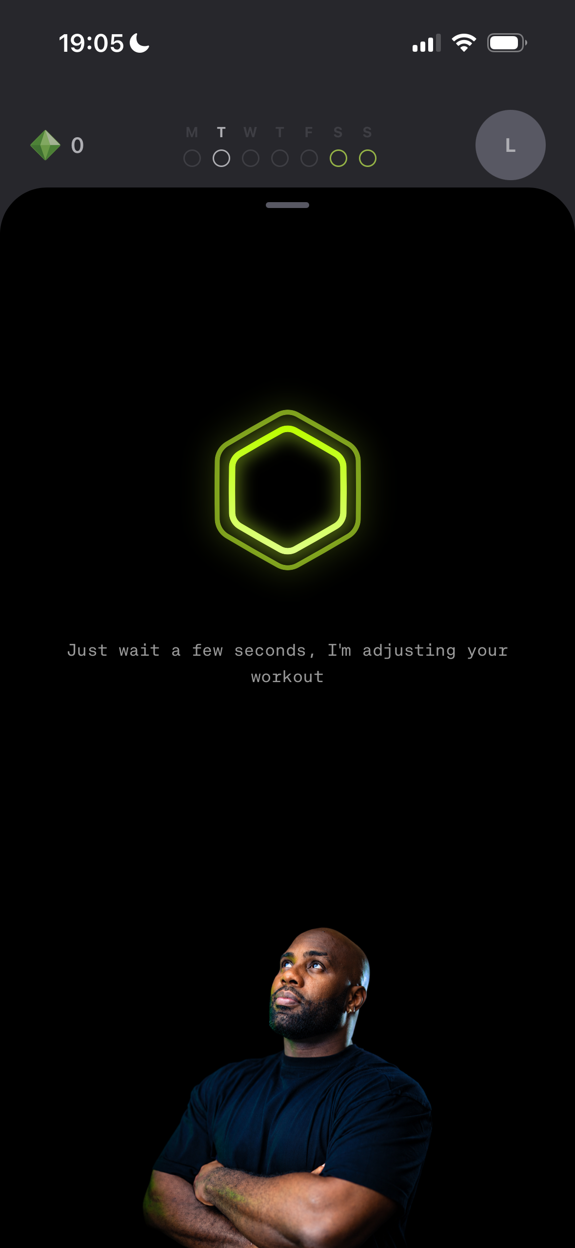
Capturing the user’s current energy level to adjust the intensity of today’s sessions.
Identifying sore or sensitive muscle areas to adapt exercises accordingly.
Integrating chat directly into the check-in giving users the freedom to share any additional information about how they feel.
Adapting the day’s experience based on the check-in with Teddy providing a short and personalized piece of advice based on the user’s input.
Teddy is an AI-powered conversational feature at the heart of the experience. It provides personalized workout and wellness advice, creates custom sessions, adjusts the plan without disrupting the overall program and offers nutrition guidance such as recipes tailored to the user’s needs.
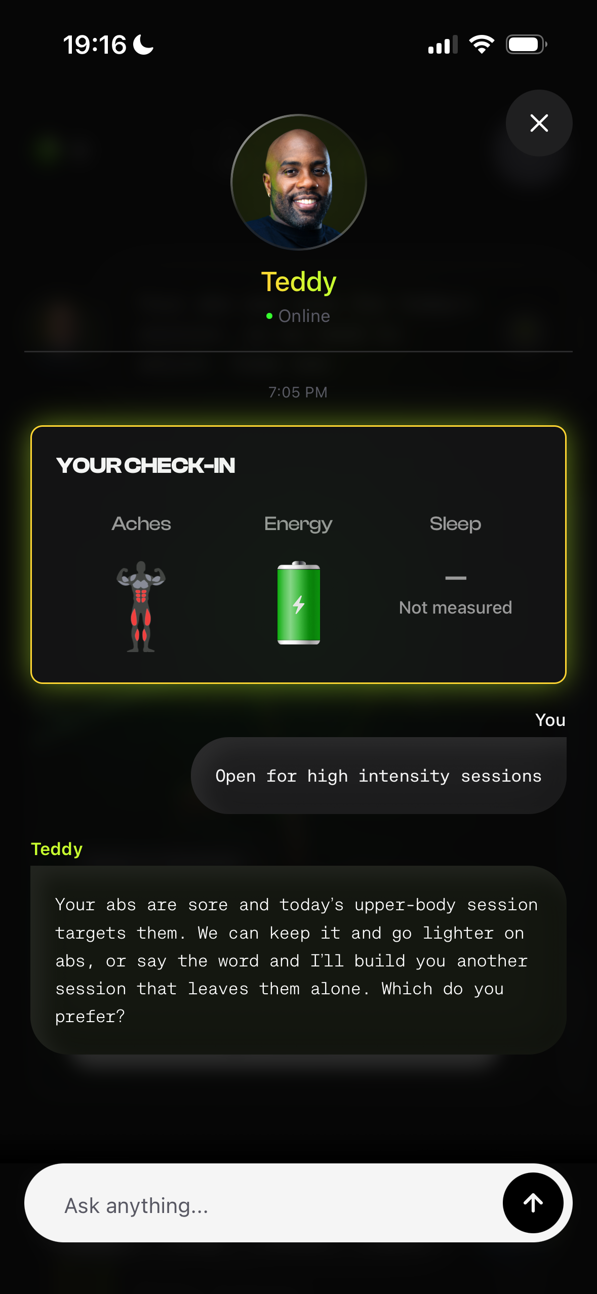
Teddy brings the latest check-in into the conversation using the user’s current state as context to provide relevant advice and guide how to approach the day’s workouts.
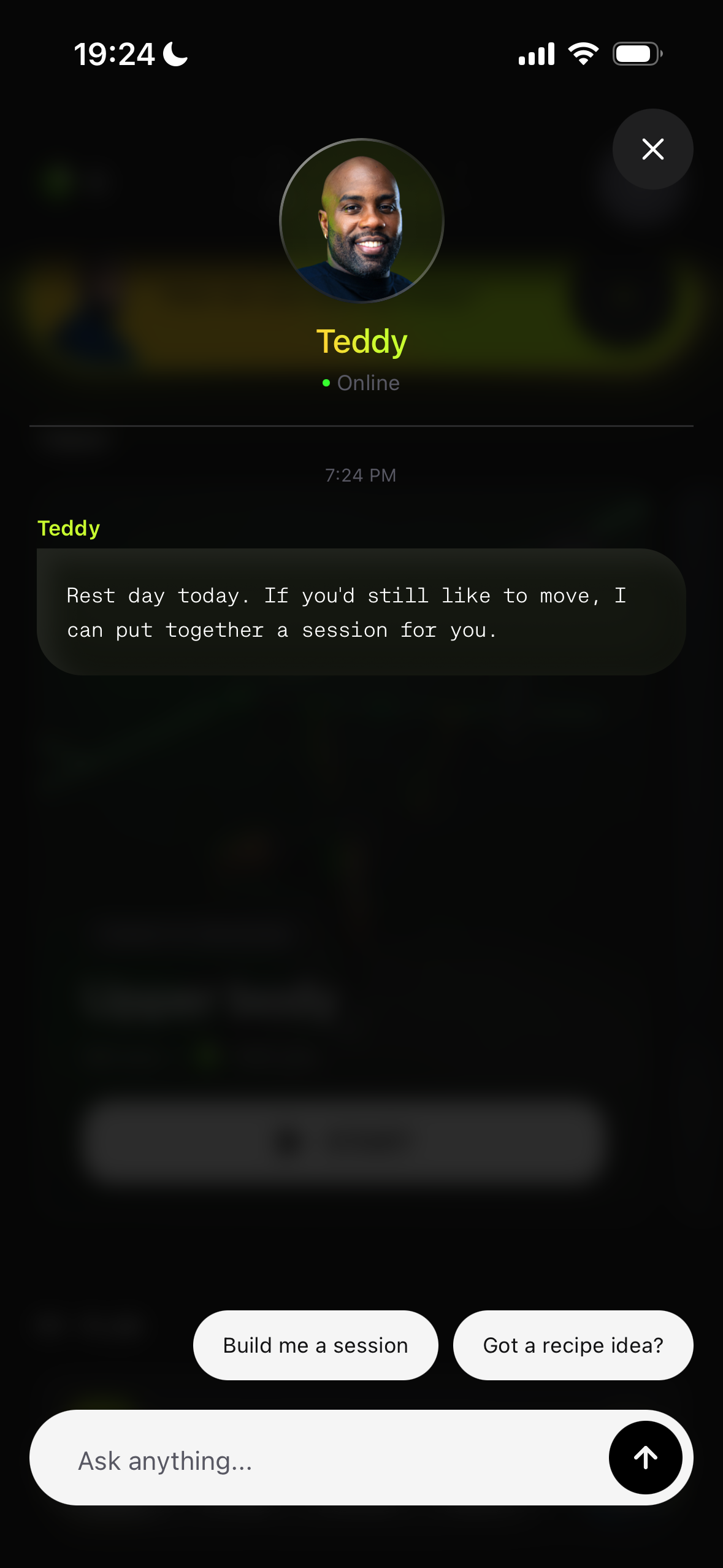
When opening the chat for the first time each day, suggested prompt chips help users start relevant conversations with Teddy based on their needs.
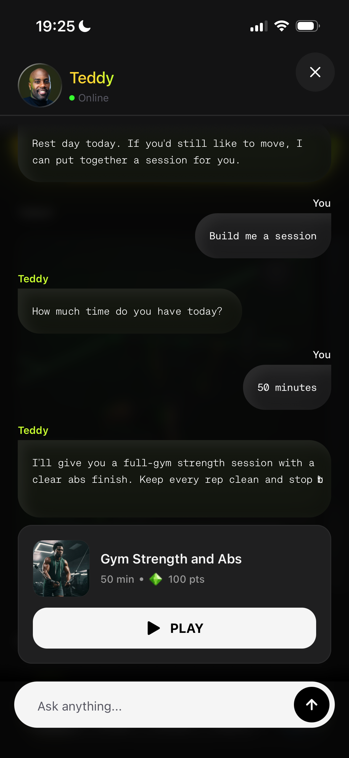
Teddy can create custom sessions on demand tailored to the user’s specific needs and preferences.
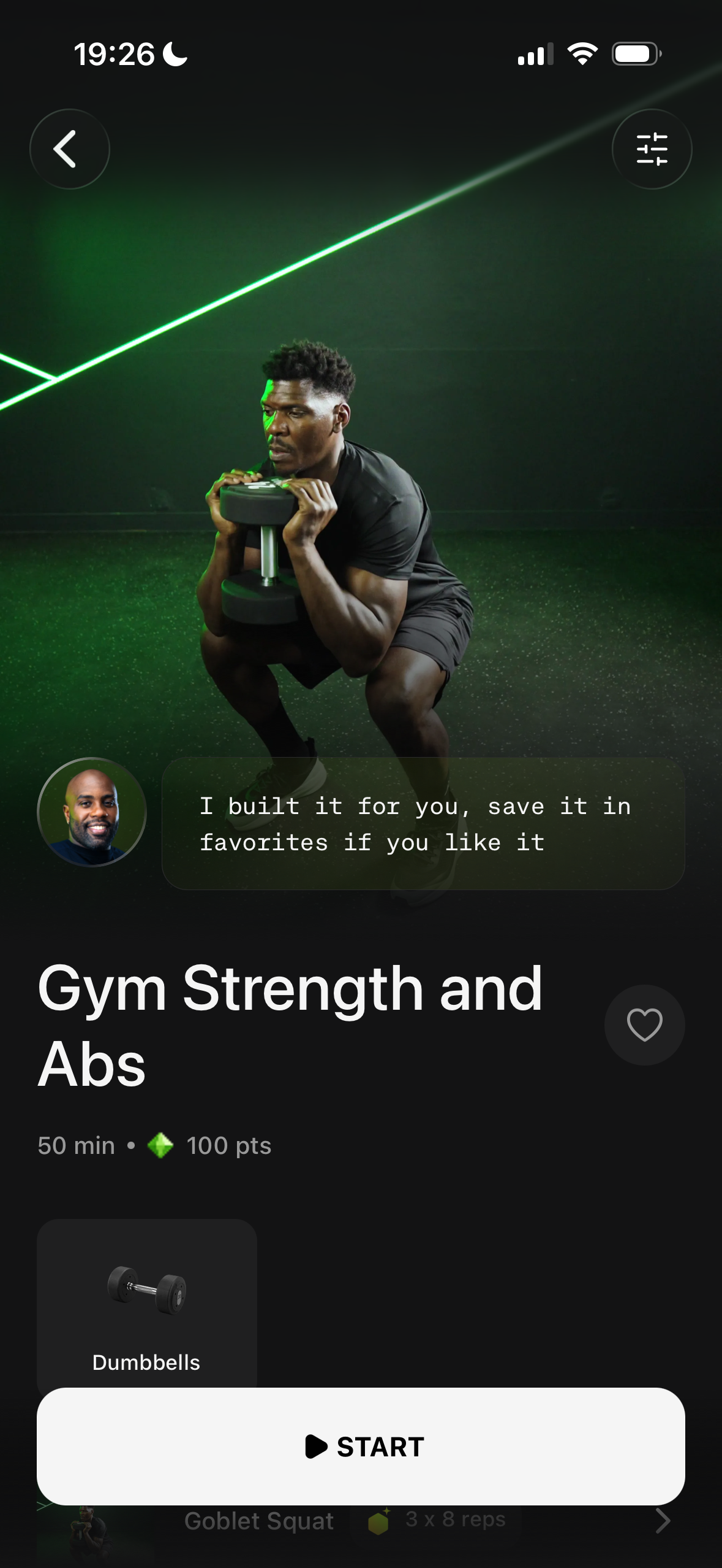
Custom sessions created by Teddy can be opened directly from the chat and saved to favorites for easy access later.
The workout player is at the heart of the app: it’s where users come to train. Our biggest challenge was translating Teddy’s coaching methods and programs into a simple, intuitive digital experience. Through continuous collaboration with coaches and beta testers, we refined the player to make every workout format easy to understand and follow, whether training at home or at the gym.
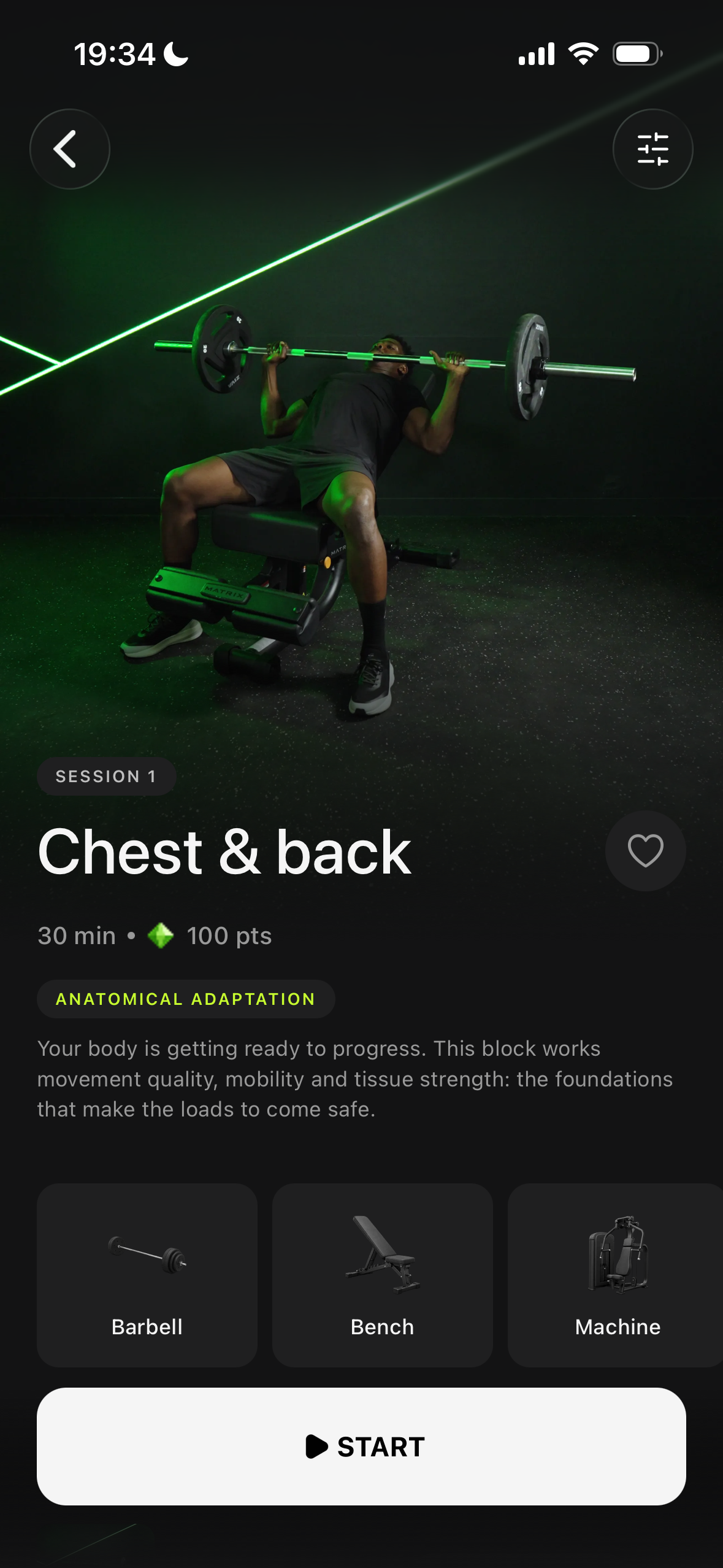
Get a clear overview of the session before starting including its structure and the equipment needed.
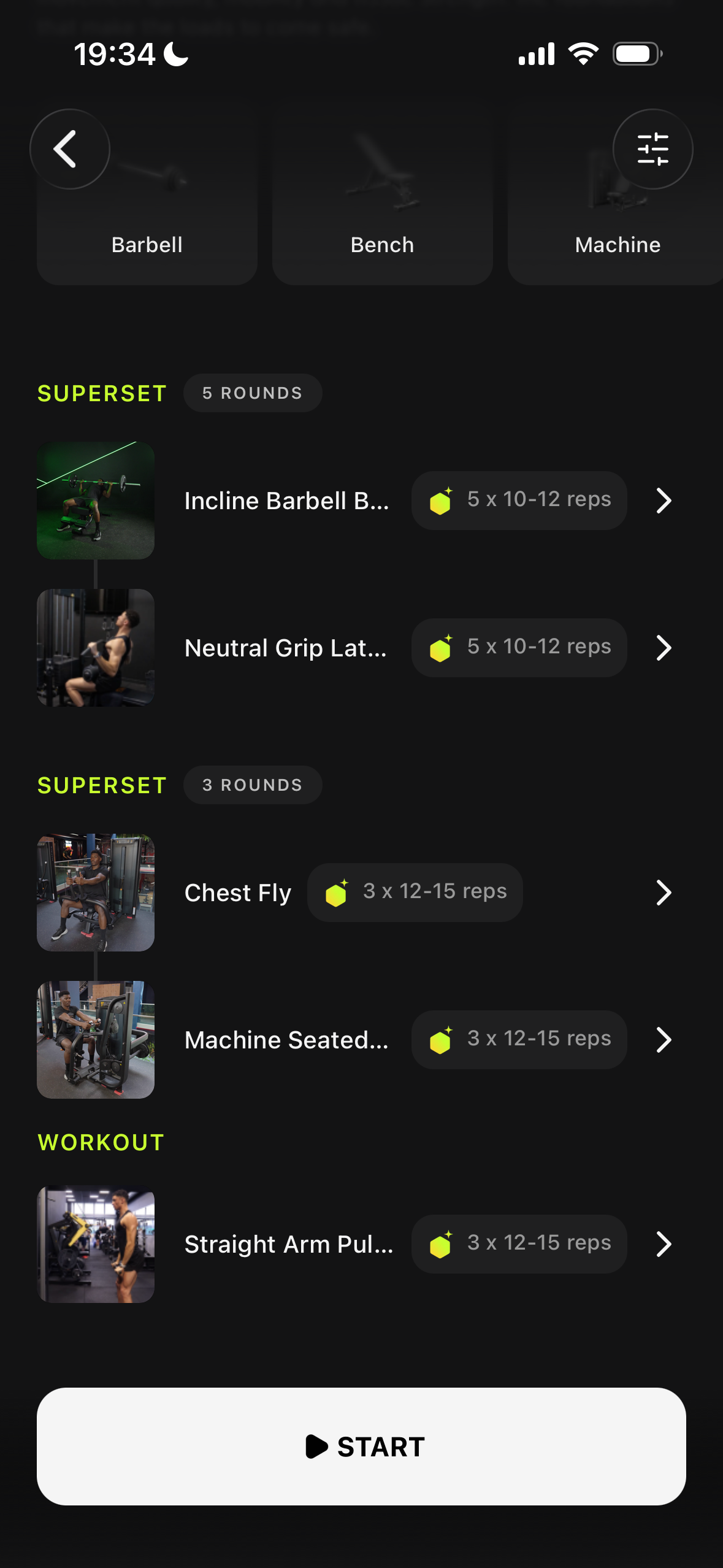
Preview each workout block, exercise, set, and rep before starting, so users always know what’s coming next.
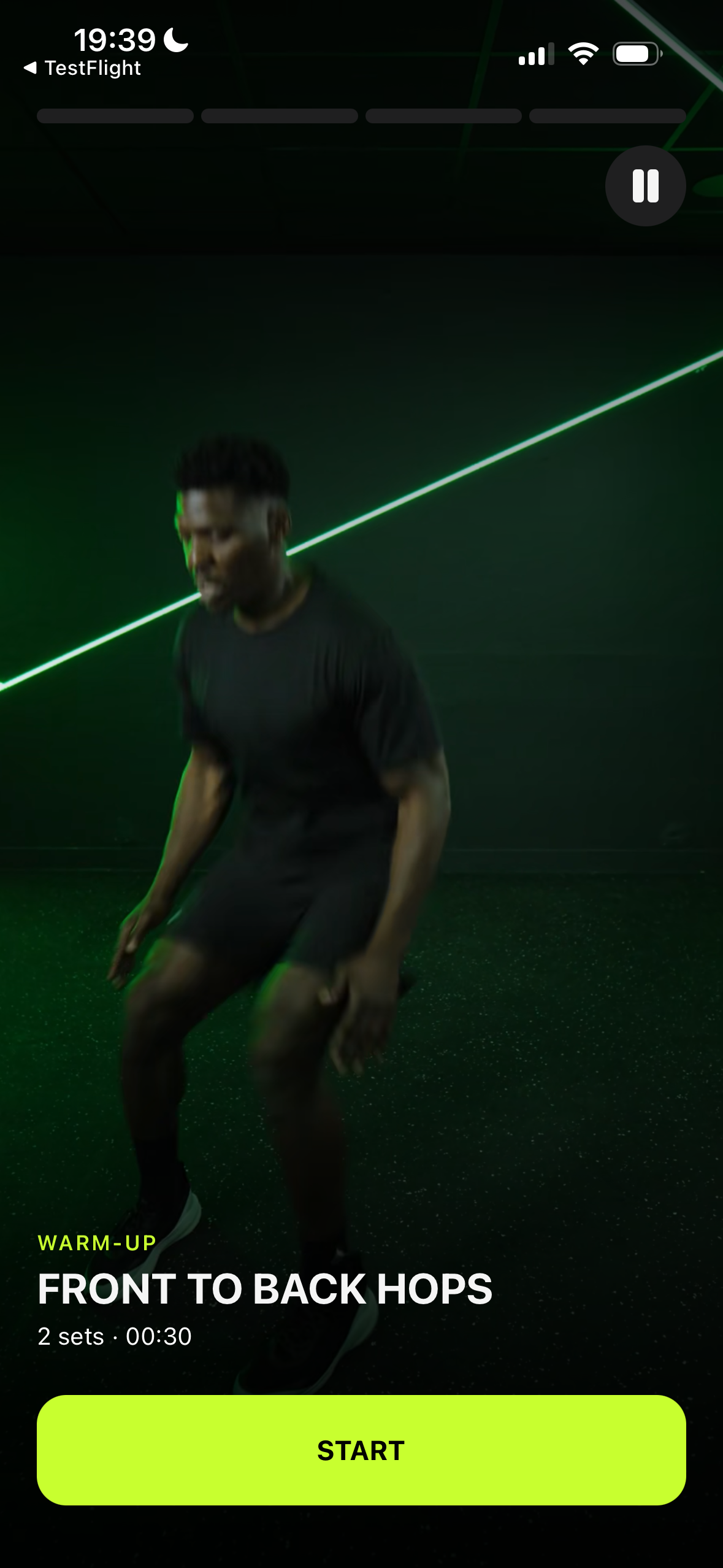
Warm-up Light movements that prepare the body for the workout ahead.
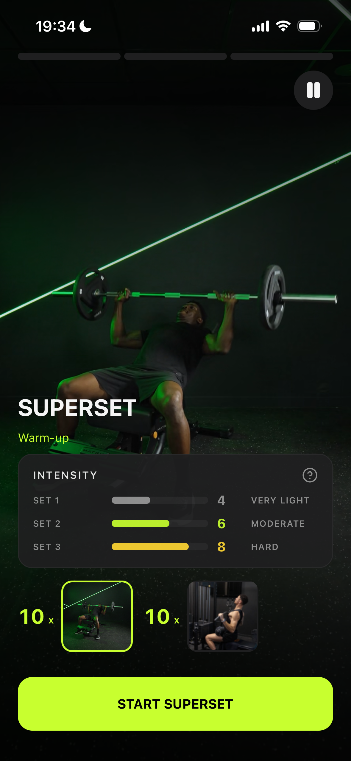
Superset Two exercises performed back-to-back, followed by a rest.
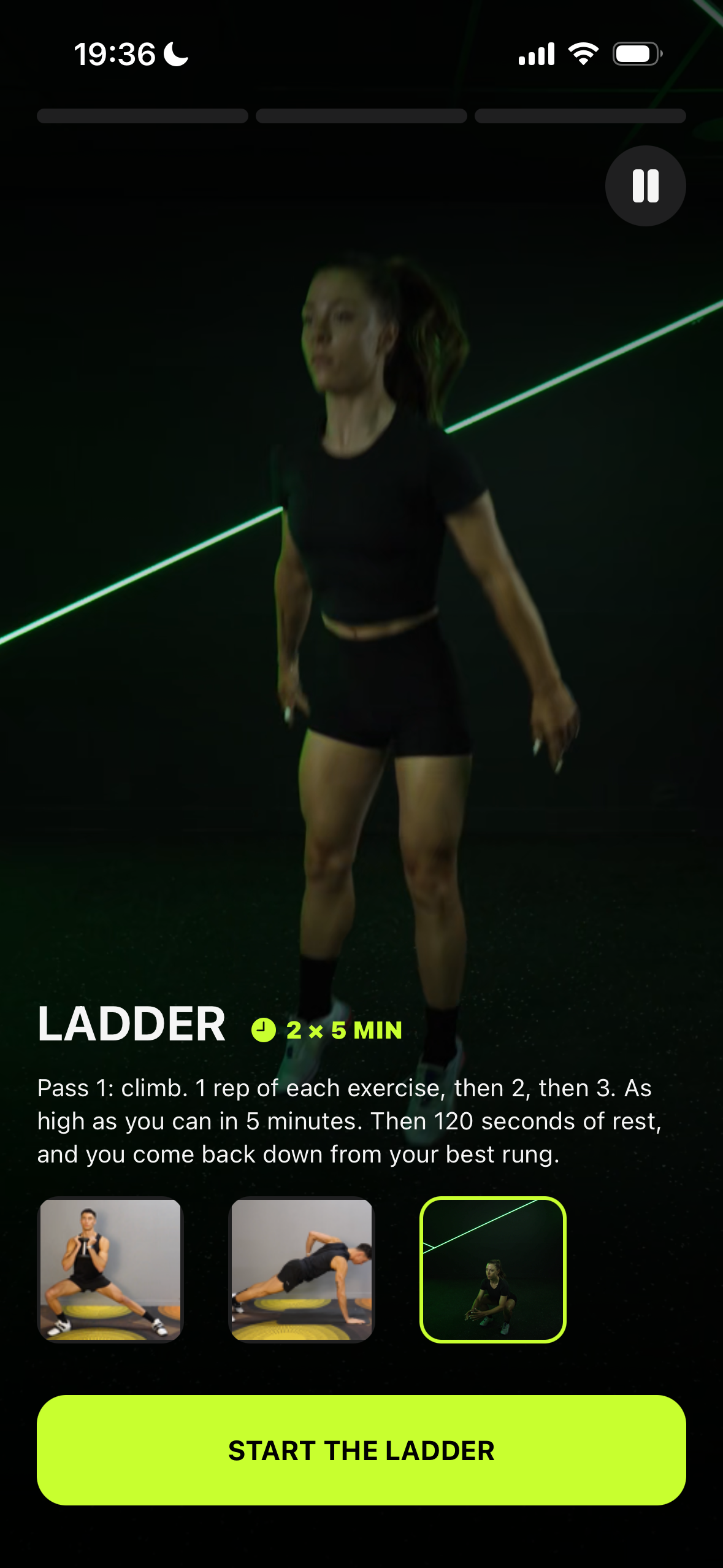
Ladder Reps progressively increase or decrease with each round.
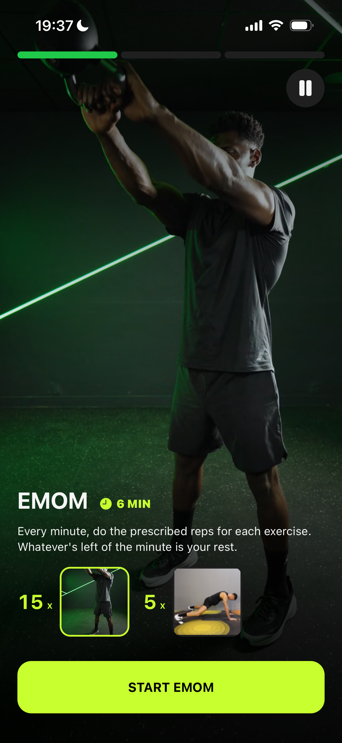
EMOM Complete the given exercise(s) at the start of every minute.
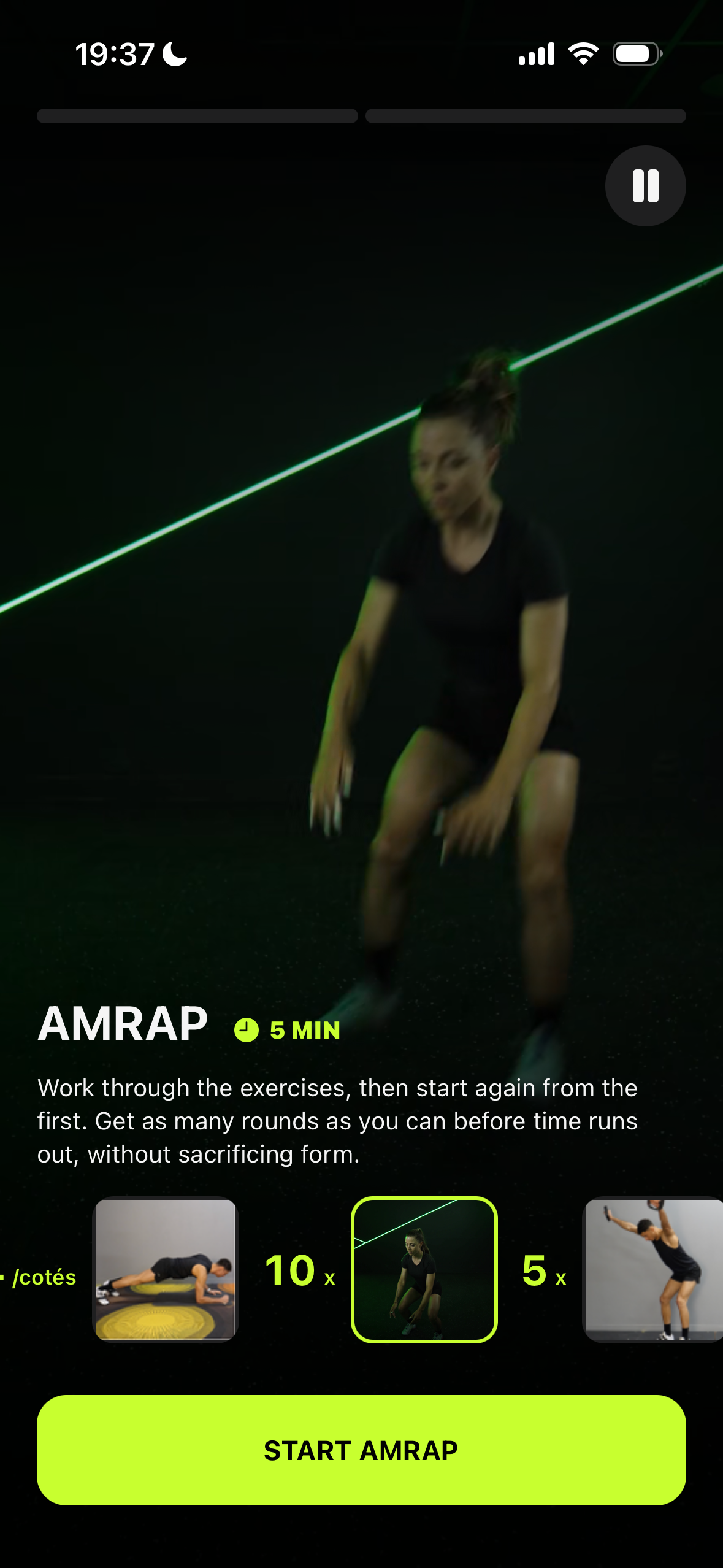
AMRAP Complete as many rounds or reps as possible within a set time.
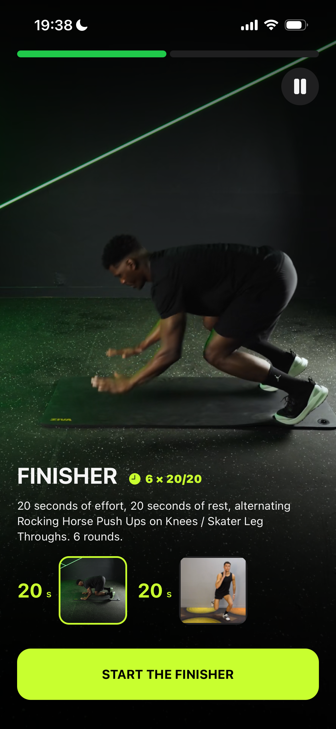
Finisher A short, high-intensity block to end the workout strong.
The program overview gives users a complete view of their plan including key characteristics, calendar, weekly workouts and rest days, while offering more flexibility to adjust the program when needed. Giving users more control over their program creates a stronger sense of ownership and helps drive long-term engagement.
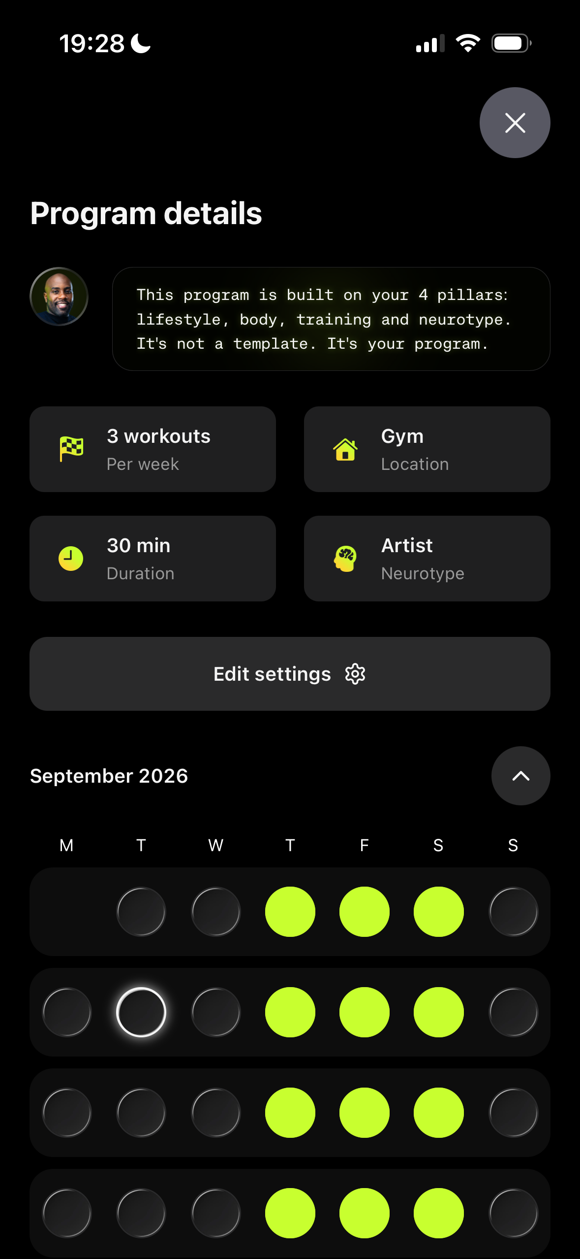
A clear overview of the program’s key characteristics with a calendar showing which days the user is scheduled to work out.
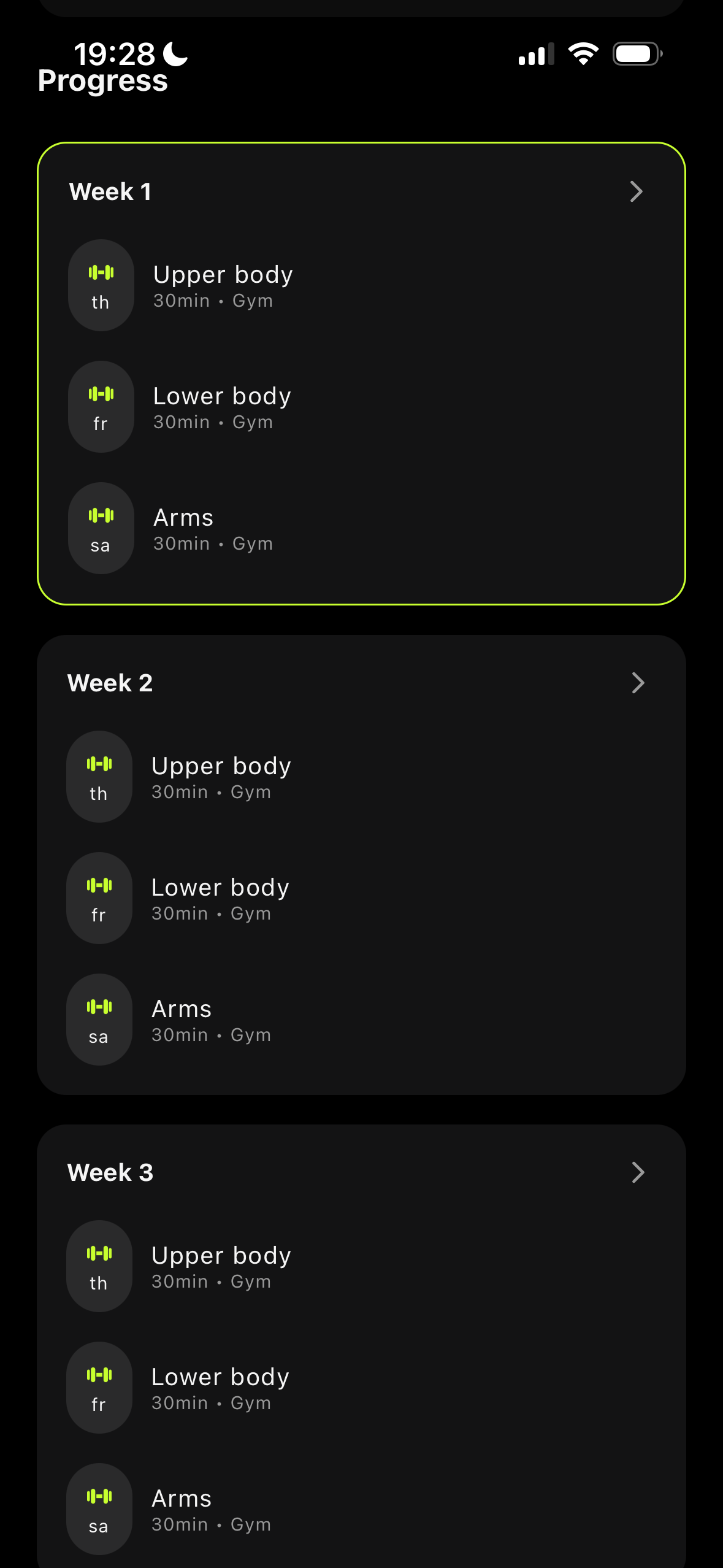
A weekly overview showing each scheduled workout and rest day, giving users a clear view of the sessions ahead.
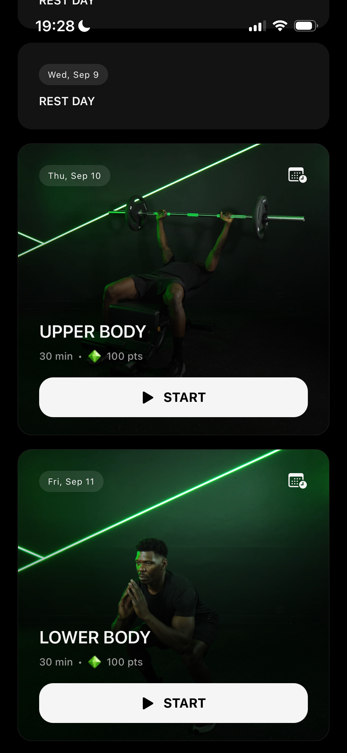
The week’s sessions are ready to be previewed or launched directly giving users easy access to their upcoming workouts.
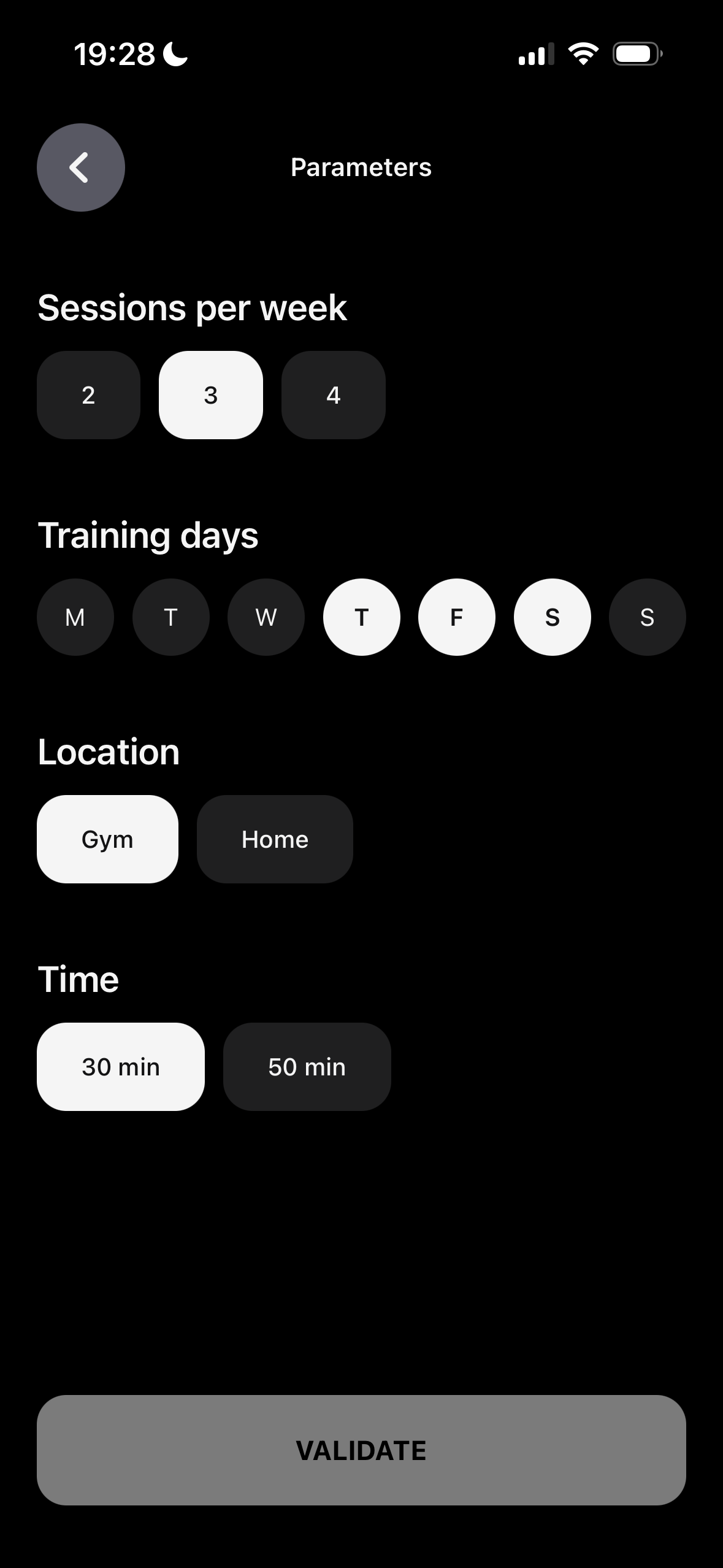
Program settings give users the flexibility to adjust their plan when needed while keeping the overall program aligned with their goals.
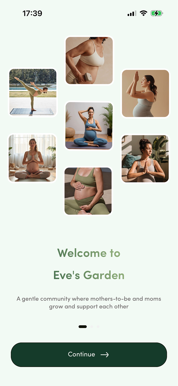
Right after onboarding, users see a card tracking their baby's size week by week creating an emotional connection and giving them a reason to check in regularly.
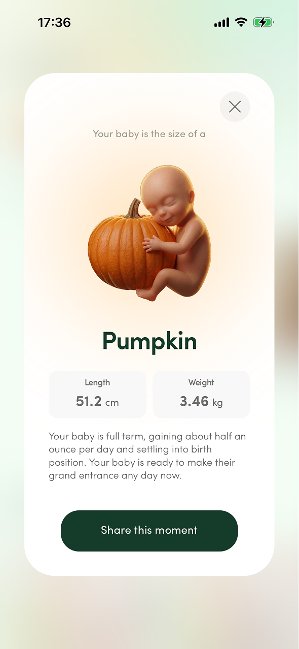
A story feature on the homepage surfaces content relevant to the user's pregnancy or postpartum stage driving daily engagement in a familiar bite-sized format.
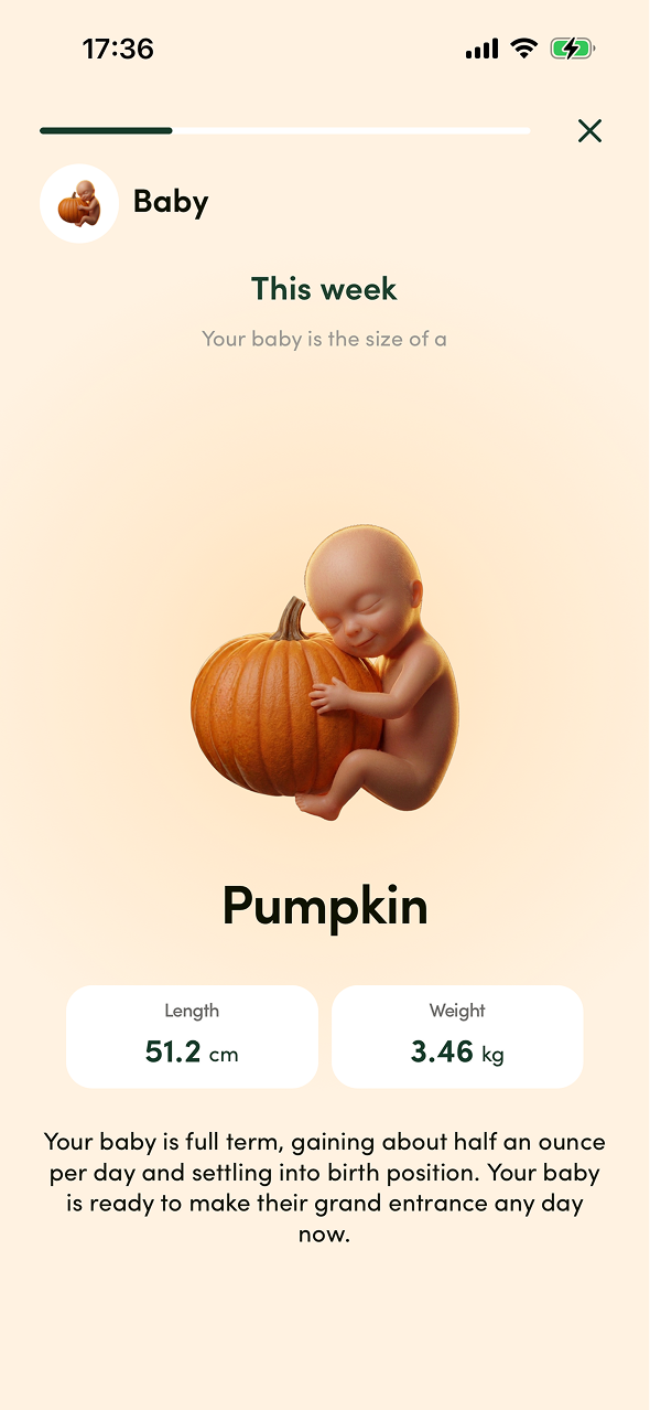
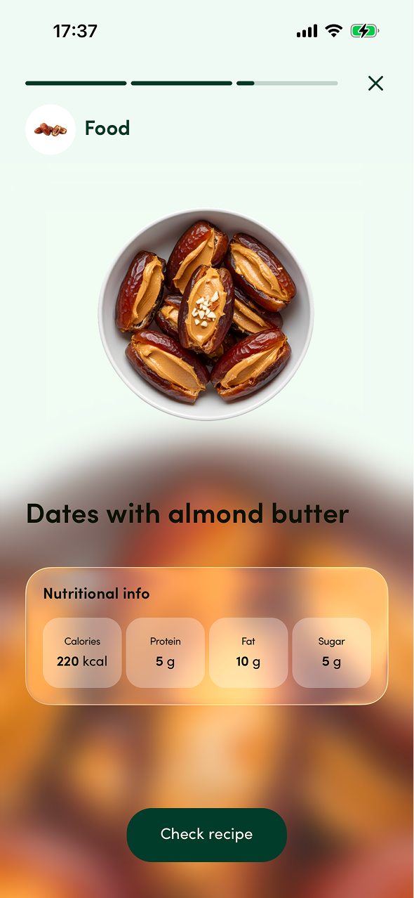
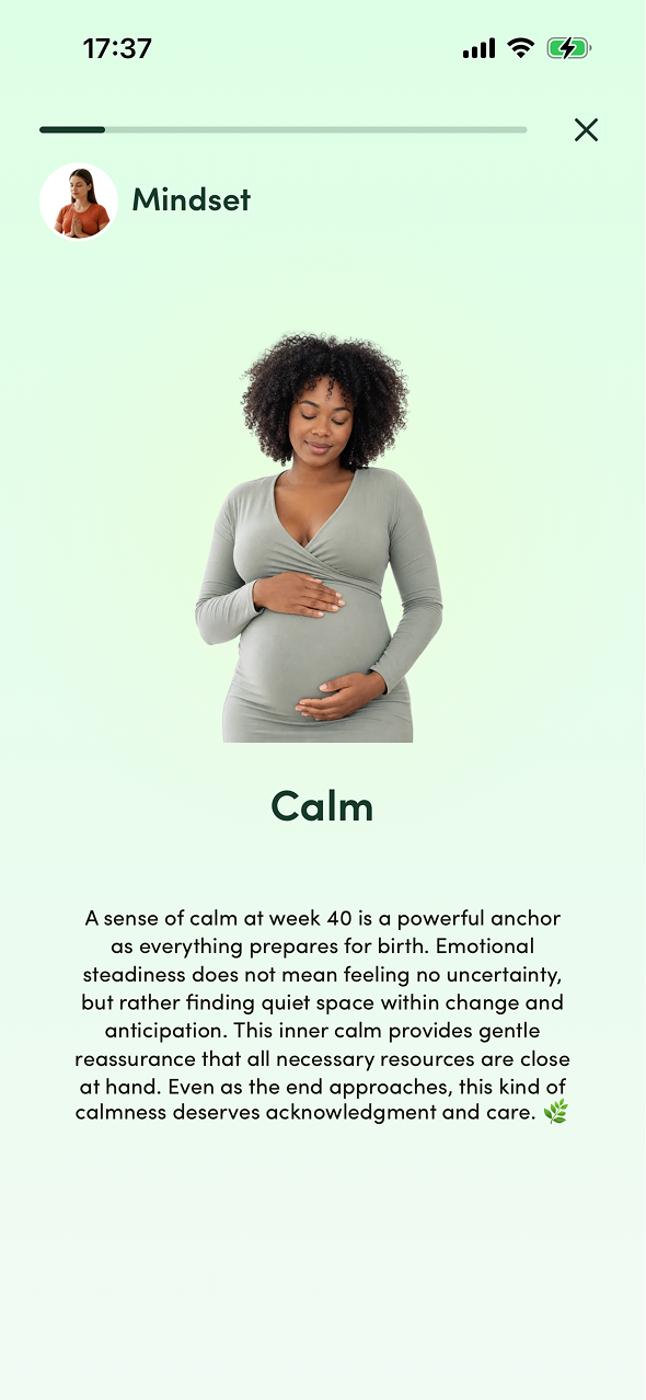
Designed to be as intuitive and engaging as possible, the homepage centers on stories, the daily check-in and a suggested session based on that check-in with Explore and Community just a tap away via the navbar.
/IMG_3431%201.png)
/IMG_3435%201.png)
/IMG_3436%201.png)
/IMG_3437%201.png)
Through continuous user interviews, we learned that users didn't want to actively check in and self-diagnose which session to take based on their symptoms. This finding put our entire check-in feature into question revealing a gap between what we assumed users wanted (control and personalization) and what they actually valued (simplicity and guidance).
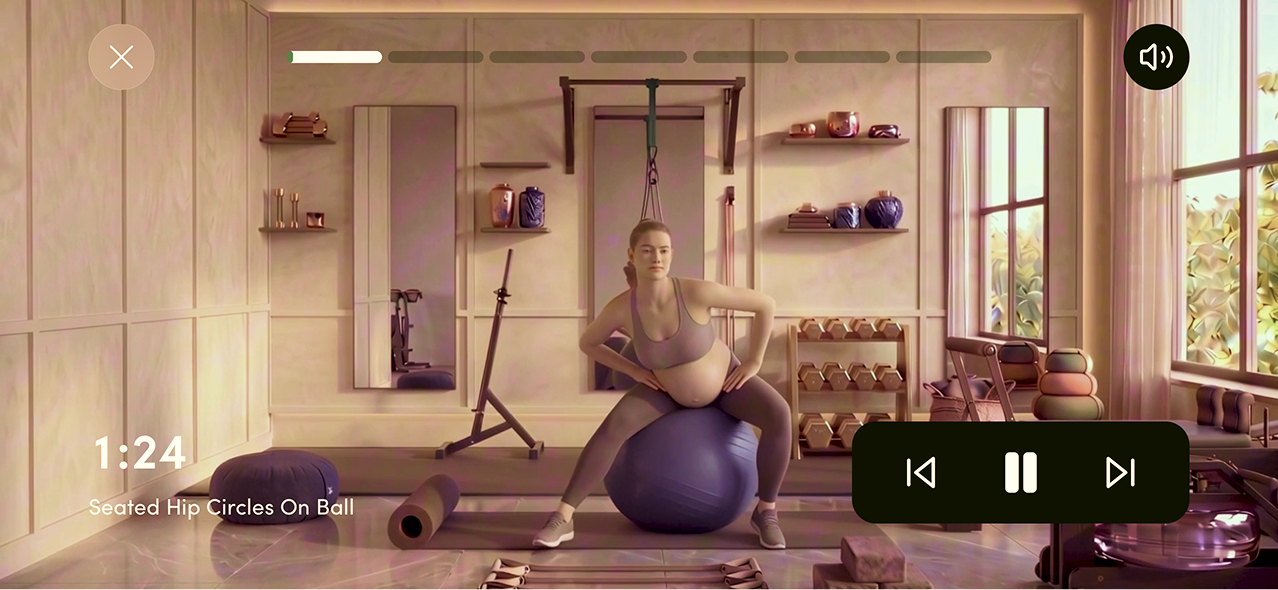
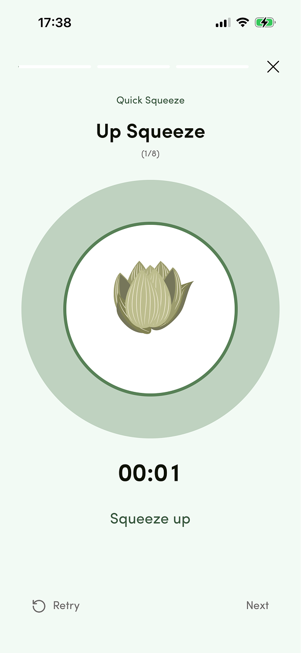
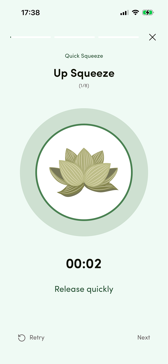
The core of the experience. Users come here to relax or work out, with sessions spanning breathing, stretching, workouts and pelvic floor strengthening.
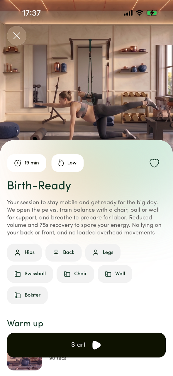
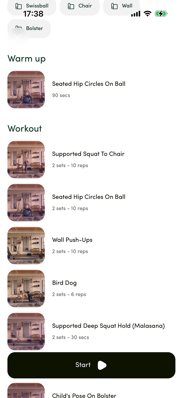
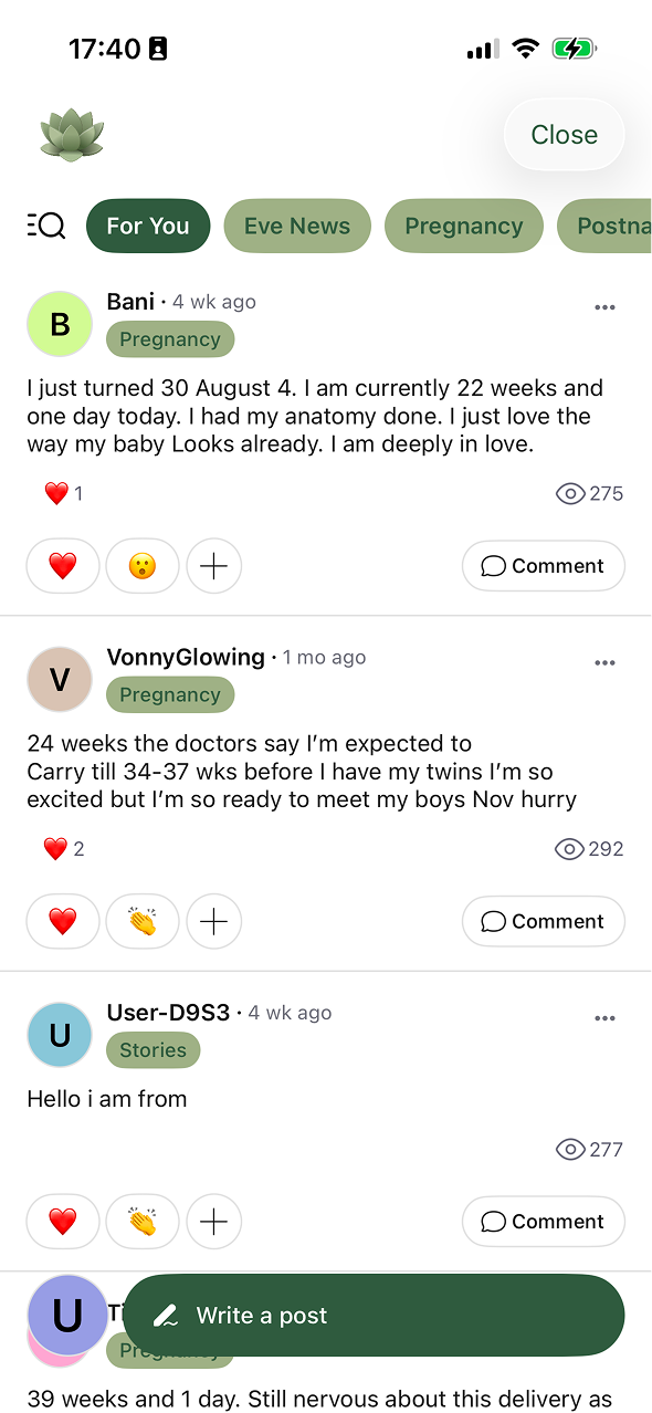
A forum-style space where users share their pregnancy experiences, exchange advice and support one another.
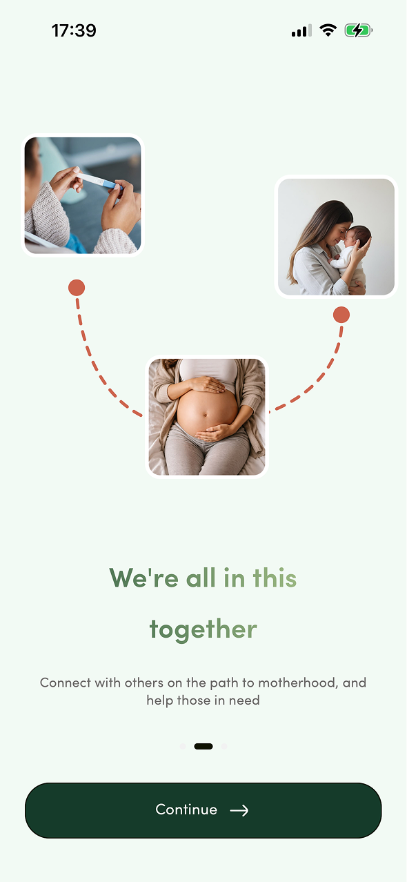
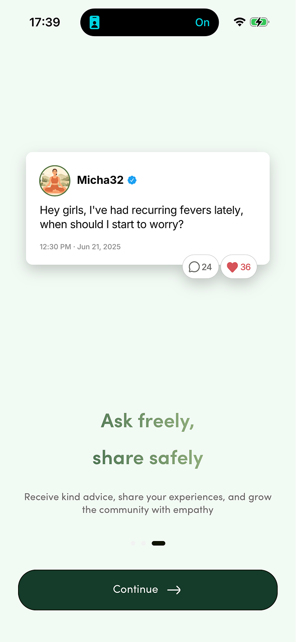
Lets users browse and find sessions on their own terms using filters and category search to match what they're looking for.
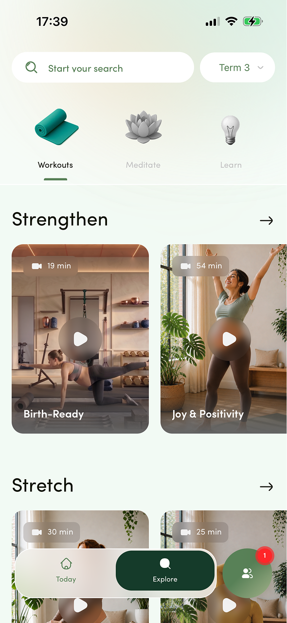
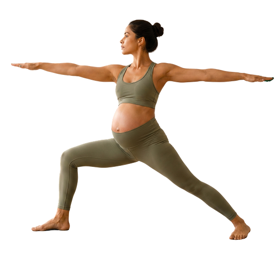
 EVE
EVE PROJECT DESCRIPTION Eve's purpose is to make prenatal and postnatal yoga accessible to every woman. Working directly with yoga instructors, we turned pregnancy and postpartum care into an everyday practice. Everything is built around each user's stage of pregnancy or postpartum so her sessions feel personal to what her body needs right now. At the center of the experience: a personalized session and a daily check-in to track how she's feeling.
MY ROLE As Product Designer, I redesigned Eve to feel more modern and fitness-driven elevating it to a premium experience to drive retention. I also run continuous user interviews to test and iterate on our core features.
KEY METRICS The objective was to increase retention by driving deeper engagement with Eve's core features (sessions, daily check and suggested session) through a redesign that made the app feel more premium and fitness-oriented encouraging users to return and build a consistent practice.
The redesign and feature refinements delivered strong results: retention rose significantly, engagement with core features increased and the app's premium, fitness-driven identity drove higher user satisfaction and App Store ratings.
| Metric | Before | After | Change |
|---|---|---|---|
| 7-day retention | 18% | 27% | +9 pts |
| Session completion rate | 42% | 61% | +19 pts |
| Weekly active users (3+ sessions) | 24% | 35% | +11 pts |
| Daily Check engagement | 31% | 48% | +17 pts |
| App Store rating | 4.2 | 4.7 | +0.5 |

 THAT GIRL
 PROJECT DESCRIPTION That Girl's purpose is to make the "clean girl" lifestyle accessible to everyone. Working directly with users through continuous interviews, we built an aesthetic lifestyle coach that guides people through the habits and routines that define this way of living. Everything is built around intentional design so consistency feels easy and habits feel motivating instead of stressful. At the center of the experience: personalized routines and a calm guided path that helps users become the most balanced version of themselves.
MY ROLE I was a Product Designer on That Girl, shaping the entire design process and iterating continuously based on user feedback from interviews. I also co-built the product roadmap with the PM translating research insights into prioritized feature decisions.
BUSINESS OBJECTIVE Turn initial motivation into lasting habits by helping users move seamlessly from intention to action. Encourage them to complete their first rituals and progressively build routines they genuinely want to return to. Success is measured through stronger ritual completion, D1/D7 retention, and weekly active usage.
Designed to become a daily ritual, combining mood check-ins, time-based routines, gratitude, manifestation and empowering statements to help users become the person they aspire to be. The experience was designed to be as intuitive as possible ensuring a clear FTUE and effortless daily use to drive engagement and strengthen retention.
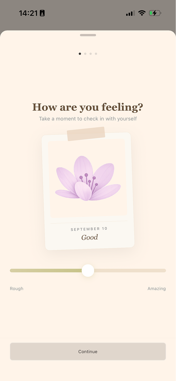
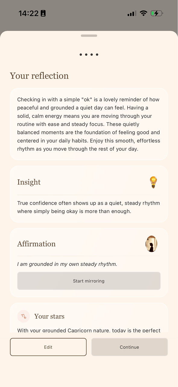
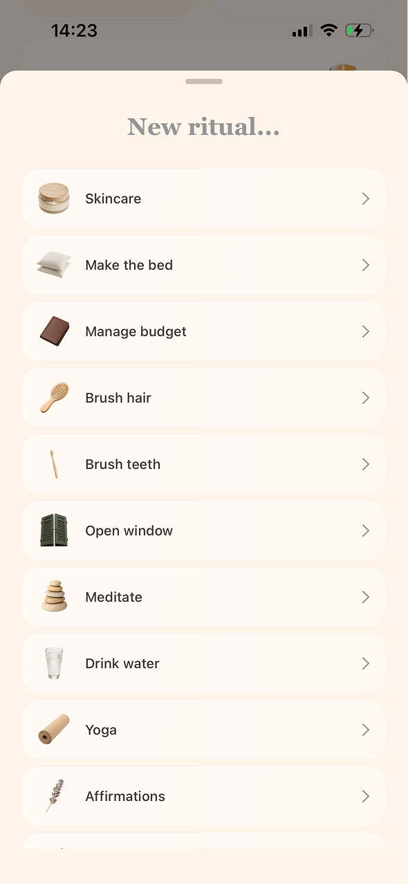
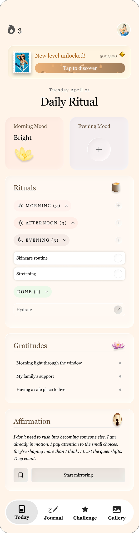
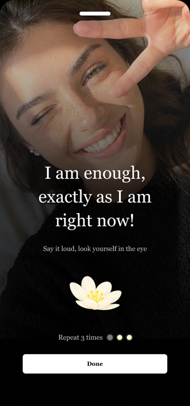
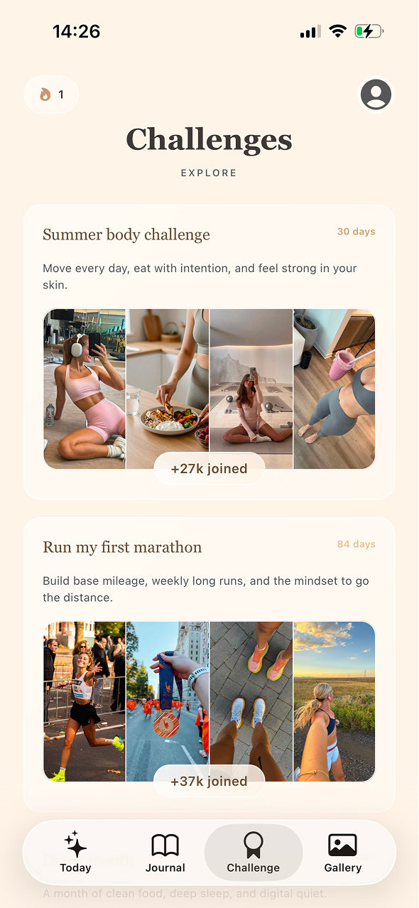
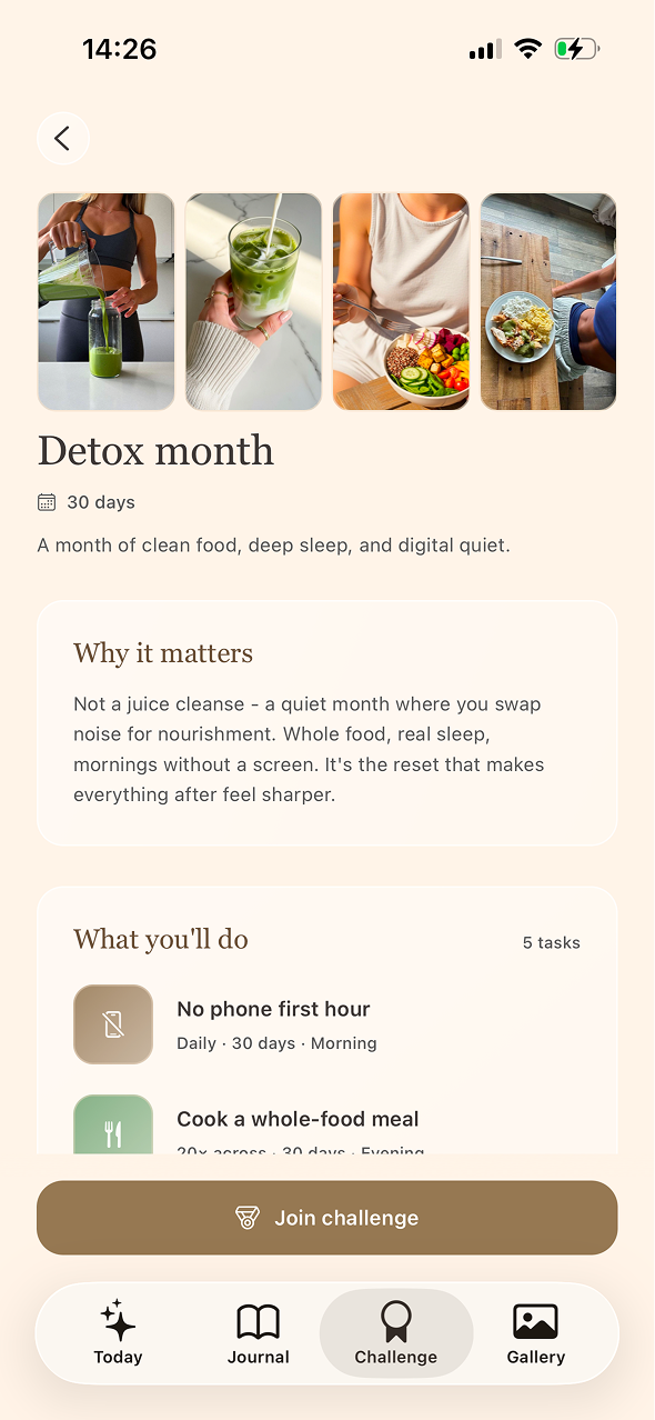
Offering challenges that support users along their chosen path designed as a side quests that complement the main journey and encourage deeper engagement.
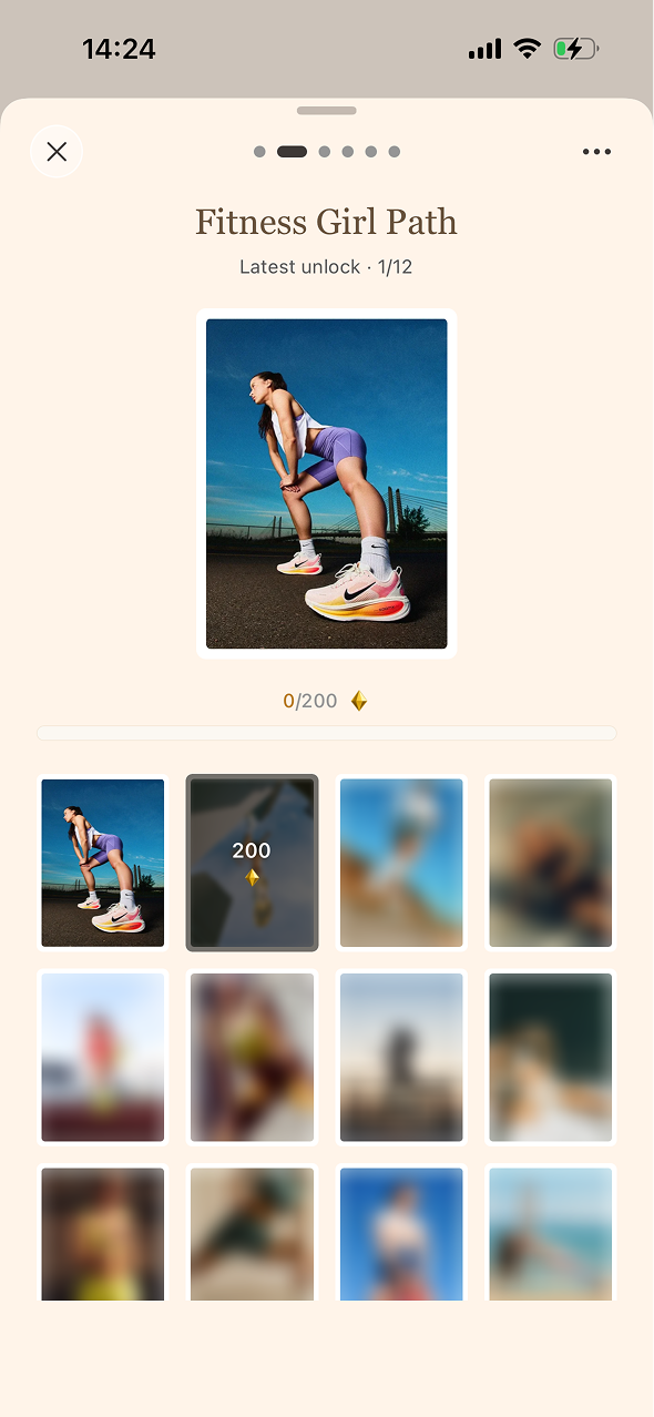
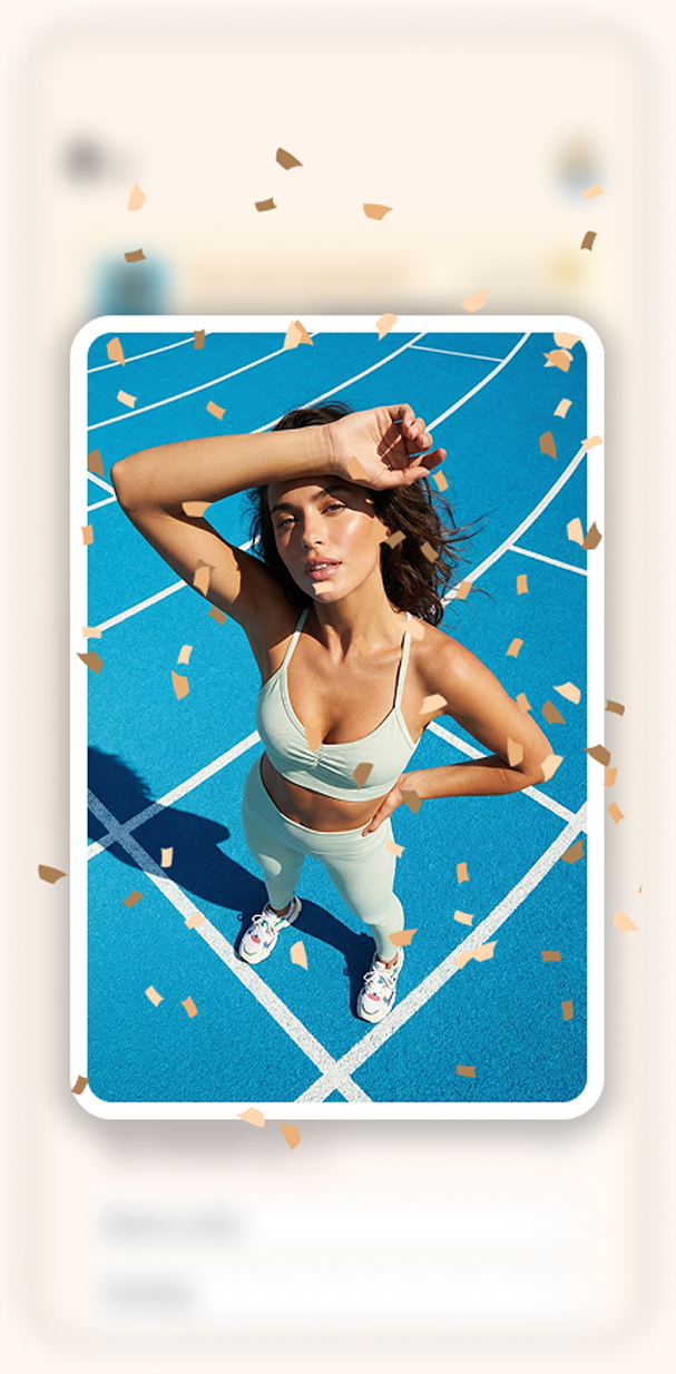
A gamification system that encourages users to progress through their journey by unlocking rewards and celebrating milestones along the way.
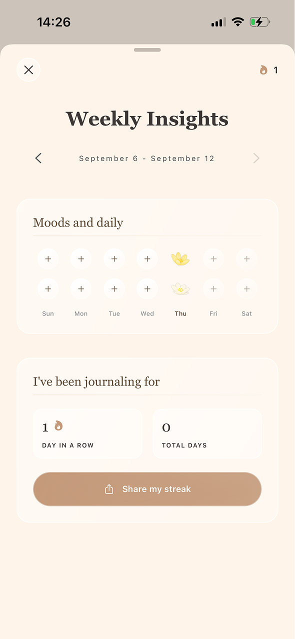
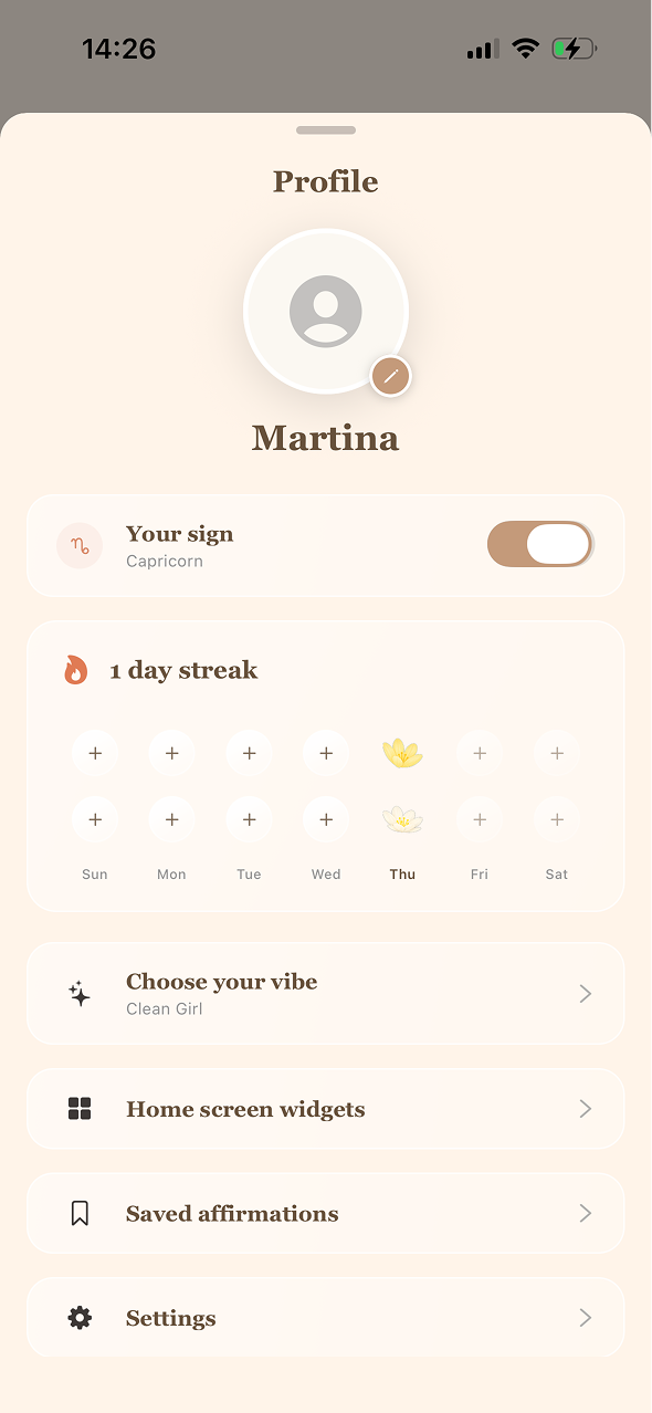
Users can track their streaks and key metrics while easily managing their personal settings and preferences.
A community space designed as an empowering forum where users can support each other, share advice and grow together toward the person they aspire to become.
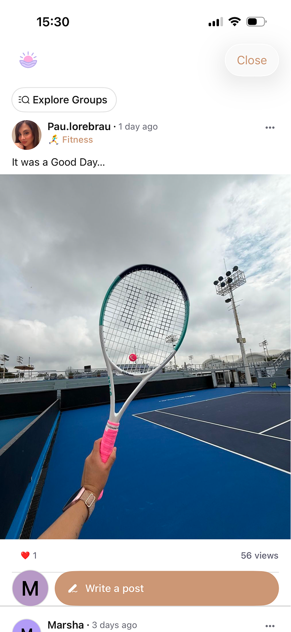
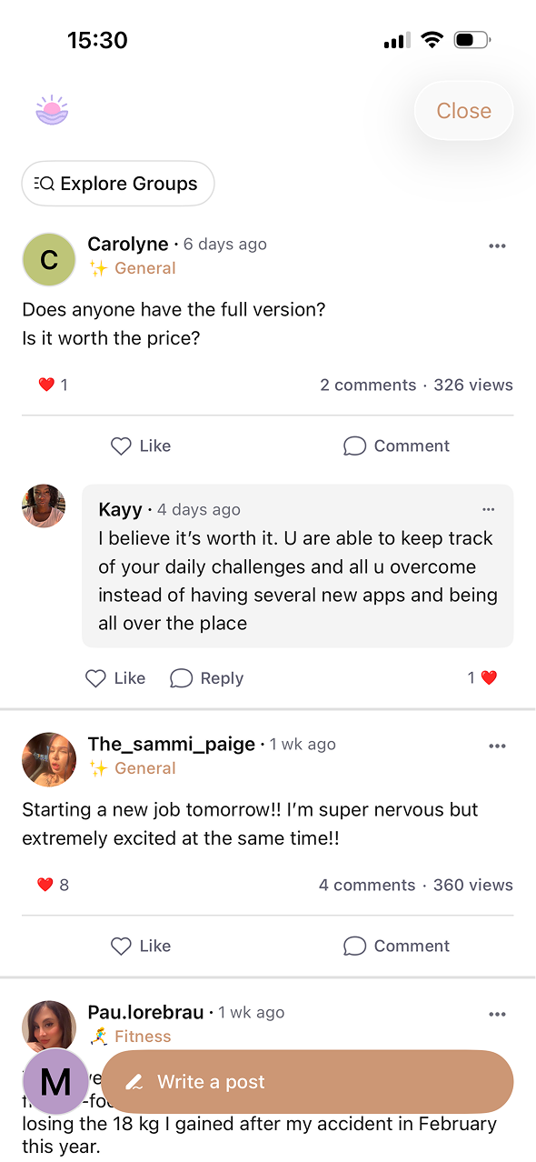
We approached retention as a habit-building challenge. We refined onboarding to turn users’ intentions into clear rituals, then focused on making progress visible and encouraging repetition. Over three months, stronger ritual completion led to higher D1/D7 retention and a growing weekly active user base. The result: intention → ritual → progress → repetition → habit.
| Metric | Month 1 | Month 3 |
|---|---|---|
| Onboarding Completion | 58% | 82% |
| First Ritual Completion | 46% | 71% |
| D1 Retention | 34% | 55% |
| D7 Retention | 15% | 32% |
| Weekly Active Users | 9K | 28K |
 ROCASITE
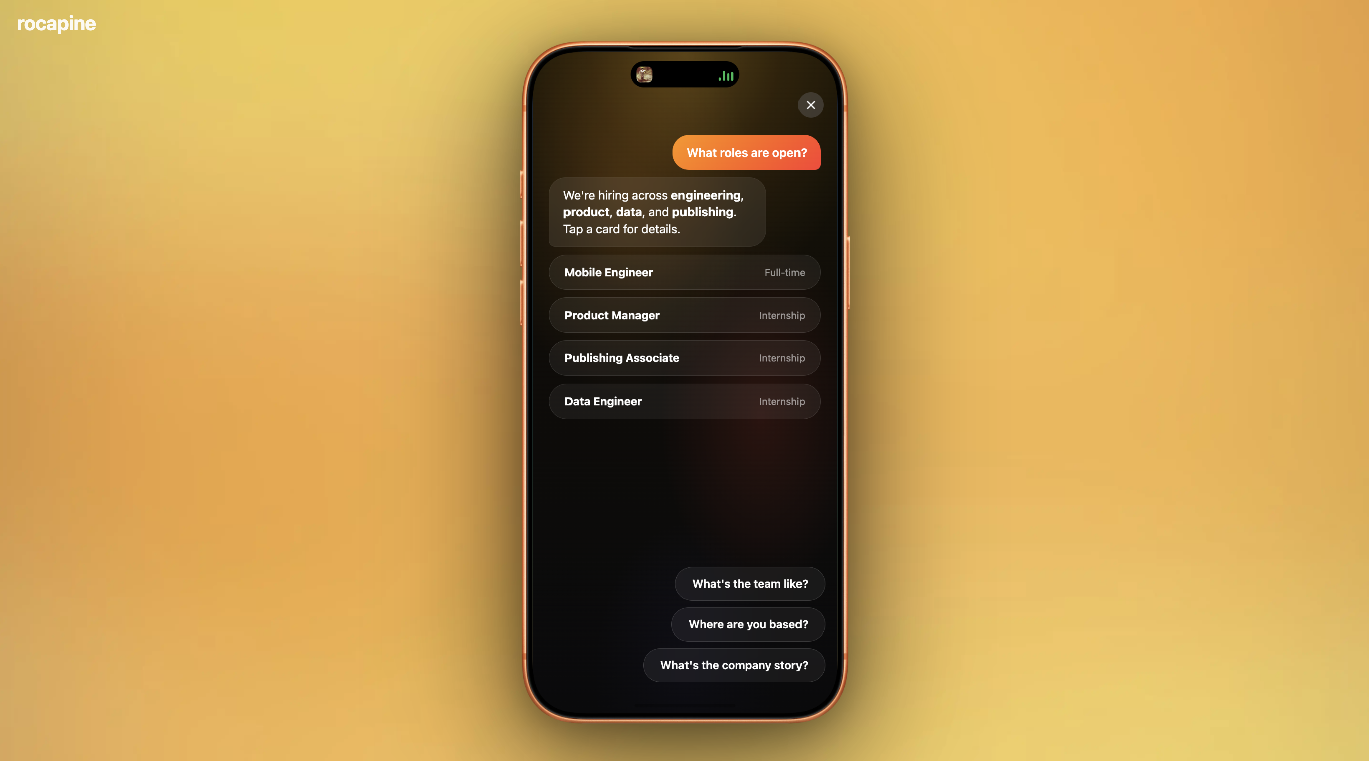
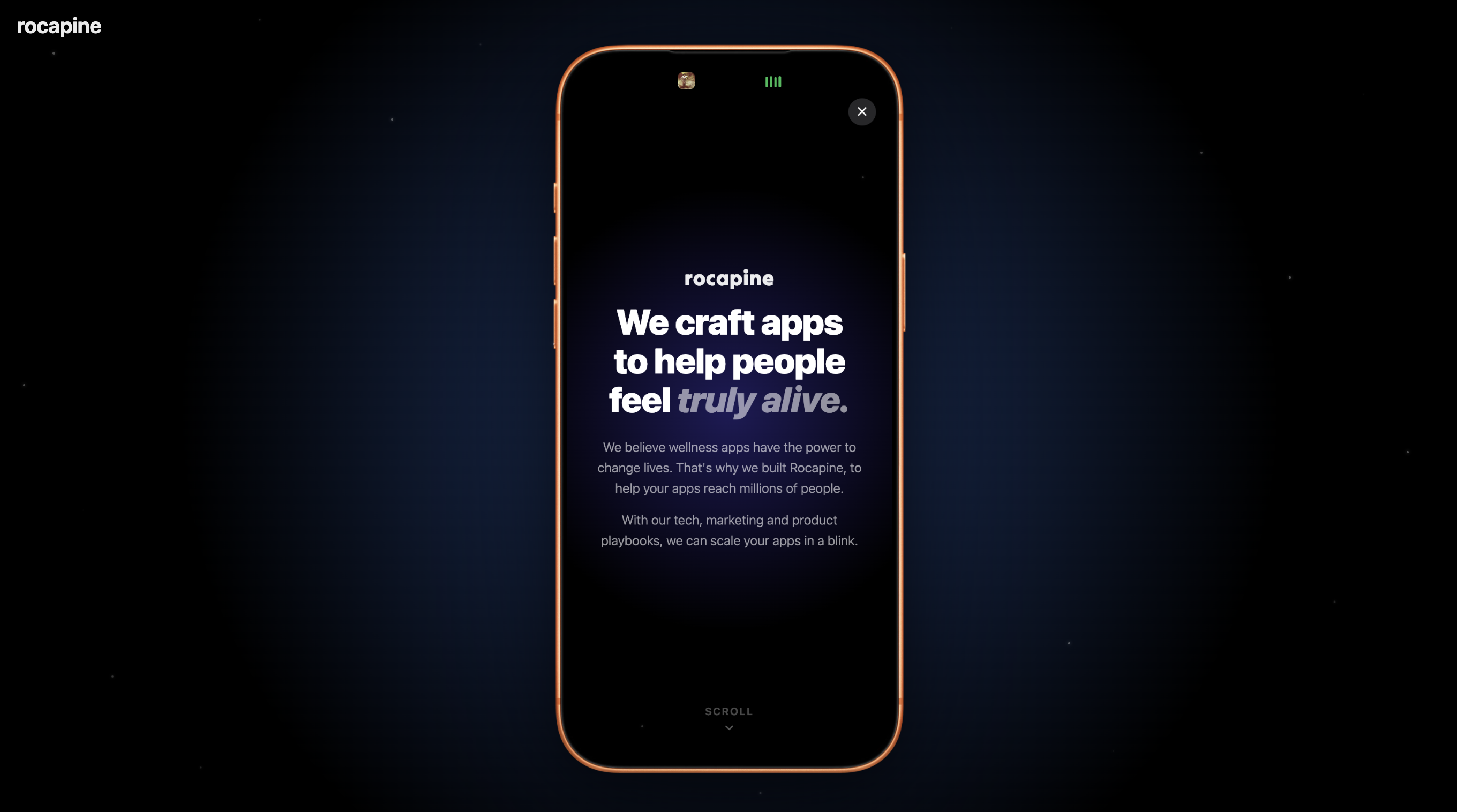
 PROJECT DESCRIPTION We initiated a complete redesign of the Rocapine website to mark the official announcement of our fundraising round and better reflect the company’s vision, identity, and expertise.
MY ROLE I co-designed and built the website with another designer, using Claude Code throughout the process. We placed our mobile app expertise at the heart of the concept, creating a distinctive navigation system where users explore the website through a phone interface, opening apps to discover each section.
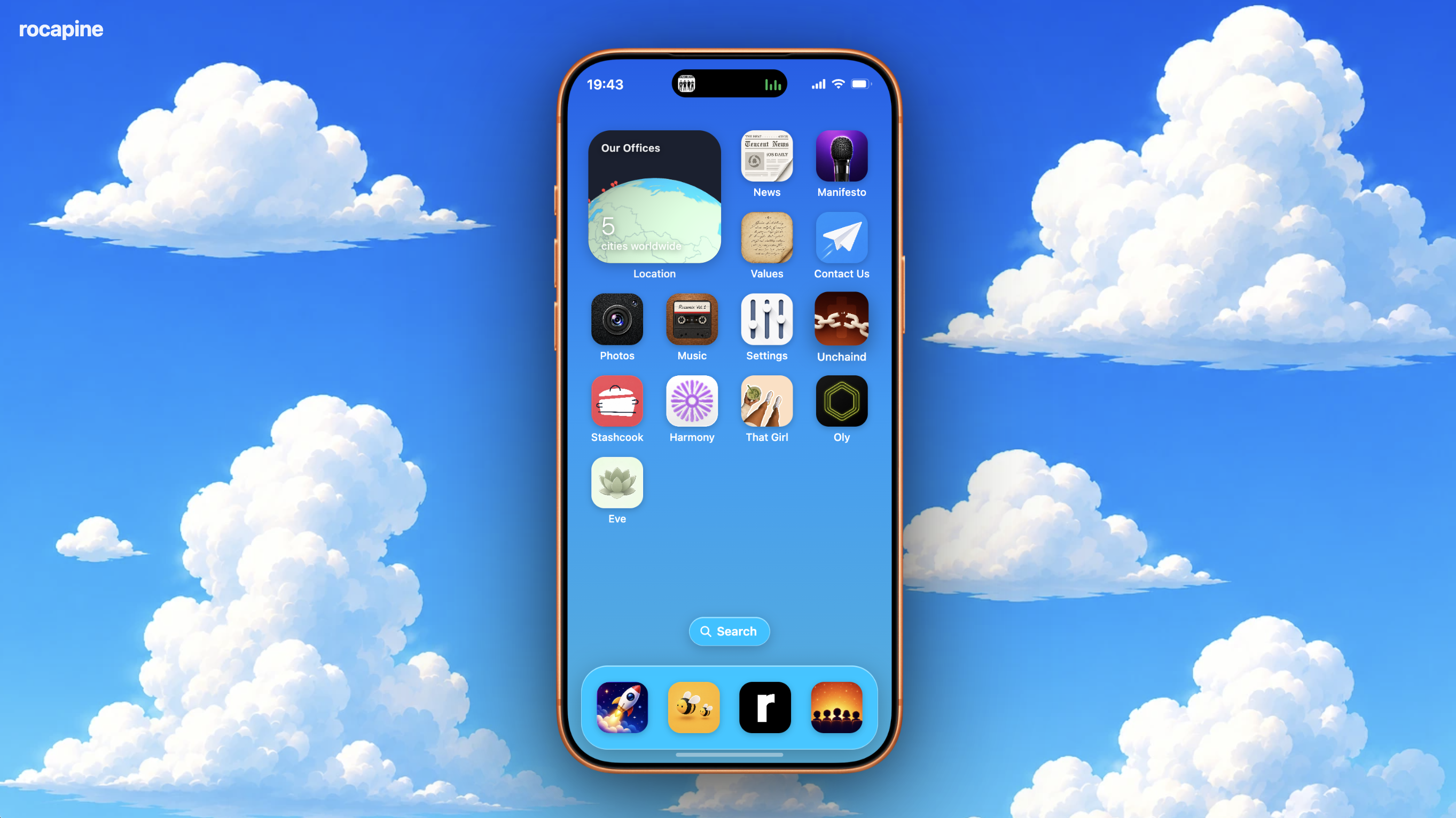
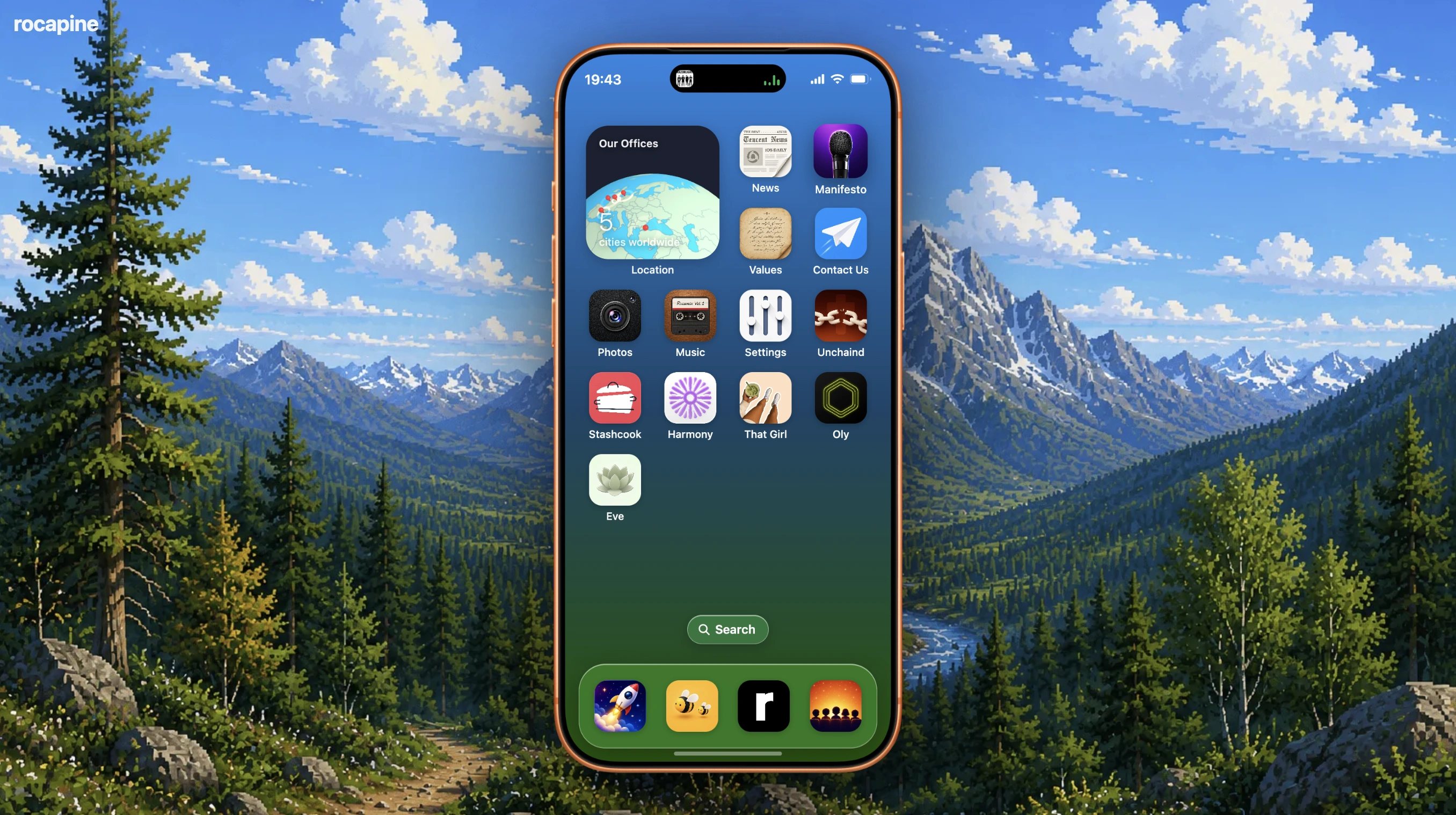
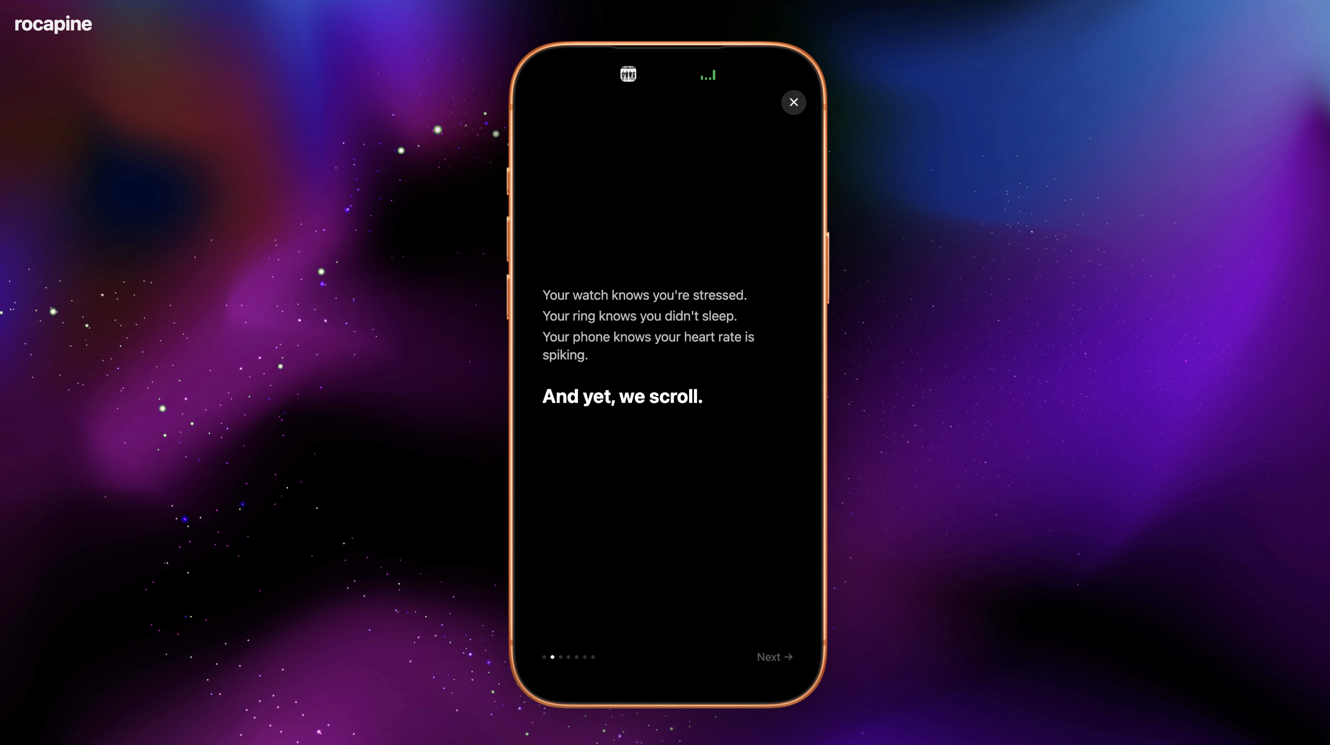
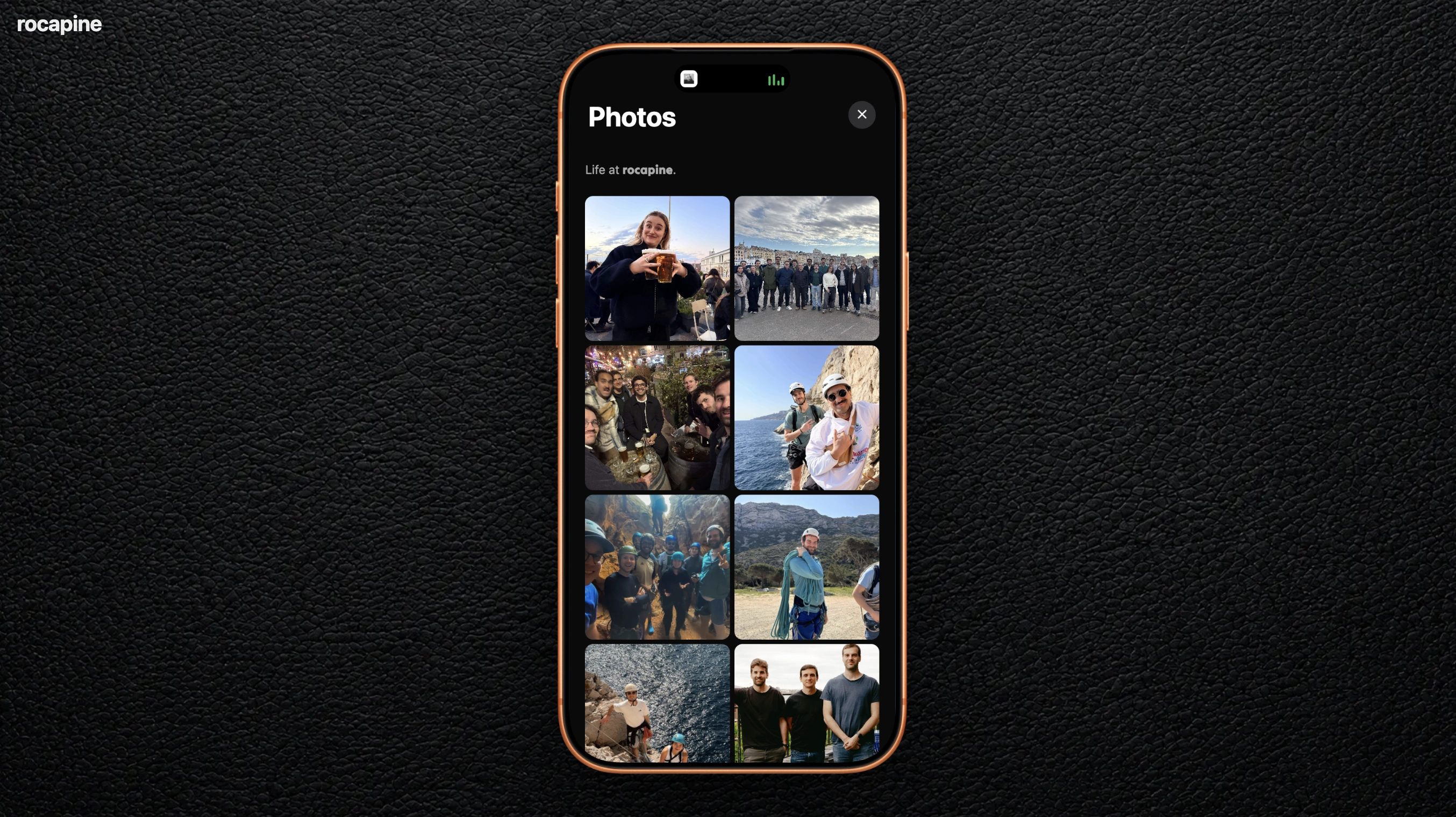
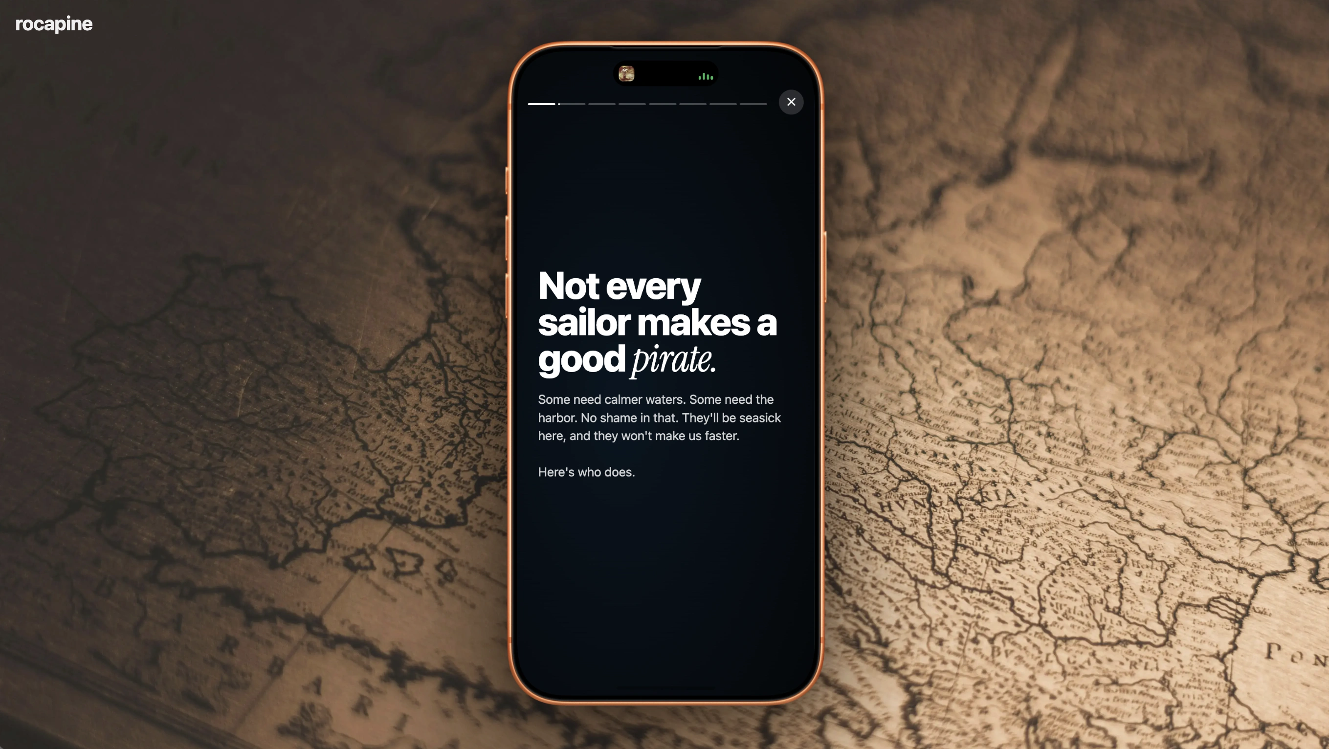
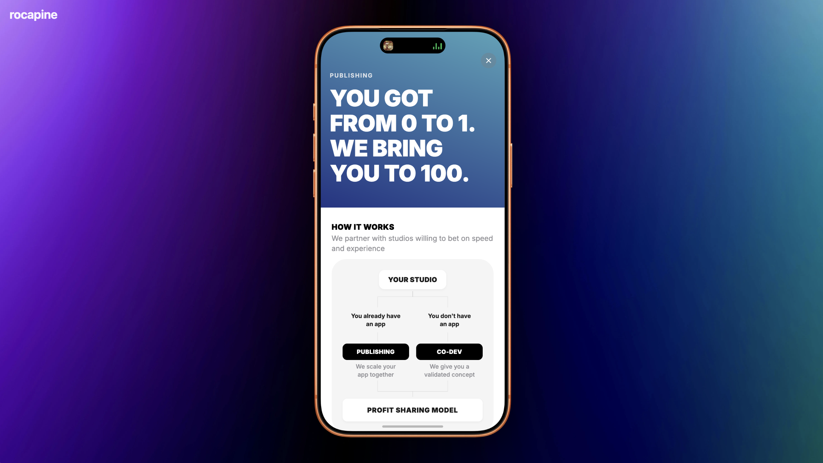
 VIBECODING
 PROJECT DESCRIPTION These apps are concepts I designed and vibe-coded myself using Claude Code, from onboarding to the in-app experience. The goal was to turn each concept into a polished product experience designed to drive conversion, engagement, and retention.
 BETWEEN US
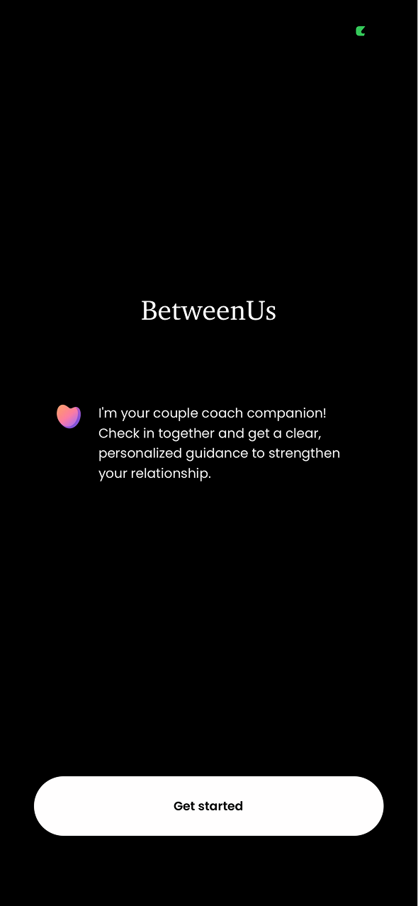
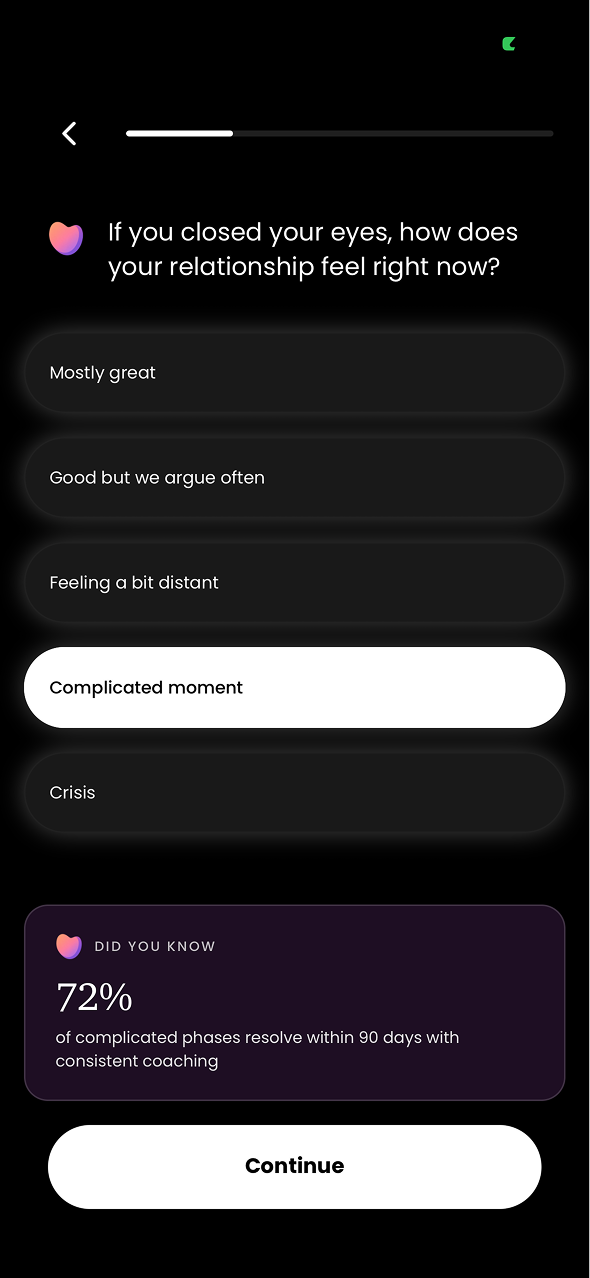
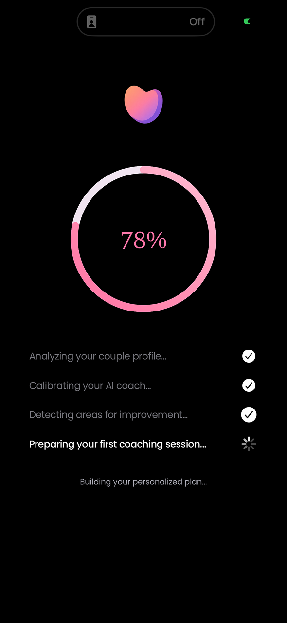
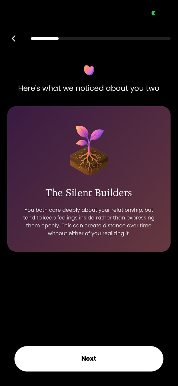
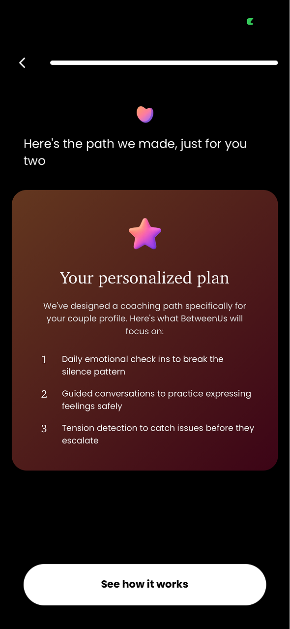
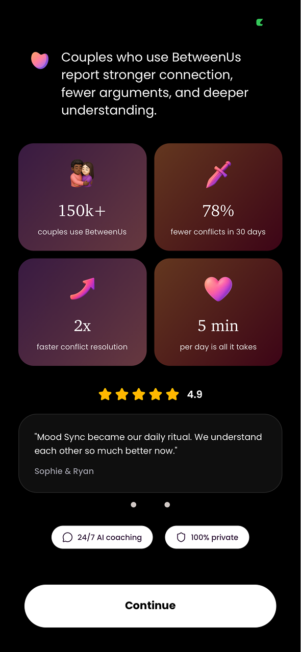
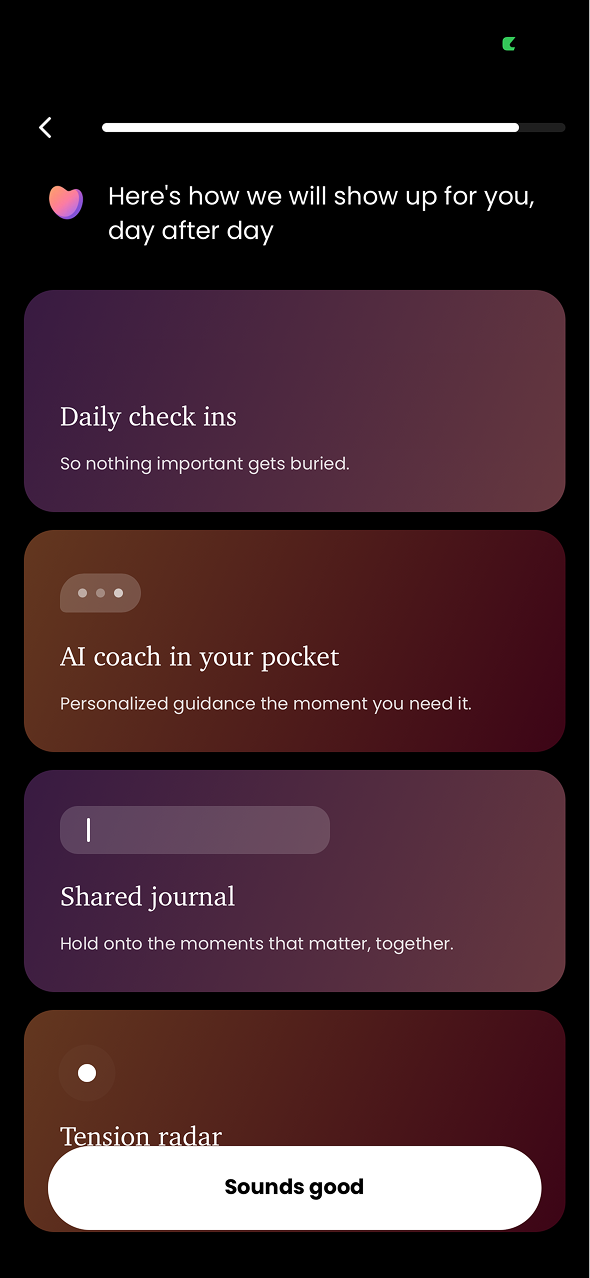
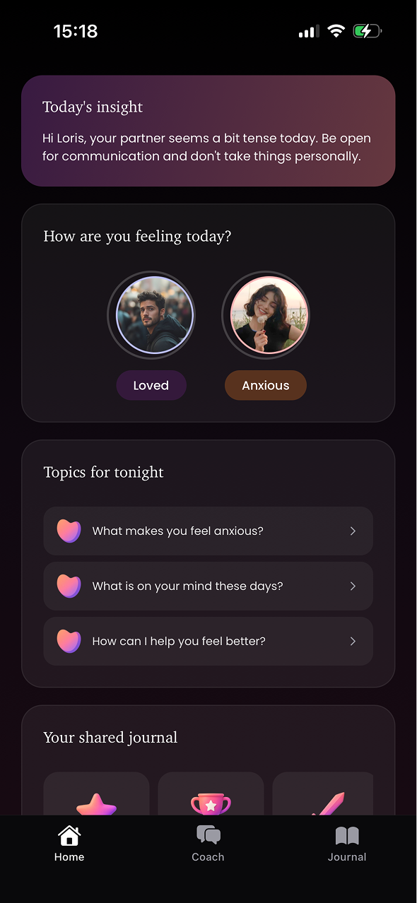
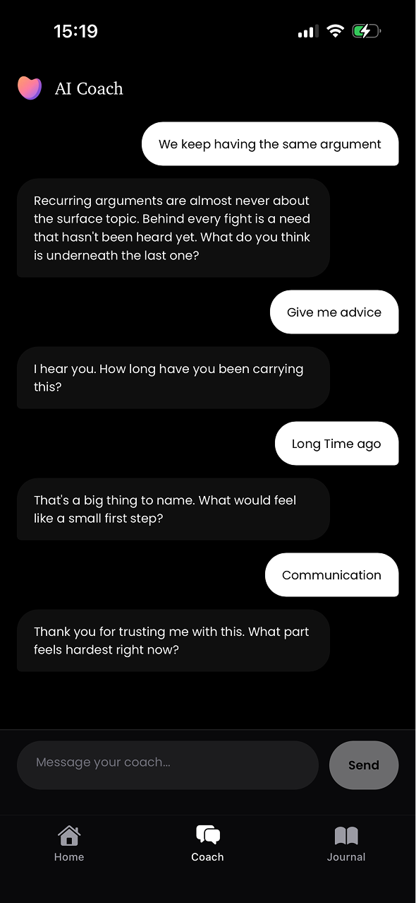
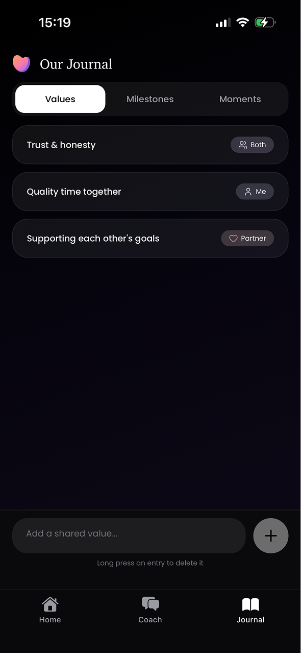
 BetweenUs helps couples understand each other better with an AI conversational coach at the heart of the experience. It supports better communication, helps navigate tensions and prevents conflicts before they escalate.
 CUBEMEAL
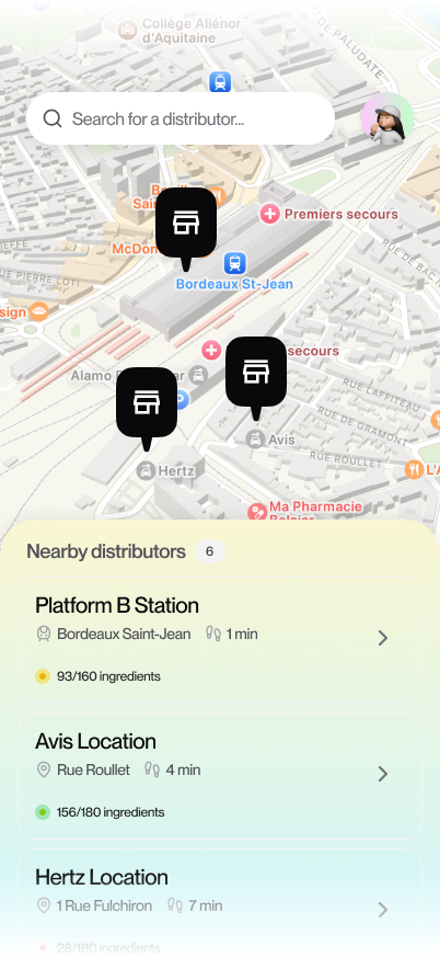
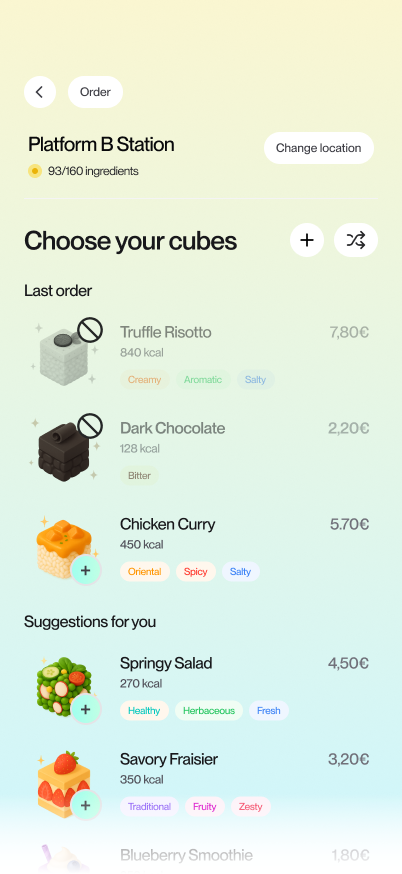
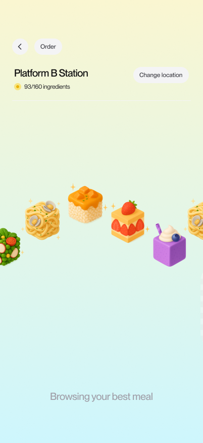
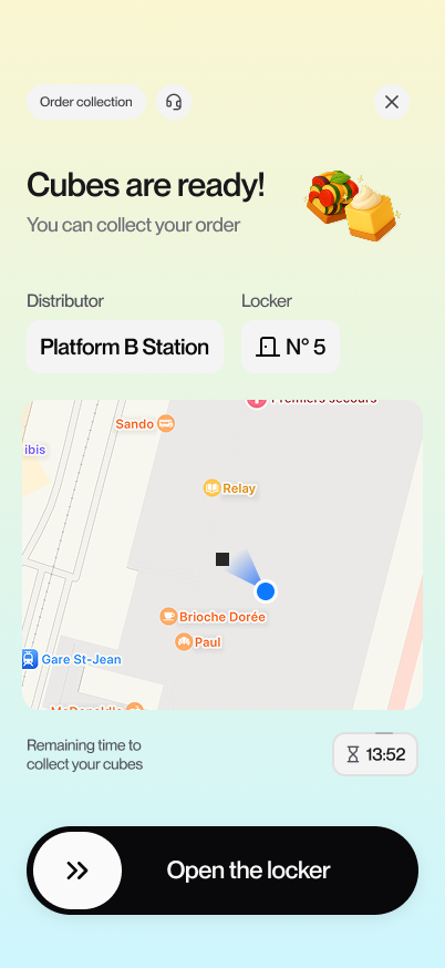
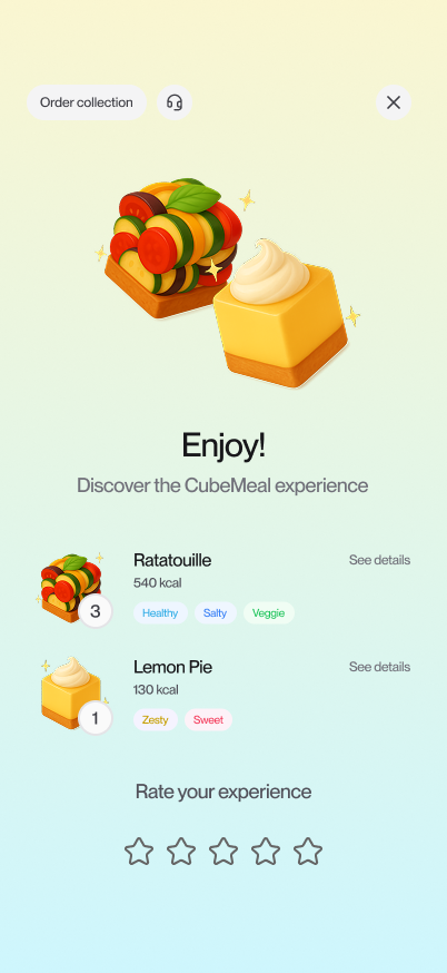
 CubeMeal explores a futuristic approach to food, where meals take the form of compact cubes combined with a unique system for storing, retrieving and consuming them.
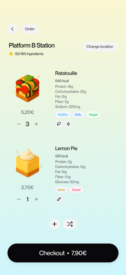
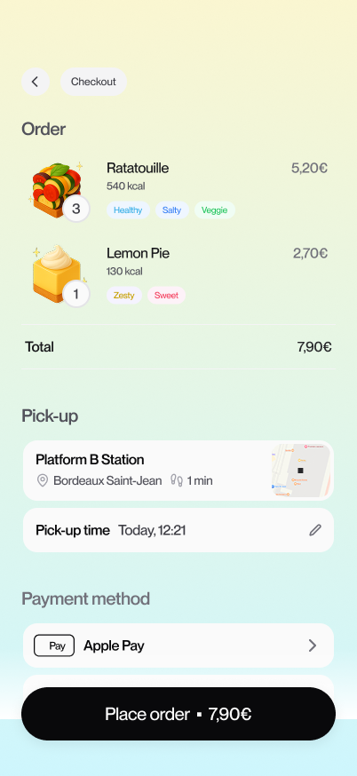
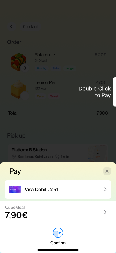
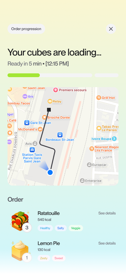
 DEPARTURE
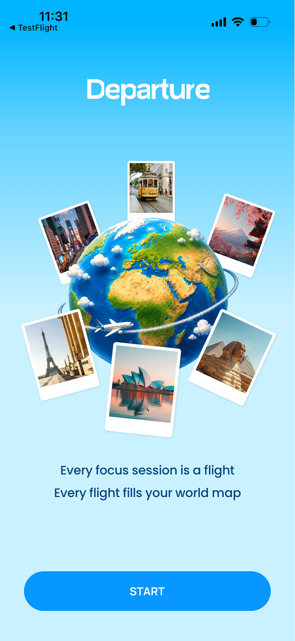
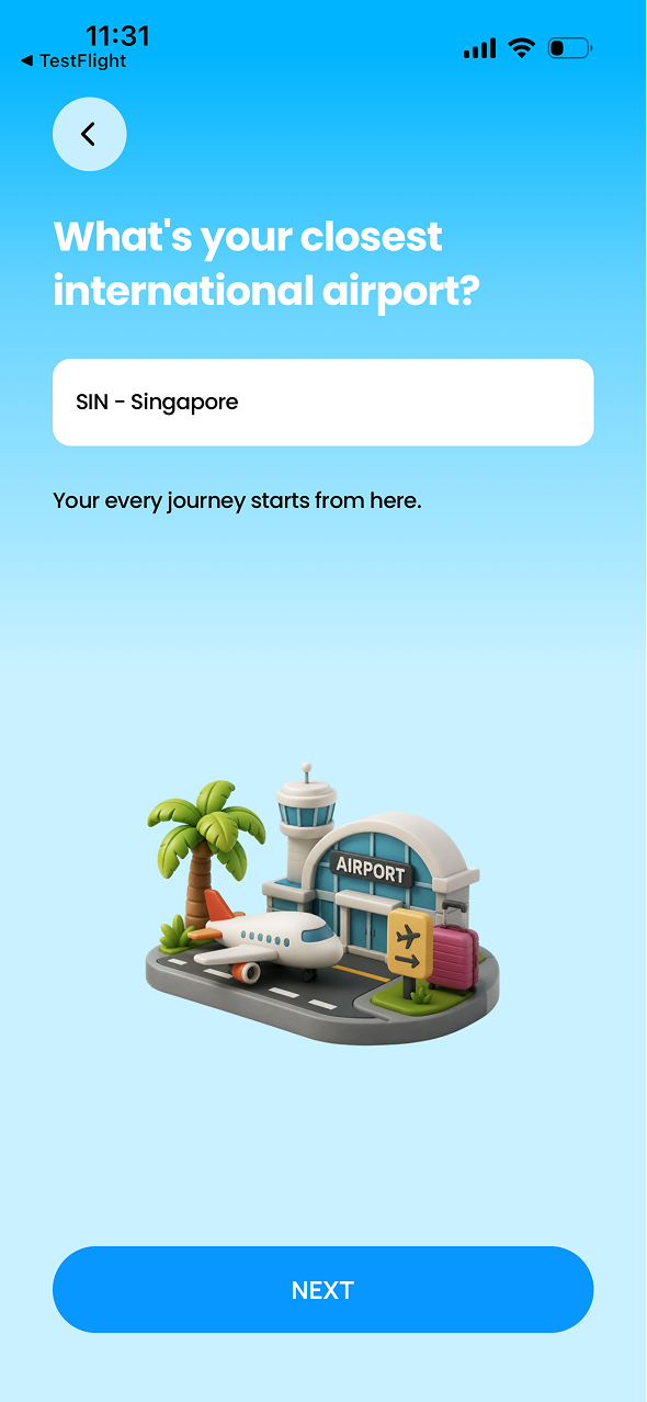
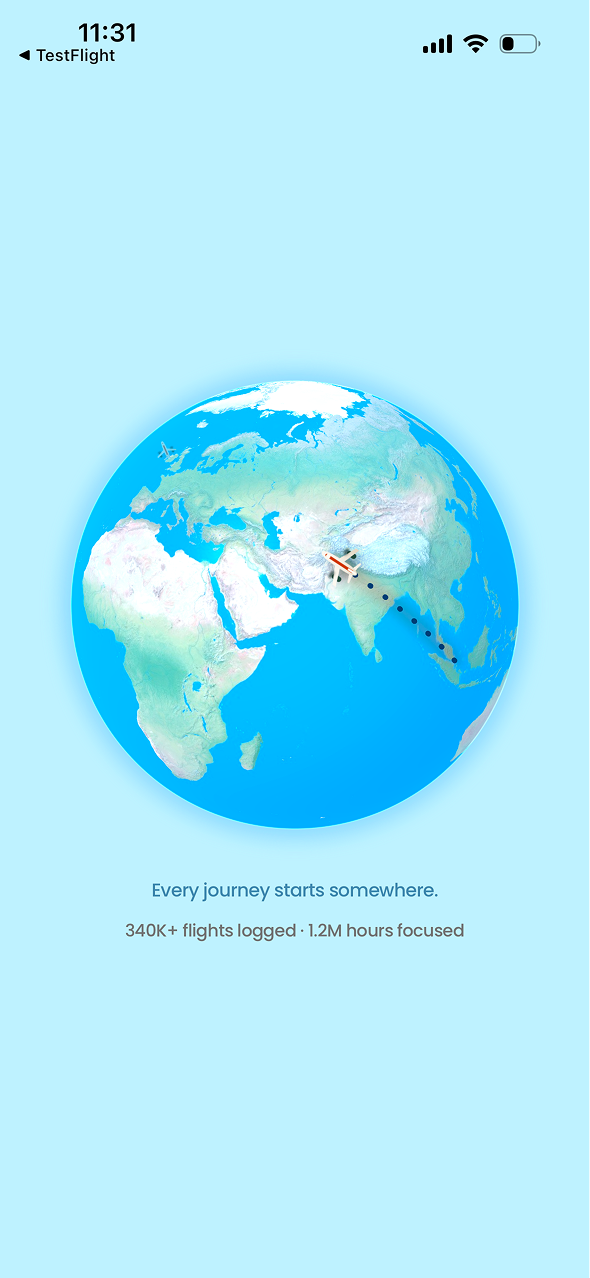
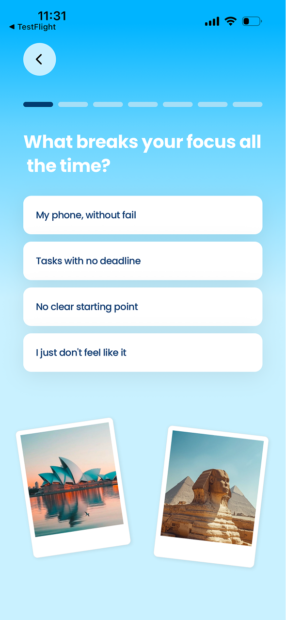
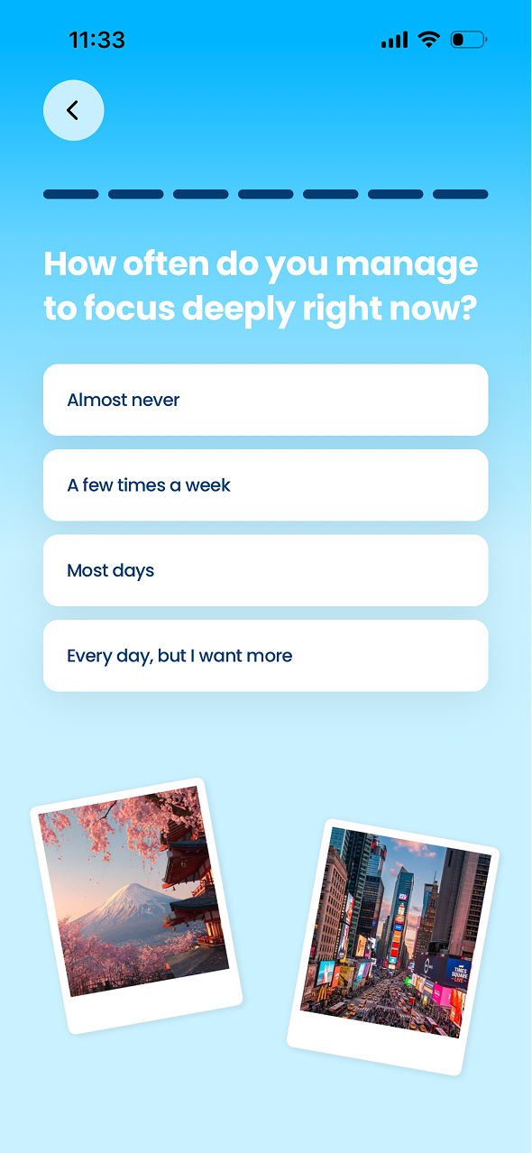
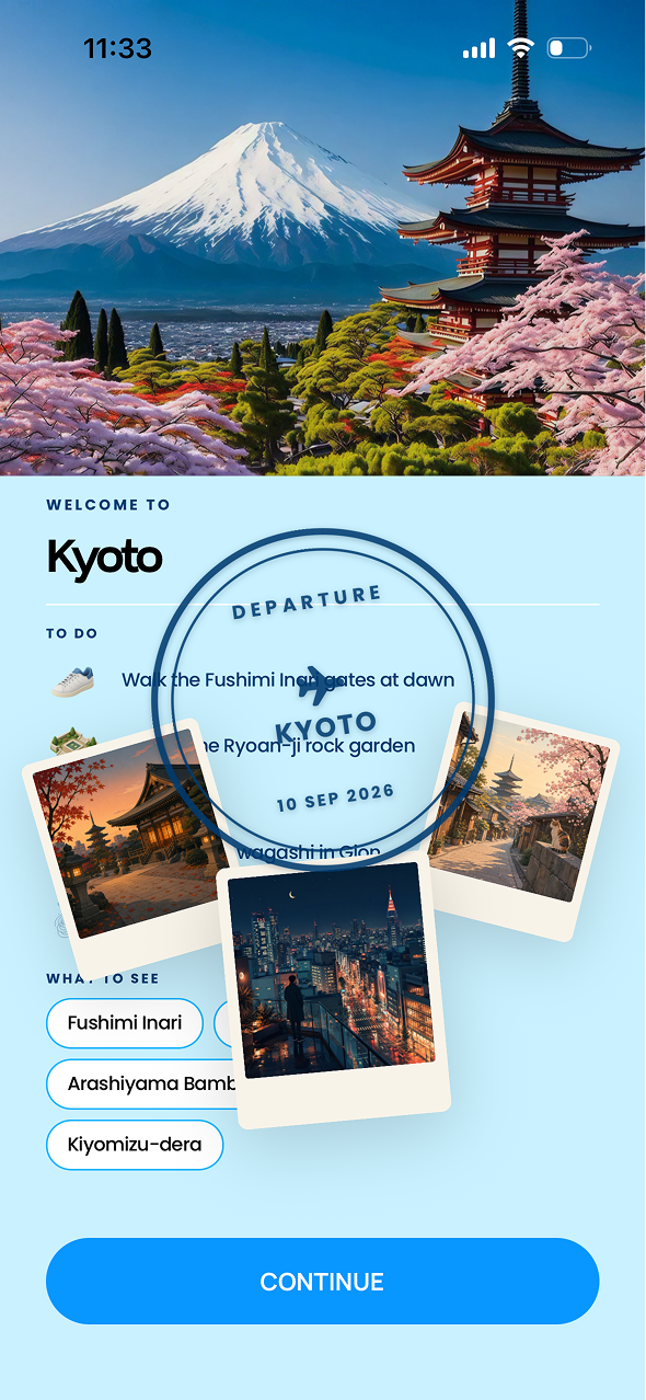
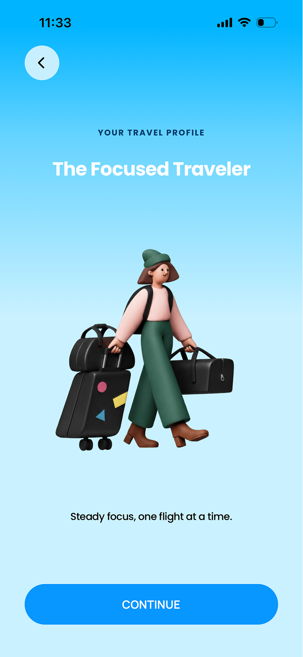
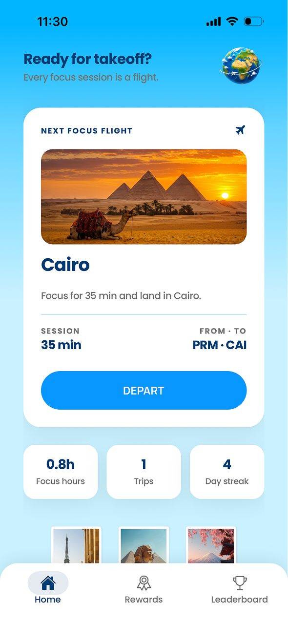
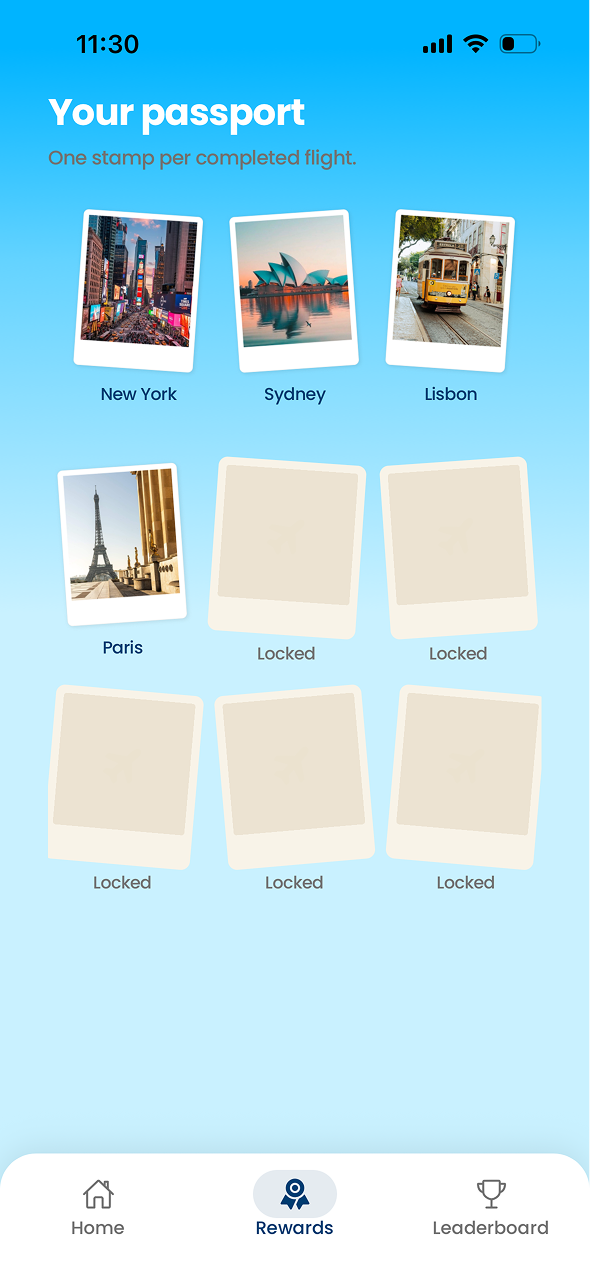
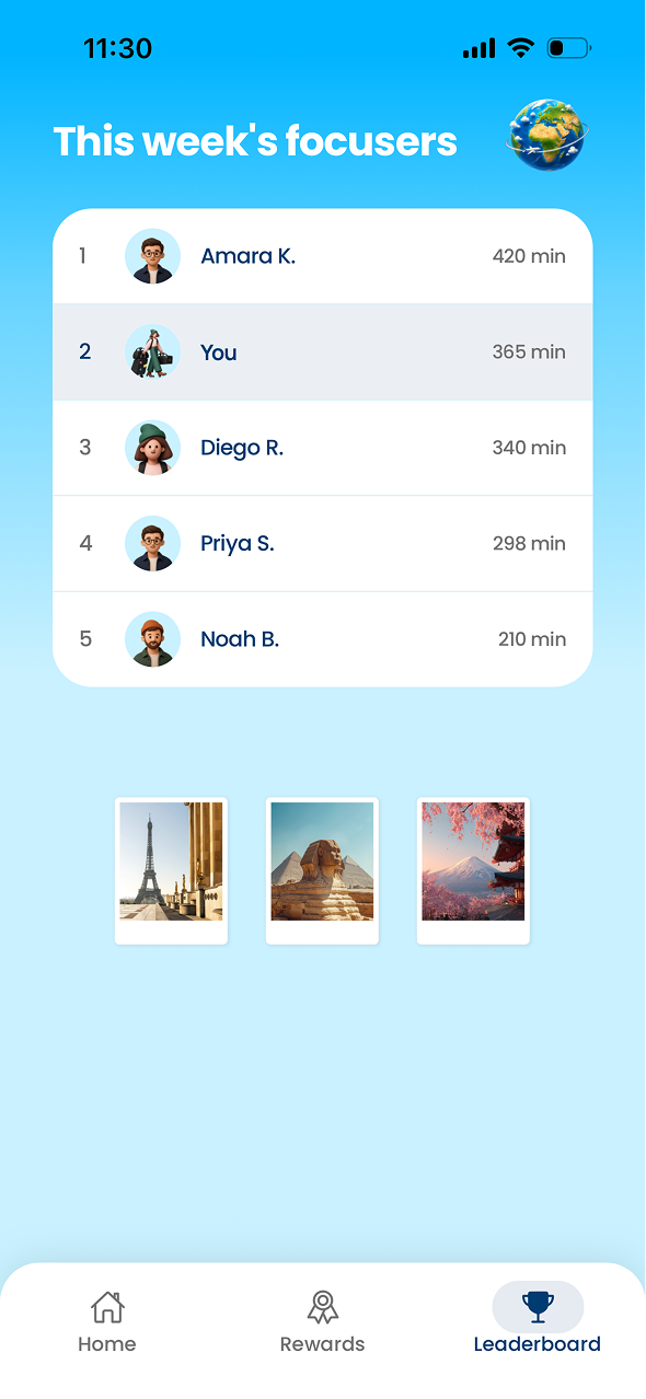
 Departure turns focus into a journey. Each focus session becomes a virtual flight: stay off your phone until you land, unlock new destinations and build your collection as you improve your focus habits.
 HIKO
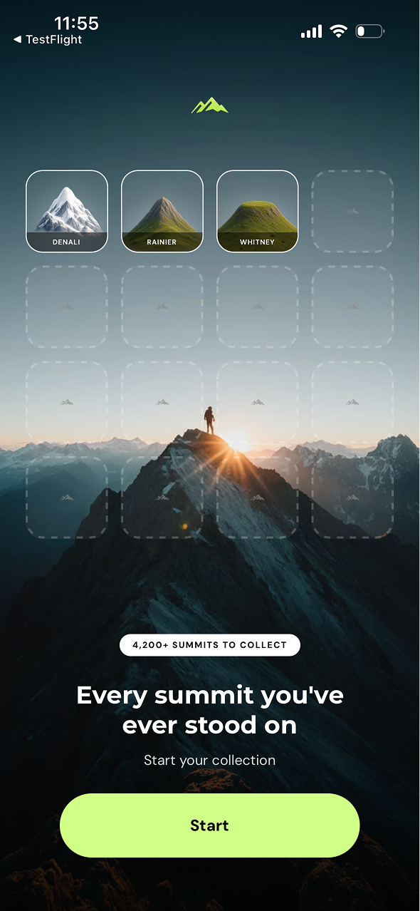
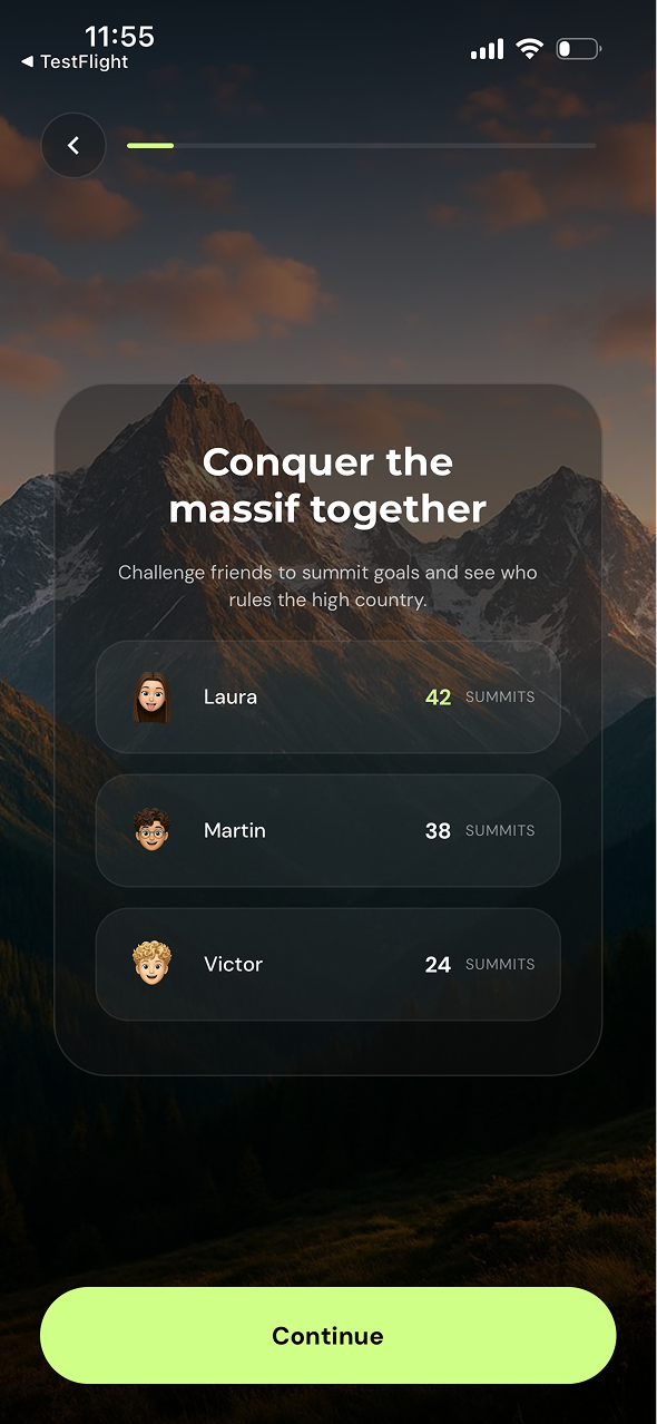
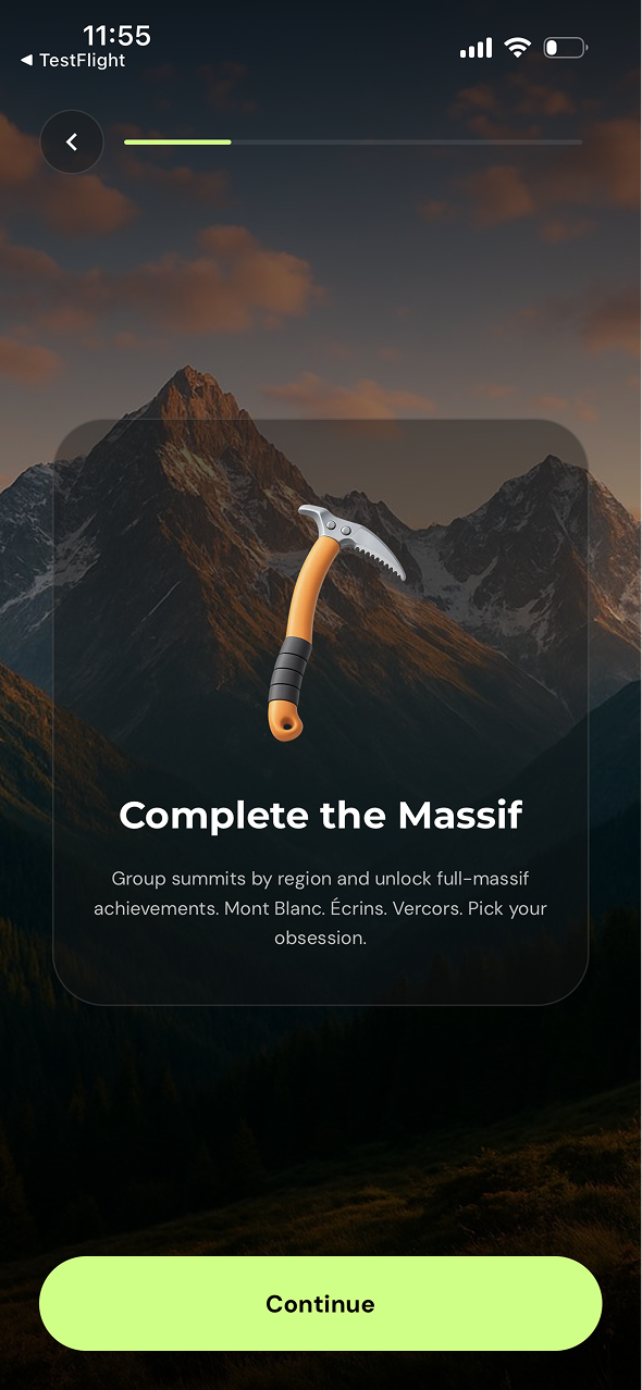
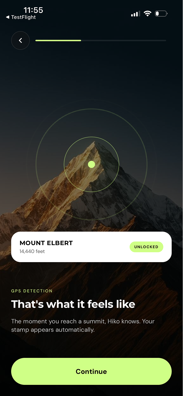
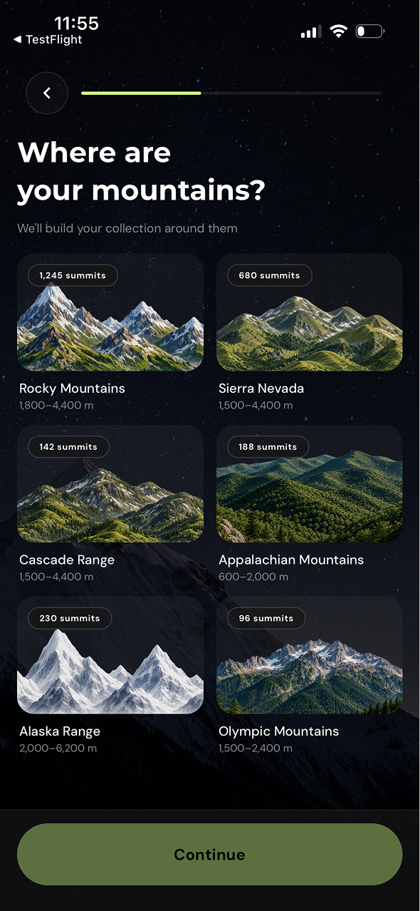
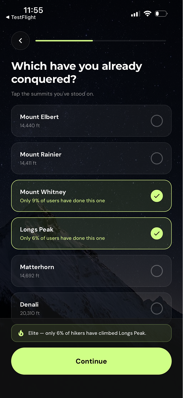
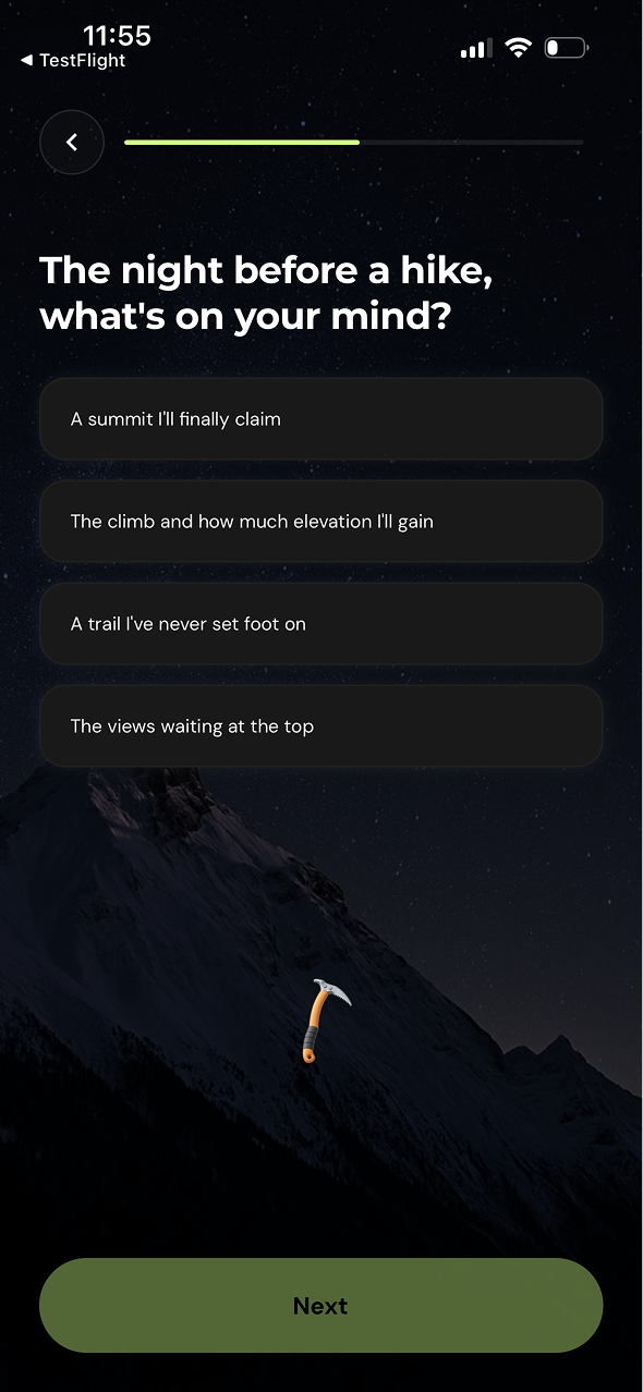
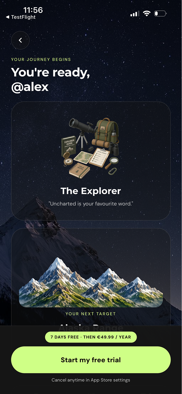
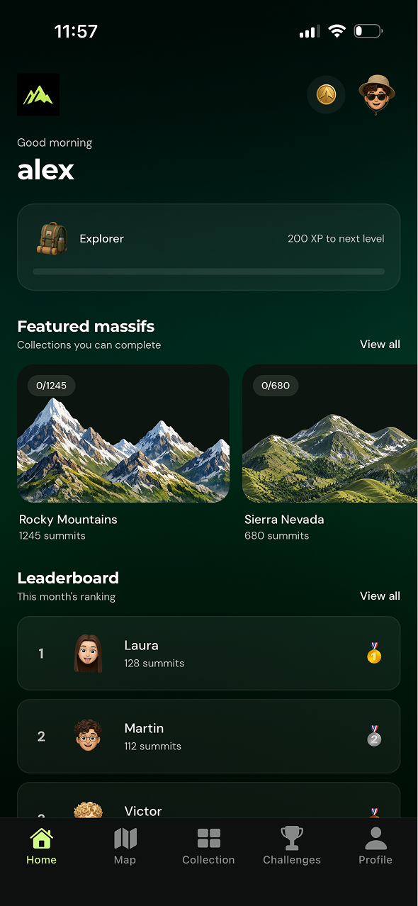
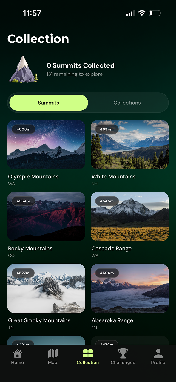
HIKO Hiko turns hiking into a collection game. Explore an interactive map, conquer real-world summits, build your Pokédex-style peak collection and compete with friends through leaderboards.
 THE DESIGN CREW
 PROJECT DESCRIPTION During my time at Design Crew, I worked with three different companies, each facing a specific product challenge and targeting key KPIs within an intensive two-week sprint.
MY ROLE As a Product Designer, I led the end-to-end design process from discovery and ideation to prototyping, craft and user testing before presenting our solutions and recommendations directly to each company.
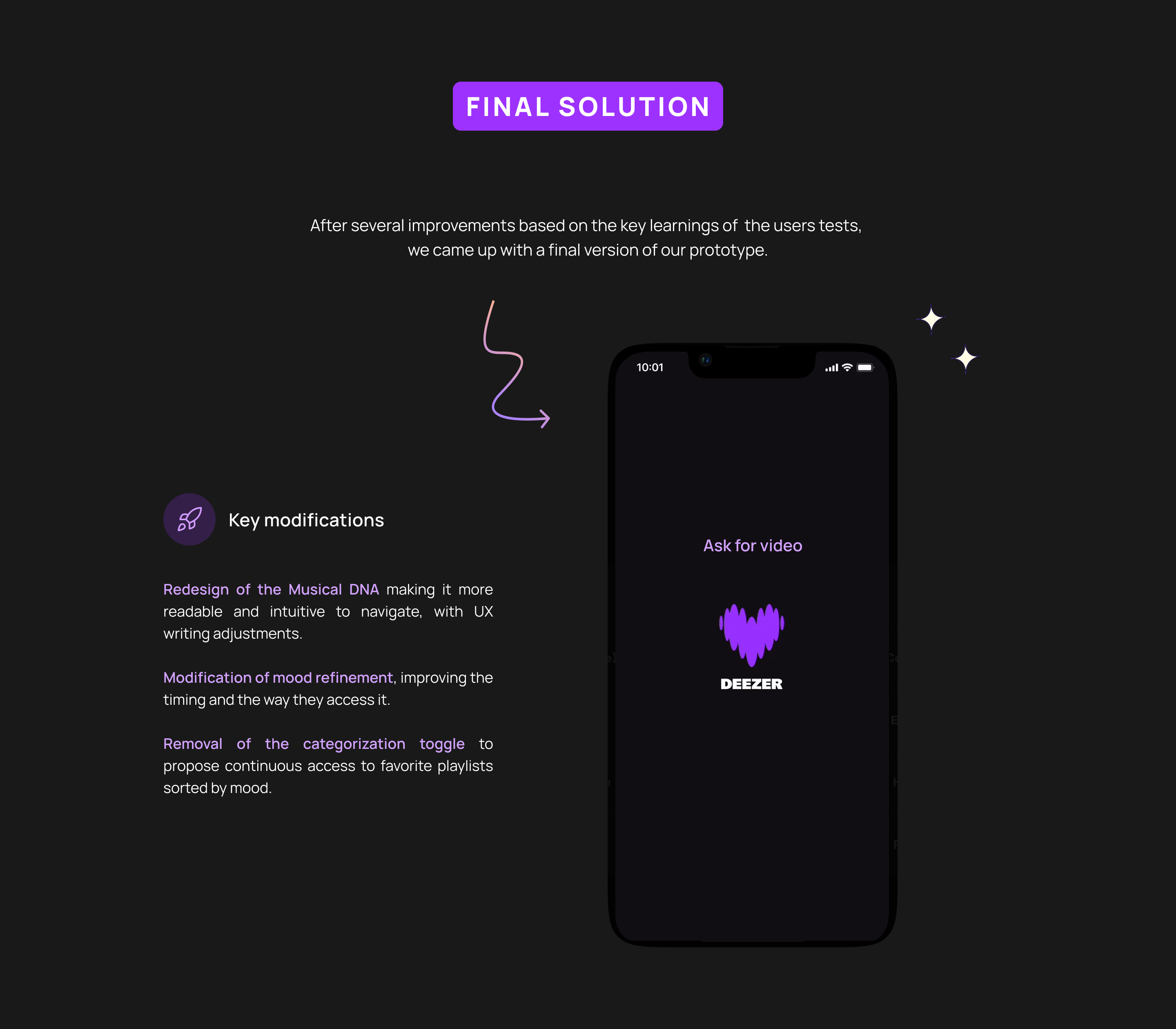
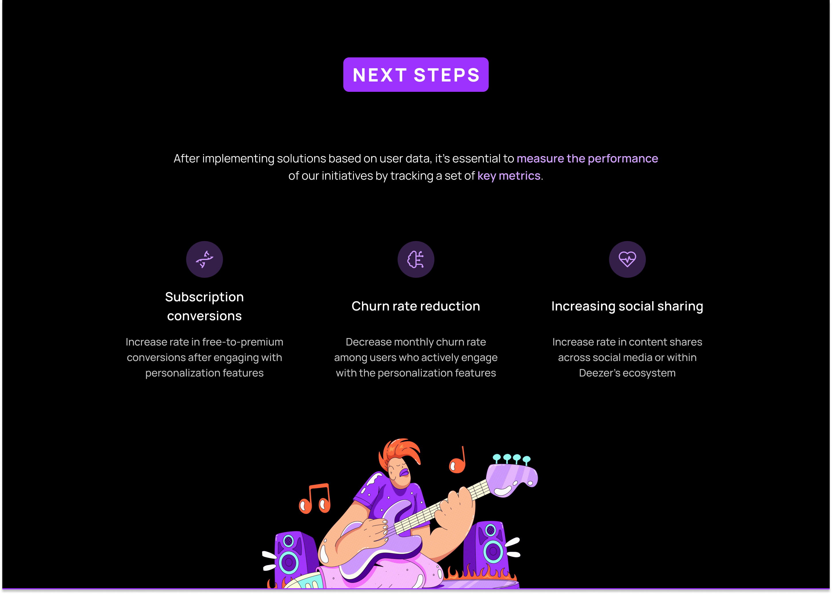
 DEEZER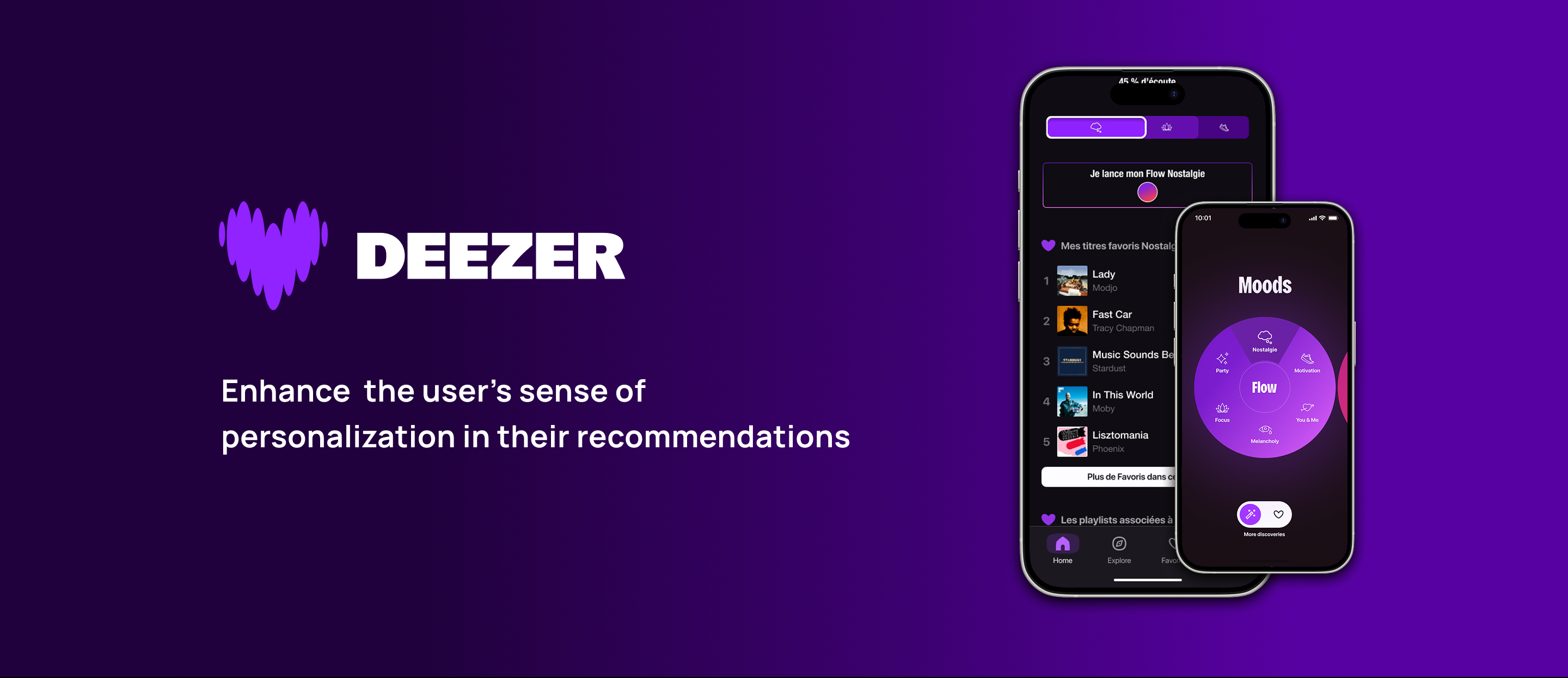
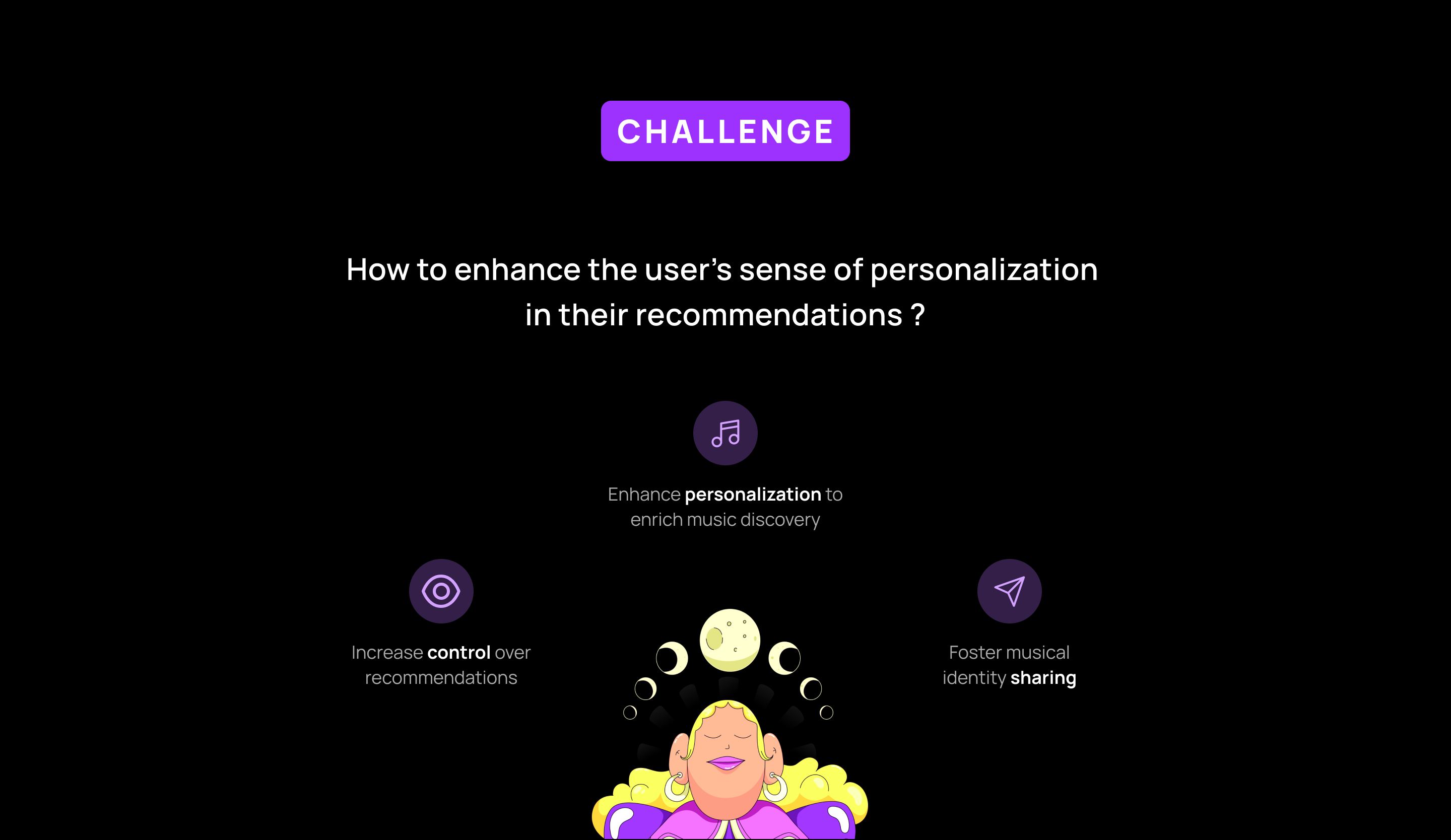
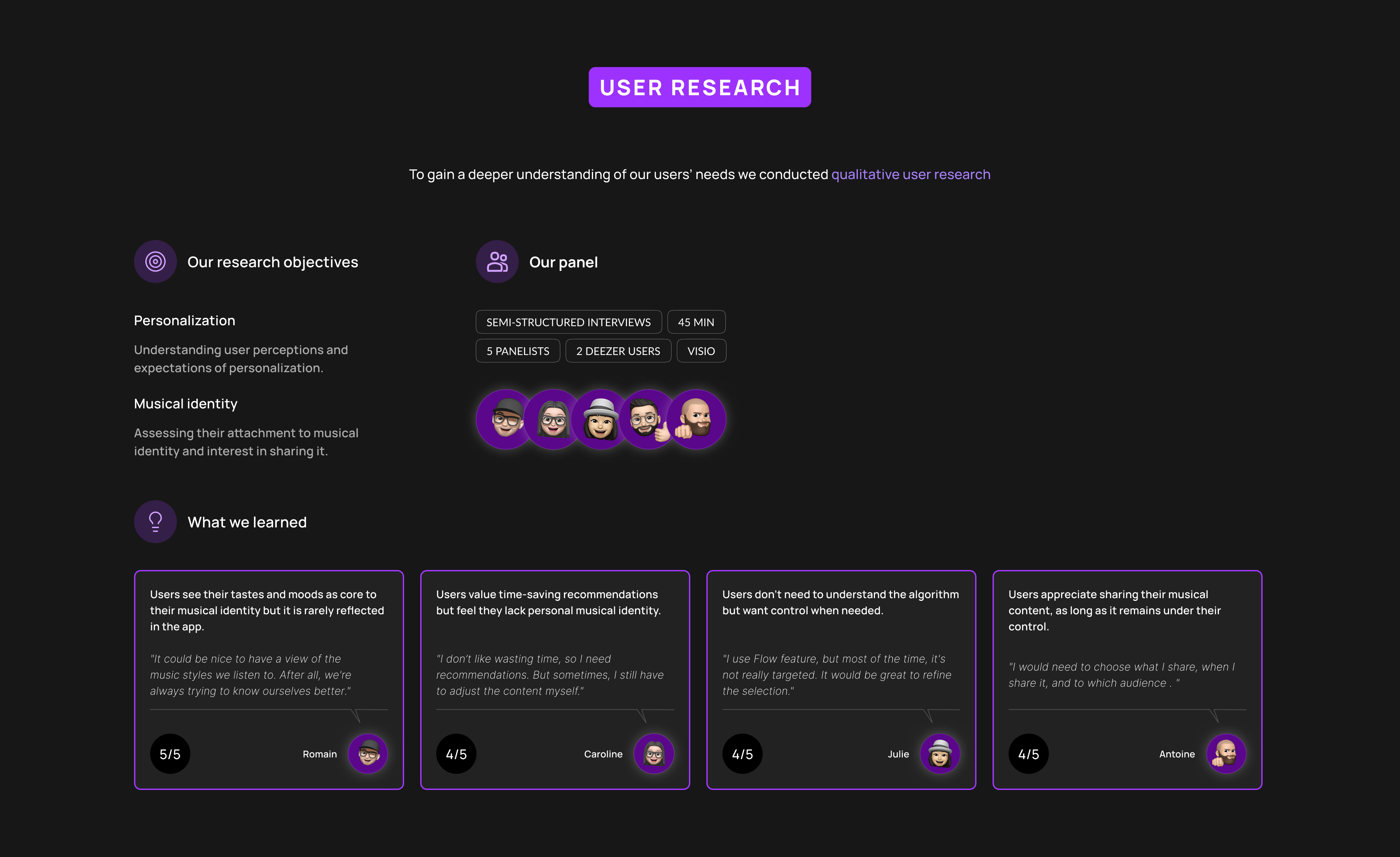
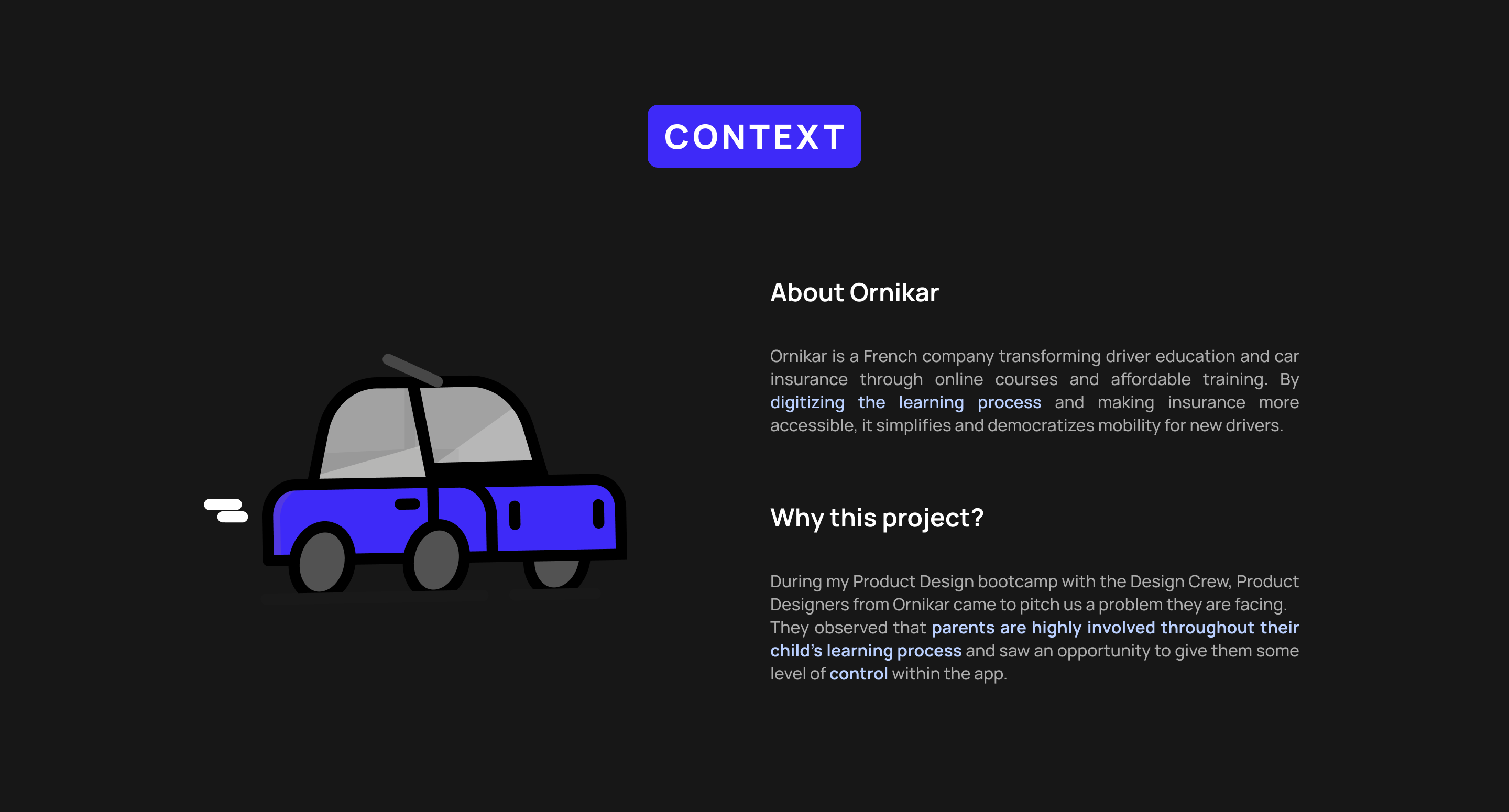
 ORNIKAR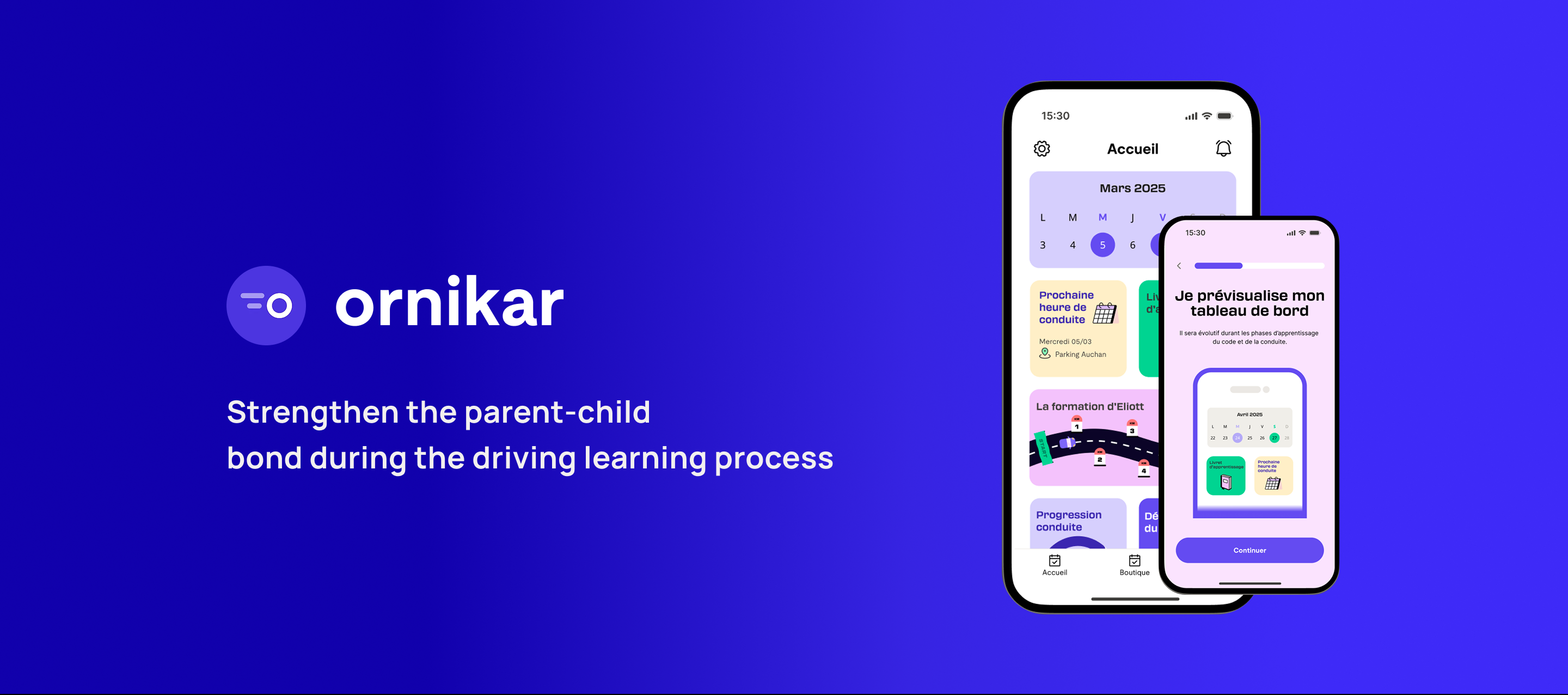
 HEADSPACE
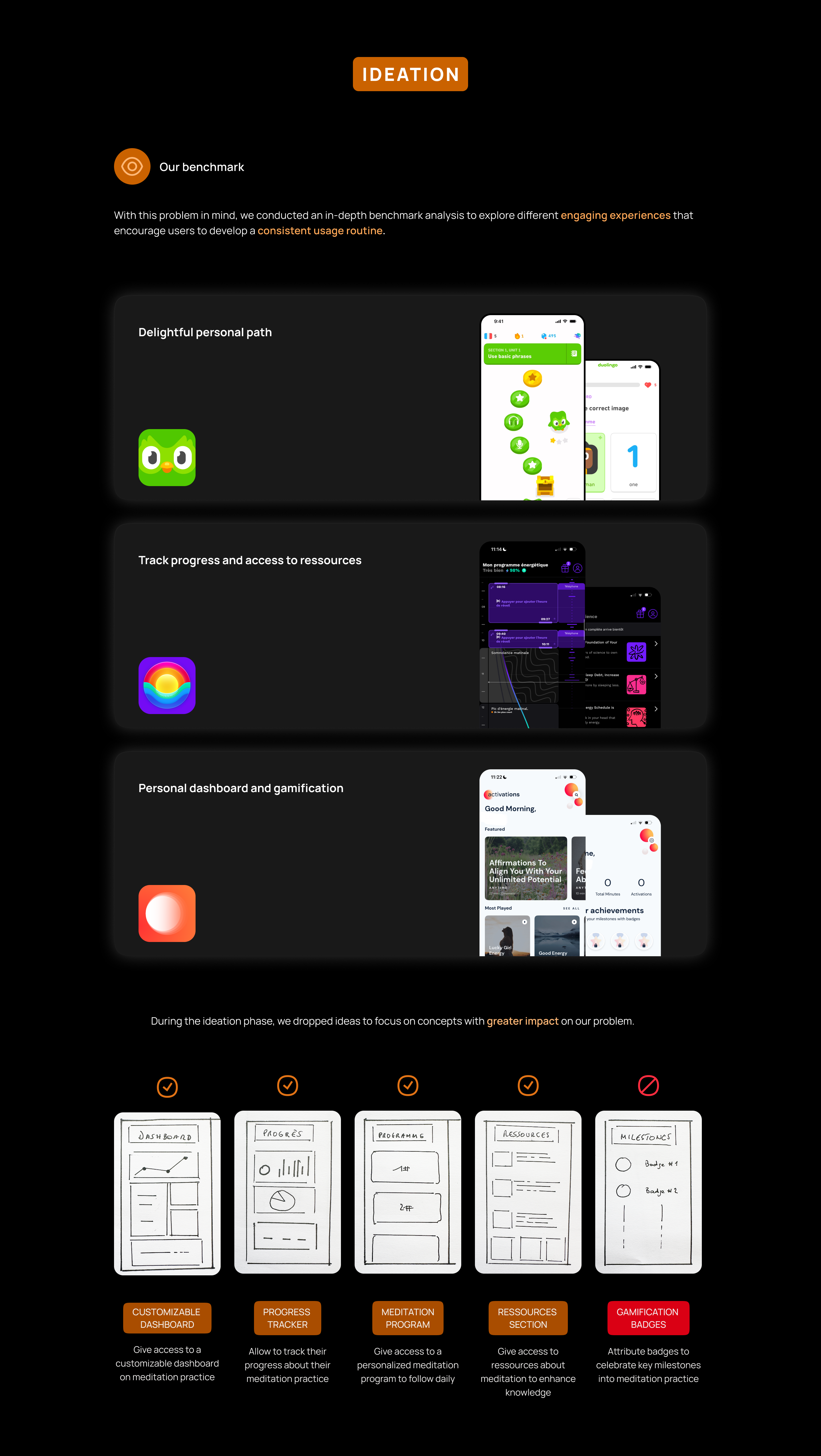
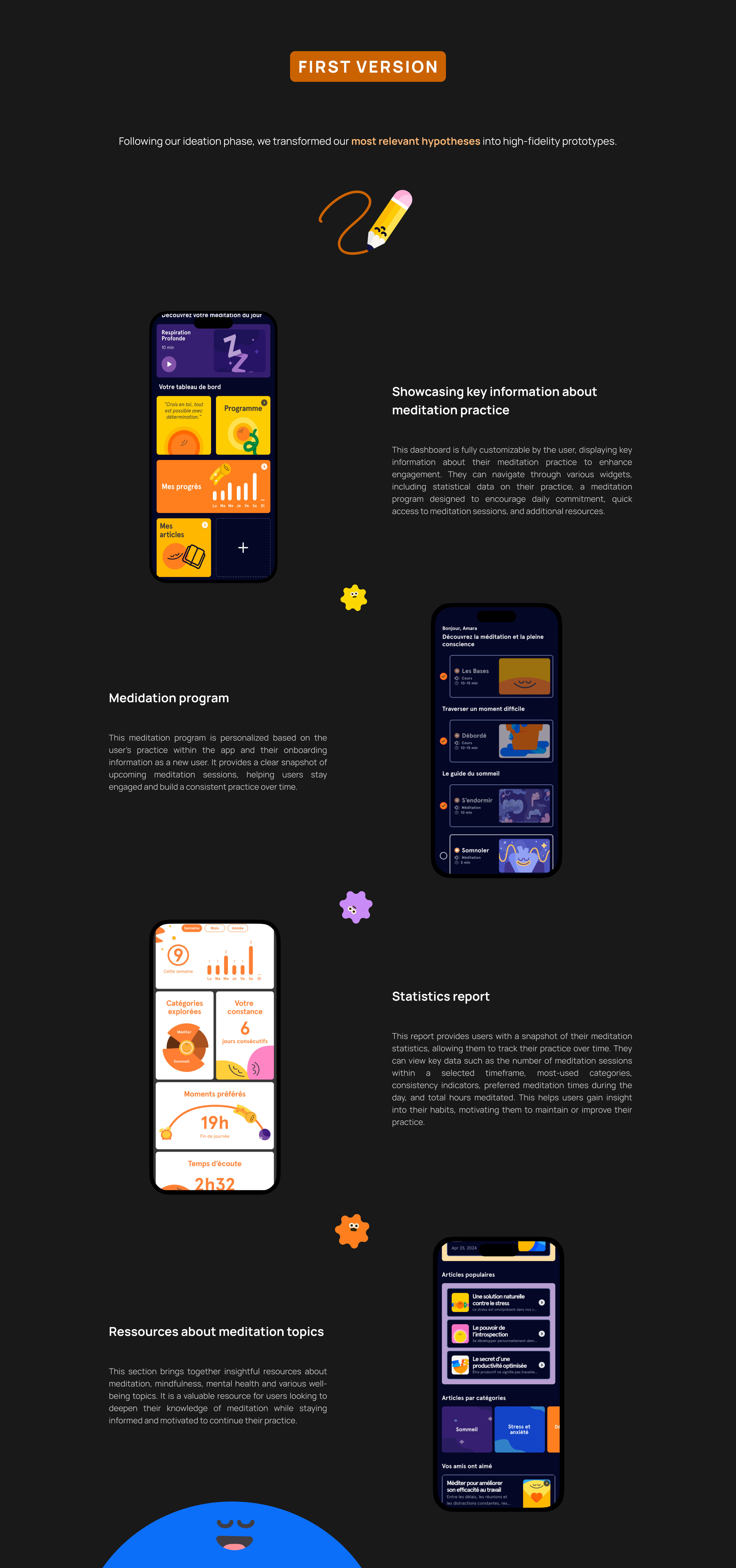
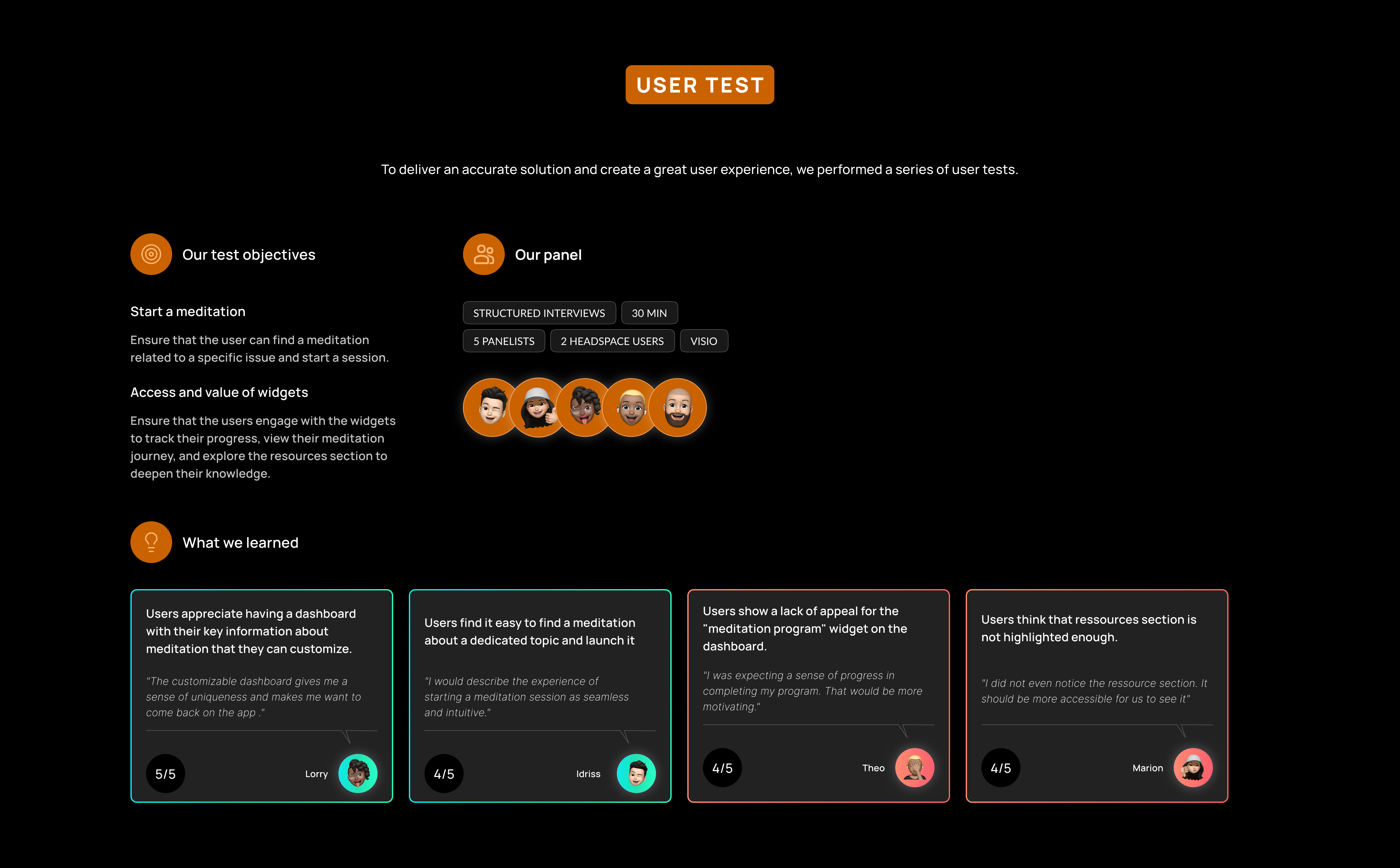
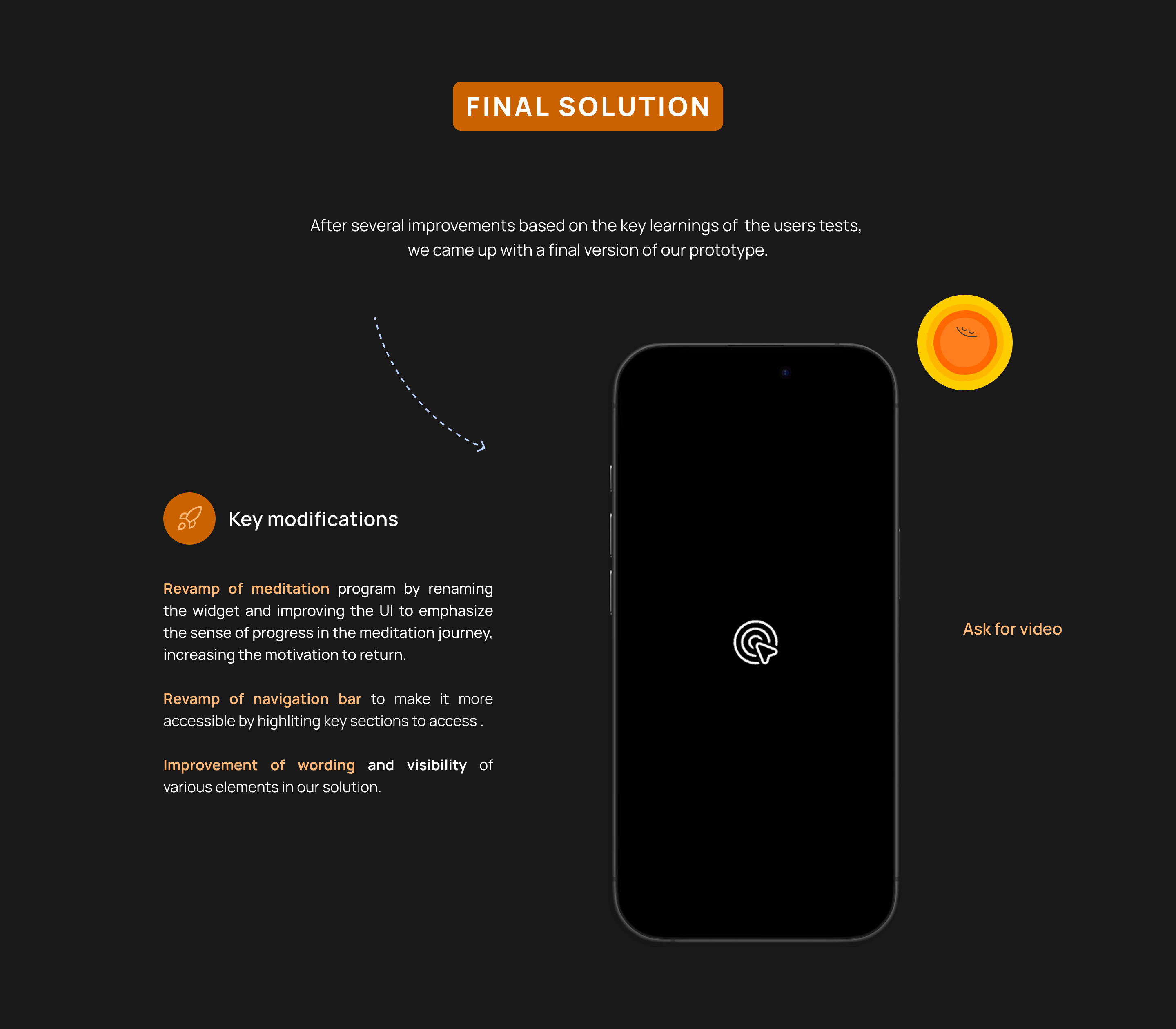
 PAYFIT
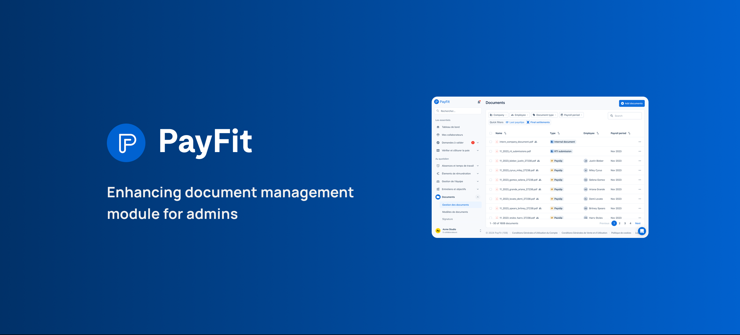
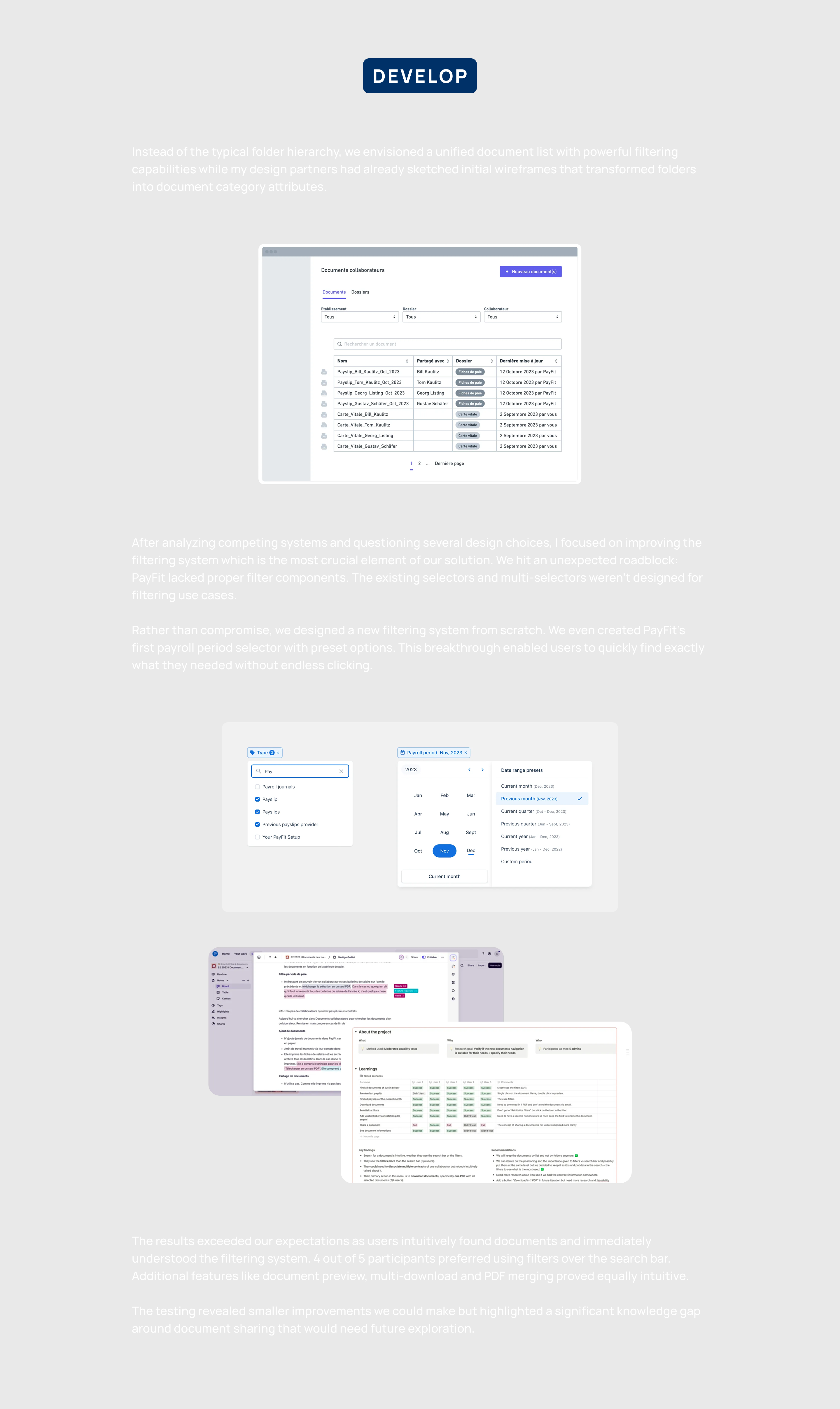
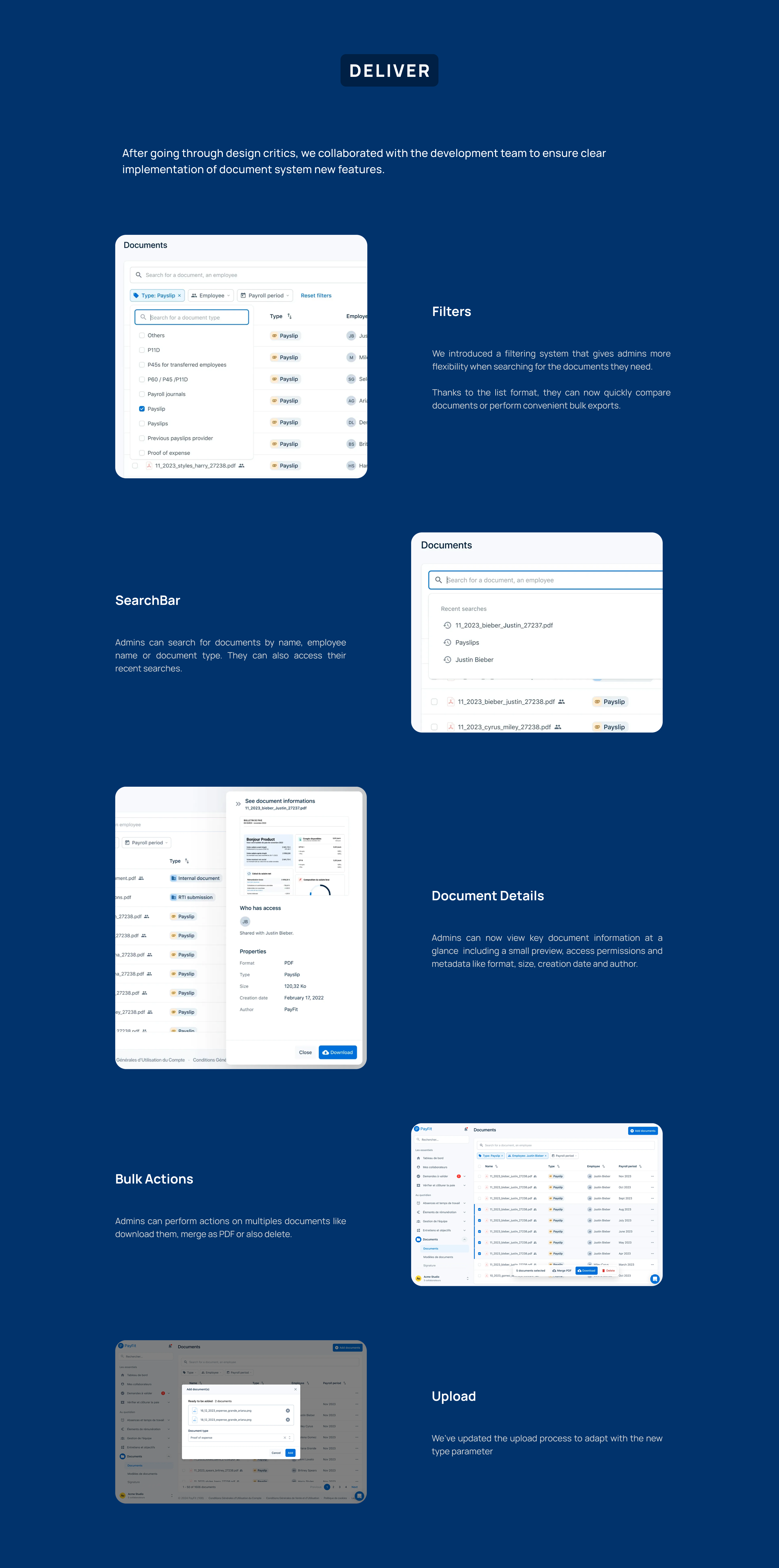
 PROJECT DESCRIPTION Users struggled with a complex folder structure that made finding and uploading documents frustrating, often leading them to dump everything into a generic “Other documents” folder.
MY ROLE I worked as both Product Marketing Manager and Product Designer conducting user interviews and shaping the new experience in close collaboration with a Product Manager and another Product Designer.

A UX case study exploring how to help Airbnb travelers locate and access their accommodation more easily.

A small side project built with Lovable to help startup employees estimate the value of their company shares (BSPCE).
Visit the website to see more.

Designed and built a full e-commerce website for a coffee brand using Webflow.

Worked with Nicolas Essayan to craft the visual identity and website for his venture capital firm.
Visit the website to see more.

Designed a food blog with a fully automated CMS, making it easy for a friend to publish recipes and content.

Created the first brand identity for Hestia, a prop-tech startup, including logo, typography, and color system.

In the first few days of the product development, we heavily invested on a highly re-usable design system.
We started on Tailwind CSS base, and created our own set on atoms by taking elements here and there from libraries like Radix UI and Shadcn. This allowed us to build the first base quickly, and customise it to match our needs.
Our design system has been thought of has a very simple set of components, with the highest flexibility possible. We build atoms and layouts, and let the engineers create molecules and organisms by themselves, following a strict set of rules to create highly usable interfaces and patterns.
Hyperline is a heavy forms & tables product — most like any other SaaS treating finance data — so we had to build components that were both

Since I joined the company in February, we iterated quite a few times on our brand. What started as something very techy quickly evolved into a SaaS that appealed to broader audiences, before taking its final shape in Q2 2025.
Visit the website to see it yourself.

For the past 3 years, I’ve been designing Hyperline from scratch. From the early ideation process until today, we shipped together with the tech team an enormous amount of features.
Visit the website or sign-up to Hyperline to see more.

Ever since we bought the domain name hyperline.co, I’ve been owning the design and experience on our website. For the lastest iteration that shipped in June 2025, I designed the website in a very minimalistic way with a polished finish, and 50+ hand designed product illustrations.
Visit the website to see for yourself.

A UX case study focused on improving La Fourche’s checkout flow to convert new registered users into first-time buyers.

Refreshed the logo and brand system for Le Crayon, a media group producing educational content on YouTube.
Visit the website to see more.

Designed the logo for L’Etincelle, a school dedicated to ecological transition.
Visit the website to see more.

A UX case study exploring how to make transaction limits more transparent for Lydia users.

Rebuilt Marble’s design system from scratch on Figma, creating a consistent component library for their product team.

Collaborated with Camille to build the Melanine cosmetics brand from the ground up, including logo, packaging, and visual identity.

Created all the visual assets for Melanine’s crowdfunding campaign on Ulule.

A tool to help SaaS companies compare and optimize their payment provider costs.
Visit the website to see more.

Designed and shipped a clean one-page website for a law firm in a single day.

A free, open-source platform to organize, browse, and share your vinyl record collection. Built with Discogs integration and AI-powered search.
Visit the website to see more.

A directory of 1000+ SaaS pricing pages and their evolution over time, helping product teams benchmark their pricing.
Visit the website to see more.

Redesigned the sign-up and KYC onboarding flow for Shine, improving the experience for both B2B and B2C users.

Detail page content coming soon.
 Book a call
  LinkedIn